Campi e widget
I campi strutturano i modelli di un database. Se pensi a un modello come a una tabella o a un foglio di calcolo, i campi sono le colonne e i record sono le singole righe. I campi definiscono anche il tipo di dati che vengono memorizzati al loro interno. Il modo in cui i dati di un campo vengono presentati e formattati nell”UI è controllato dal suo widget.
Con Studio è possibile:
aggiungi nuovi campi al tuo database. Da un punto di vista tecnico, esistono 15 tipi di campo in Odoo. Tuttavia, puoi scegliere 20 tipi di campo in Studio, poiché alcuni tipi di campi sono disponibili più di una volta con un widget predefinito diverso;
aggiungere campi esistenti, ovvero campi che esistono già su un modello, a qualsiasi vista di quel modello;
Campi di Studio vs. campi di proprietà
I campi creati utilizzando Studio vengono salvati come colonne nel database Odoo. I campi di proprietà, d’altra parte, agiscono come pseudo-campi; sono condivisi da tutti i record collegati allo stesso record padre (ad esempio, per le attività, il progetto, o per un prodotto, la categoria di prodotto), ma non vengono salvati come colonne nel database.
Example
L’aggiunta di un campo Scadenza alla vista modulo di un’attività tramite Studio rende quel campo visibile in ogni attività del database. L’aggiunta di un campo di proprietà Istruzioni speciali a un’attività rende il campo visibile in tutte le attività all’interno dello stesso progetto (ovvero il suo padre) mentre le attività di altri progetti rimangono inalterate.
Tipi di campo
I campi possono essere suddivisi in due categorie:
Campi semplici, che contengono valori di base, come testo, numeri, file, ecc.
Campi relazionali, che vengono utilizzati per collegare e visualizzare i dati dai record su un altro modello.
Campi semplici
Nota
I widget non predefiniti, quando disponibili, vengono presentati come elenchi puntati o sottotitoli.
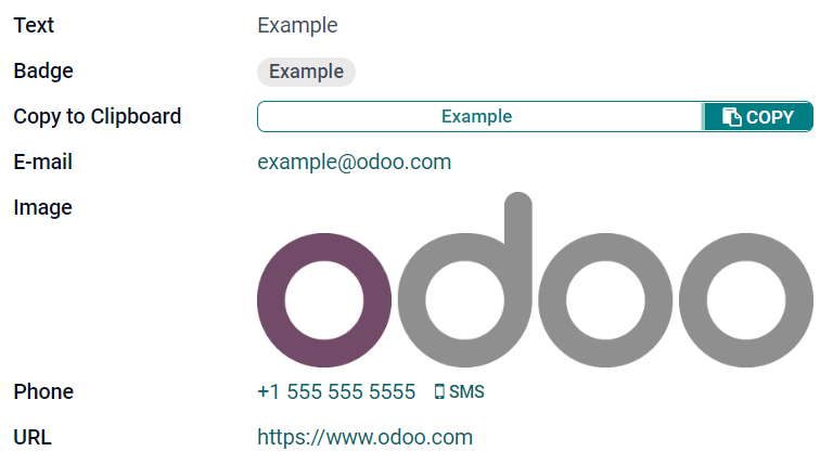
Testo (char)
Il campo Testo viene utilizzato per testi brevi contenenti qualsiasi carattere. Una riga di testo viene visualizzata quando viene riempito il campo.
Badge: visualizza il valore all’interno di una forma arrotondata, simile a un tag. Il valore non può essere modificato nell’interfaccia utente, ma è possibile impostare un valore predefinito
Copia negli appunti: gli utenti possono copiare il valore facendo clic su un pulsante
E-mail: il valore diventa un link mailto cliccabile
Immagine: mostra un’immagine utilizzando un URL. Il valore non può essere modificato manualmente ma è possibile impostare un valore predefinito.
Nota
Questo funziona diversamente dalla selezione diretta del campo Immagine, poiché l’immagine non viene memorizzata in Odoo quando si utilizza un campo Testo con il widget Immagine. Ad esempio, può essere utile se si desidera risparmiare spazio su disco.
Telefono: il valore diventa un link tel cliccabile.
Suggerimento
Spunta l’opzione Abilita SMS per aggiungere un’opzione per inviare un SMS direttamente da Odoo accanto al campo.
URL: il valore diventa un URL cliccabile.
Example
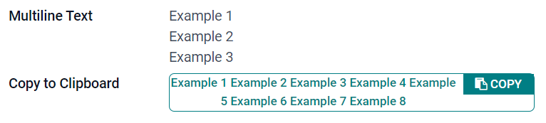
Testo su più righe (text)
Il campo Testo multiriga viene utilizzato per testi più lunghi contenenti qualsiasi tipo di carattere. Due righe di testo vengono visualizzate nell’IU quando viene riempito il campo.
Copia negli appunti: gli utenti possono copiare il valore facendo clic su un pulsante
Example
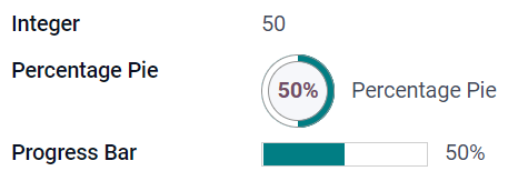
Intero (integer)
Il campo Intero viene utilizzato per tutti i numeri interi (positivo, negativo o zero, senza un decimale).
Torta percentuale: mostra il valore all’interno di un cerchio, di solito per un valore calcolato. Il valore non può essere modificato sull’IU ma è possibile impostare un valore predefinito.
Barra di avanzamento: mostra il valore accanto alla barra percentuale, di solito per un valore calcolato. Il campo non può essere modificato manualmente ma è possibile impostare un valore predefinito.
Maniglia: mostra un’icona a forma di maniglia per ordinare i record manualmente nella vista elenco.
Example
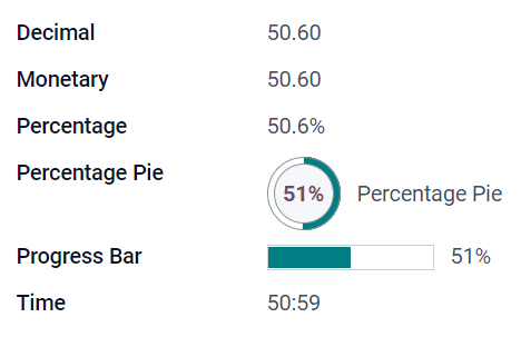
Decimale (float)
Il campo Decimale viene utilizzato per tutti i numeri decimali (positivo, negativo o zero, con un decimale).
Nota
Nell’IU, i numeri decimali vengono visualizzati con due decimali dopo il punto ma vengono salvati nel database con più precisione.
Monetario: è simile all’utilizzo del campo Monetario. È consigliato utilizzarlo in quanto offre più funzionalità.
Percentuale: mostra il simbolo di percentuale
%dopo il valore.Torta percentuale: mostra il valore all’interno di un cerchio, di solito per un valore calcolato. Il campo non può essere modificato manualmente ma è possibile impostare un valore predefinito.
Barra di avanzamento: mostra il valore accanto alla barra percentuale, di solito per un valore calcolato. Il campo non può essere modificato manualmente ma è possibile impostare un valore predefinito.
Tempo: il valore deve rispettare il formato hh:mm con un massimo di 59 minuti.
Example
Monetario (monetary)
Il campo Monetario viene utilizzato per tutti i valori monetari.
Nota
Quando aggiungi un campo Monetario per la prima volta, ti verrà richiesto di aggiungere il campo Valuta se non esiste già nel modello. Odoo si offre di aggiungere il campo Valuta per te. Una volta aggiunto, riaggiungi il campo Monetario.
Example

Html (html)
Il campo Html viene utilizzato per aggiungere del testo che può essere modificato utilizzando l’editor HTML di Odoo.
Testo multiriga: disabilita l’editor HTML di Odoo per consentire la modifica dell’HTML puro.
Example

Data (date)
Il campo Data viene utilizzato per selezionare una data sul calendario.
Giorni residui: il numero di giorni rimanenti prima della visualizzazione della data selezionata (ad es., Tra 5 giorni), in base alla data attuale. Questo campo dovrebbe essere impostato su Sola lettura.
Example

Data e ora (datetime)
Il campo Data e ora viene utilizzato per selezionare una data sul calendario e un orario per l’orologio. L’orario attuale dell’utente viene utilizzato automaticamente se non imposti un altro orario.
Suggerimento
Come nel caso delle proprietà generali, alcune proprietà specifiche sono disponibili per i campi Data e ora che hanno il widget Data e ora o Intervallo data configurato.
Intervallo data (daterange)
Il widget Intervallo data viene utilizzato per mostrare un periodo di tempo definito da una data di inizio e una data di fine in una singola riga. Un intervallo di date può avere una data di inizio e di fine obbligatoria, ad esempio per un evento di più giorni, o consentire una data di inizio o di fine opzionale, ad esempio per un intervento di assistenza sul campo o un’attività di progetto.
L’aggiunta di un intervallo data richiede due campi: un campo Data e ora con il widget Intervallo data configurato e un altro campo selezionato come data di inizio o data di fine. Questo campo sottostante può essere un campo Data o Data e ora esistente, oppure uno creato specificatamente per questo scopo.
Per aggiungere un intervallo data:
individua un campo Data o Data e ora esistente che può essere usato come il campo data inizio/fine sottostante oppure aggiungine uno nuovo. Se l’intervallo data:
ha una data di inizio e di fine obbligatorie, il campo può corrispondere sia alla data di inizio che alla data di fine; il risultato è lo stesso.
permette di aggiungere una data di inizio o fine facoltativa, questo campo corrisponde alla data di inizio o di fine.
Suggerimento
Per evitare di mostrare le stesse informazioni due volte, il campo data inizio/fine sottostante può essere reso invisibile attivando Invisibile oppure può essere eliminato dalla vista facendo clic su Elimina da vista.
Aggiungi un campo Data e ora e imposta il campo Widget su Intervallo data.
Inserisci una Etichetta appropriata.
Seleziona il campo data inizio/fine sottostante dal menu a discesa Campo data inizio o Campo data fine.
Se l’intervallo data deve avere una data di inizio e fine obbligatorie, attiva Sempre intervallo.
Aggiorna qualsiasi altra proprietà generale o specifica per i campi Data e ora se necessario. In seguito, fai clic su Chiudi nell’angolo in alto a destra dello schermo.
Example
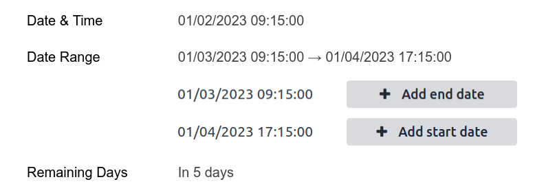
Giorni rimanenti (remaining_days)
Il widget Giorni rimanenti mostra il numero restante di giorni che precedono la data selezionata (ad es., Tra 5 giorni), in base a data e orario attuali. Il campo dovrebbe essere impostato su Sola lettura.
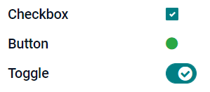
Casella (boolean)
Il campo Casella viene utilizzato quando un valore può essere solo vero o falso, indicato spuntando o meno la casella.
Pulsante: visualizza un pulsante rotondo. Il widget funziona senza dover passare alla modalità di modifica.
Interruttore: visualizza un pulsante a forma di interruttore. Il widget funziona senza dover passare alla modalità di modifica.
Example
Selezione (selection)
Il campo Selezione viene utilizzato quando gli utenti devono scegliere un solo valore da un gruppo di valori predefiniti.
Badge: visualizza il valore all’interno di una forma arrotondata, simile a un tag. Il valore non può essere modificato nell’interfaccia utente, ma è possibile impostare un valore predefinito
Badge: mostra tutti i valori selezionabili contemporaneamente all’interno di forme rettangolari, organizzate orizzontalmente.
Priorità: mostra simboli a forma di stella invece di valori utilizzabili per indicare il livello di importanza o soddisfazione, ad esempio. È come selezionare il campo Priorità, sebbene, per quest’ultimo, sono previsti quattro valori.
Pulsante di selezione: mostra tutti i valori selezionabili allo stesso tempo come pulsanti di selezione.
Suggerimento
Per impostazione predefinita, i pulsanti di selezione vengono organizzati verticalmente. Spunta Visualizza in orizzontale per modificare la visualizzazione.
Barra di stato: mostra tutti i valori selezionabili allo stesso tempo come una freccia che avanza.
Suggerimento
Per impostazione predefinita, i valori sulla barra di stato sono selezionabili. Disattiva Cliccabile per evitare di modificare il valore sull’interfaccia utente.
Example

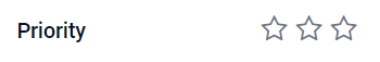
Priorità (selection)
Il campo Priorità viene utilizzato per visualizzare un sistema di valutazione a tre stelle che può essere utilizzato per indicare il livello di importanza o soddisfazione. Questo tipo di campo è campo Selezione con il widget Priorità selezionato per impostazione predefinita con quattro valori di priorità. Di conseguenza, i widget Badge, Badge, Pulsante di selezione e Selezione hanno lo stesso effetto descritto nel campo Selezione.
Suggerimento
Per modificare il numero di stelle disponibili aggiungendo o rimuovendo valori, fai clic su Modifica valori. Nota che il primo valore è pari a 0 stelle (ad es., quando non viene effettuata nessuna scelta) quindi quando si hanno quattro valori, il sistema di valutazione sarà caratterizzato da tre stelle.
Example
File (binary)
Il campo File viene utilizzato per caricare qualsiasi tipo di file oppure per firmare un modulo (Sign widget).
Immagine: gli utenti possono caricare un file immagine che poi viene visualizzato nella vista modulo. Questo ha lo stesso effetto del campo Immagine.
Visualizzatore PDF: gli utenti possono caricare un file PDF che può essere consultato dalla vista modulo.
Firma: gli utenti possono firmare digitalmente il modulo. Questo ha lo stesso effetto del campo Firma.
Example

Immagine (binary)
Il campo Immagine viene utilizzato per caricare un’immagine e visualizzarla nella vista modulo. Questo tipo di campo è un campo File con il widget Immagine selezionato per impostazione predefinita. Di conseguenza, i widget File, Visualizzatore PDF e Firma hanno lo stesso effetto descritto per il campo File.
Suggerimento
Per modificare la dimensione delle immagini caricate, scegli Piccola, Media o Grande nel campo Dimensione.
Firma (binary)
Il campo Firma viene utilizzato per firmare il modulo digitalmente. Questo tipo di campo è un campo File con il widget Firma selezionato per impostazione predefinita. Di conseguenza, i widget File, Immagine e Visualizzatore PDF widgets hanno lo stesso effetto del campo File.
Suggerimento
Per fornire l’opzione Automatica al momento dell’inserimento della firma, seleziona uno dei campi Completa automaticamente con (Text, molti a uno e Campo correlato solo sul modello). La firma viene generata automaticamente utilizzando i dati del campo selezionato.
Campi di relazione
Nota
I widget non predefiniti, quando disponibili, vengono presentati come elenchi puntati o sottotitoli.
Molti a uno (many2one)
Il campo Molti a uno viene utilizzato per collegare un record (di un altro modello) al record che si sta modificando. Il nome del record dell’altro modello viene poi visualizzato sul record che si sta modificando.
Example
Sul modello Ordine di vendita, il campo Cliente è un campo Molti a uno che punta al modello Contatto. Questo permette di collegare più ordini di vendita a un solo contatto (cliente).

Suggerimento
Spunta l’opzione Disattiva creazione per impedire agli utenti di creare un nuovo record nel modello collegato.
Spunta l’opzione Disattiva apertura per impedire agli utenti di aprire record in una finestra pop-up.
Fai clic su Dominio per creare un filtro che aiuta gli utenti a selezionare solo il record giusto.
Badge: mostra il valore all’interno di una forma arrotondata, simile a un tag. Il valore non può essere modificato nell’interfaccia utente.
Pulsante di selezione: mostra tutti i valori selezionabili allo stesso tempo come pulsanti di selezione.
Uno a molti (one2many)
Il campo Uno a molti viene utilizzato per mostrare le relazioni esistenti tra un record del modello attuale e altri record di un altro modello.
Example
È possibile aggiungere un campo Uno a molti al modello Contatto per visualizzare molti ordini di vendita di un solo cliente.

Nota
Per utilizzare un campo Uno a molti, i due modelli devono essere già collegati utilizzando un campo Molti a uno. Le relazioni Uno a molti non esistono in modo indipendente: viene eseguita una ricerca inversa delle relazioni Molti a uno esistenti.
Righe (one2many)
Il campo Righe viene utilizzato per creare una tabella con righe e colonne (ad es., le righe dei prodotti di un ordine di vendita).
Suggerimento
Per modificare le colonne, fai clic sul campo Righe e poi su Modifica vista elenco. Per modificare il modulo che appare quando un utente fa clic su Aggiungi riga, fai clic su Modifica vista modulo.
Example

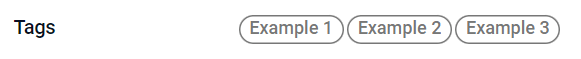
Molti a molti (many2many)
Il campo Molti a molti viene utilizzato per collegare più record di un altro modello a più record del modello attuale. I campi Molti a molti possono usare Disattiva apertura, Dominio proprio come i campi Molti a uno.
Example
Nel modello Lavoro, il campo Assegnatari è un campo Molti a molti che punta al modello Contatto. Questo permette a un singolo utente di essere assegnato a più lavori e più utenti possono essere assegnati a un solo lavoro.

Caselle di controllo: gli utenti possono selezionare vari valori utilizzando le caselle di controllo.
Tag: gli utenti possono selezionare vari valori visualizzati in forme rotonde e denominati tag. Questo ha lo stesso effetto della selezione del campo Tag.
Tag (many2many)
Il campo Tag viene utilizzato per visualizzare vari valori di un altro modello che si presentano con una forma arrotondata, conosciuti anche come tag. Questo tipo di campo è un campo Molti a molti con il widget Tag selezionato in automatico. Di conseguenza, i widget Caselle di controllo e Molti a molti hanno lo stesso effetto descritto nella sezione Molti a molti.
Suggerimento
Per mostrare tag con vari colori di sfondo è necessario spuntare l’opzione Usa colori.
Example
Aggiungere un campo a una vista
Con Studio è possibile aggiungere:
un nuovo campo a una vista modulo o elenco di un modello
un campo esistente, ovvero un campo che esiste già sul modello in questione, a qualsiasi vista di quel modello
Suggerimento
Aggiungi un nuovo campo a una vista modulo o elenco per salvarlo nel modello e renderlo disponibile come campo esistente in altre viste dello stesso modello.
Aggiungere un nuovo campo
Suggerimento
Attiva la modalità sviluppatore prima di aggiungere un nuovo campo per vedere, e poter modificare, il nome tecnico del campo durante la configurazione.
Per aggiungere un nuovo campo, segui questi passaggi:
Vai alla vista modulo o elenco pertinente, quindi fai clic sull’icona (Attiva/Disattiva Studio) nell’angolo in alto a destra. In alternativa, con qualsiasi app aperta, fai clic sull’icona (Attiva/Disattiva Studio), quindi vai alla vista modulo o elenco pertinente.
Nella scheda Aggiungi, trascina il tipo di campo pertinente dalla sezione Nuovi campi e rilascialo nella posizione desiderata. Se il nuovo campo è un campo relazionale, seleziona il campo reciproco, il modello o il campo correlato pertinente nel pop-up.
Nella scheda Proprietà, configura le proprietà del campo:
Inserisci l”Etichetta da visualizzare come nome del campo nell’interfaccia utente; questa viene utilizzata anche per generare il nome tecnico predefinito del campo.
Fai clic in un punto qualsiasi al di fuori del campo Etichetta per vedere il Nome tecnico aggiornato con il nome tecnico predefinito.
Nota
Il Nome tecnico di un nuovo campo può essere modificato in Studio durante il processo di configurazione. In qualsiasi altro momento, il nome tecnico di un campo può essere modificato solo tramite le impostazioni tecniche del database.
Il nome tecnico di un nuovo campo aggiunto utilizzando Studio ha per impostazione predefinita il prefisso
x_studio_.
Facoltativamente, seleziona un Widget diverso tramite il menu a discesa; il widget predefinito per il tipo di campo è selezionato per impostazione predefinita.
Facoltativamente, configura qualsiasi altra proprietà del campo.
Fai clic su Chiudi nell’angolo in alto a destra per chiudere Studio.
Aggiungere un campo esistente
Per aggiungere un campo che esiste sul modello ma che non è presente nella vista corrente, segui questi passaggi:
Vai alla vista pertinente, quindi fai clic sull’icona (Attiva/Disattiva Studio) nell’angolo in alto a destra. In alternativa, con qualsiasi app aperta, fai clic sull’icona (Attiva/Disattiva Studio), quindi vai alla vista pertinente.
Nella scheda Aggiungi, nel pannello di sinistra, fai clic su Campi esistenti per visualizzare un elenco di tutti i campi del modello che non sono attualmente presenti nella vista.
Trascina il campo pertinente e rilascialo nella posizione desiderata.
Nella scheda Proprietà, configura le proprietà pertinenti per il campo nella vista corrente.
Nota
Diverse proprietà possono essere configurate indipendentemente per viste differenti, se necessario, come l”Etichetta, il Widget, la visibilità del campo per determinati gruppi di utenti, così come se il campo è Invisibile, Obbligatorio o Sola lettura.
Fai clic su Chiudi nell’angolo in alto a destra per chiudere Studio.
Proprietà del campo
Una serie di proprietà generali può essere configurata per la maggior parte delle combinazioni di tipo di campo e widget. Proprietà aggiuntive sono disponibili a seconda del tipo di campo e widget specifico selezionato. Ad esempio, i campi Data e ora che utilizzano il widget Data e ora o Intervallo di date hanno varie proprietà specifiche che possono essere configurate.
Proprietà generali
Classe: usa Bootstrap o altre classi personalizzate definite in Odoo per personalizzare lo stile e la visualizzazione del campo nell’interfaccia utente.
Invisibile: abilita questa proprietà quando non è necessario che gli utenti visualizzino un campo nell’interfaccia utente. Questo aiuta a snellire l’interfaccia utente, mostrando solo i campi essenziali in base a una situazione specifica.
Richiesto: attiva questa proprietà se un campo deve essere sempre compilato dall’utente prima di essere in grado di proseguire.
Sola lettura: abilita questa proprietà se gli utenti non devono poter modificare un campo.
Suggerimento
La proprietà Invisibile si applica anche all’interno di Studio. Per visualizzare i campi nascosti in Studio, fai clic sulla scheda Vista di una vista e abilita Mostra elementi invisibili.
Le proprietà Invisibile, Obbligatorio e Sola lettura possono essere abilitate solo per record specifici facendo clic su Condizionale e creando un filtro.
Example
Nella vista modulo del modello Contatto, il campo Titolo appare solo quando è selezionato Individuo, poiché quel campo non sarebbe utile per un contatto di tipo Azienda.
Etichetta: questo è il nome del campo nell’interfaccia utente; l’etichetta viene utilizzata per generare il nome tecnico del campo.
Suggerimento di aiuto: per spiegare lo scopo di un campo, inserisci una descrizione. Il testo viene visualizzato all’interno di una casella di suggerimento quando si passa il mouse sul punto interrogativo accanto all’etichetta del campo.
Nome tecnico: per visualizzare il nome tecnico di un campo in Studio (e, durante la configurazione di un nuovo campo, modificarlo se necessario), attiva la modalità sviluppatore.
Suggerimento
Se questo campo deve essere aggiornato ma non è più modificabile tramite Studio, il nome tecnico può essere modificato tramite le impostazioni tecniche del database.
Widget: per modificare l’aspetto predefinito o la funzionalità di un campo, seleziona uno o più widget disponibili.
Segnaposto: per fornire un esempio di come un campo debba essere compilato, aggiungi un testo segnaposto fisso. Il testo appare in grigio chiaro finché non viene inserito un valore.
Segnaposto dinamico: per fornire il valore del campo selezionato come esempio di come un campo debba essere compilato. Il testo appare in grigio chiaro finché non viene inserito un valore.
Valore predefinito: per visualizzare un valore predefinito in un campo quando viene creato un record, aggiungere un valore.
Consenti visibilità gruppi: per limitare gli utenti che possono visualizzare il campo, seleziona uno o più gruppi utenti di accesso.
Impedisci visibilità gruppi: per evitare che alcuni utenti possano visualizzare il campo, seleziona uno o più gruppi utenti accesso.
Proprietà per campi Data e ora
Per i campi Data e ora che utilizzano il widget Data e ora o Intervallo di date, sono disponibili alcune proprietà specifiche:
Precisione minima: determina l’unità di data più piccola che deve essere selezionata nel selettore di date. I valori possibili sono
Day,Month,YearoDecade. Se non viene selezionato alcun valore, l’utente deve selezionare un giorno nel selettore di date.Precisione massima: determina l’unità di data più grande che può essere utilizzata per navigare nel selettore di date. I valori possibili sono
Day,Month,YearoDecade. Se non viene selezionato alcun valore, l’utente può navigare nel selettore di date per decennio.Avviso per date future: attiva questa proprietà per visualizzare un’icona di avviso se selezioni una data futura.
Visualizzazione breve: attiva questa proprietà per mostrare giorni, mesi e ore senza zeri iniziali, ad esempio
4/2/2025 8:05:00invece di04/02/2025 08:05:00.Mostra ora: questa proprietà è abilitata per impostazione predefinita per i campi Data e ora. In un campo di sola lettura, disabilita la proprietà per mostrare solo la data. In questo modo, ad esempio, la visualizzazione di un elenco può risultare meno ingombrante.
Mostra secondi: questa proprietà è abilitata per impostazione predefinita per i campi Data e ora. Disattiva la proprietà per mostrare solo ore e minuti.
Intervallo di tempo: inserisci un valore per determinare gli intervalli di minuti visualizzati nel selettore orario. Ad esempio, inserisci 15 per consentire intervalli di un quarto d’ora. Il valore predefinito è impostato su 5 minuti.
Earliest accepted date: Enter the earliest date that can be selected in the date selector in ISO-format, i.e.,
YYYY-MM-DD. If the current date is always the earliest accepted date, entertoday. On the date selector, dates prior to the earliest accepted date are grayed out.Ultima data accettata: inserisci la data più recente che può essere selezionata nel selettore in formato ISO, ossia
AAAA-MM-GG. Se la data corrente è sempre l’ultima data accettata, inseriscioggi. Nel selettore di date, le date successive all’ultima data accettata sono oscurate.
Modificare le proprietà di un campo
Per modificare le proprietà di un campo, segui questi passaggi:
Vai alla vista pertinente, quindi fai clic sull’icona (Attiva/Disattiva Studio) nell’angolo in alto a destra. In alternativa, con qualsiasi app aperta, fai clic sull’icona (Attiva/Disattiva Studio), quindi vai alla vista pertinente.
Fai clic sul campo pertinente.
Nella scheda Proprietà, apportare le modifiche desiderate alle proprietà del campo.
Suggerimento
Varie proprietà possono essere configurate in modo indipendente per diverse viste, come l”Etichetta, il Widget, la visibilità del campo per determinati gruppi di utenti, così come se il campo è Invisibile, Obbligatorio o Sola lettura.
Fai clic su Chiudi nell’angolo in alto a destra per chiudere Studio.
Nota
Il Nome tecnico di un campo (visibile in Studio con la modalità sviluppatore attivata) non può essere modificato in Studio; questo può essere fatto tramite le impostazioni tecniche del database.
Modificare il nome tecnico di un campo
Per modificare il nome tecnico di un campo, attivare la modalità sviluppatore, quindi seguire questi passaggi:
Con il campo aperto in Studio, copiare il nome tecnico del campo.
Rimuovere il campo da tutte le viste in Studio, quindi fare clic su Chiudi per chiudere Studio.
Andare a .
Incollare il nome tecnico copiato nella barra di ricerca, quindi aprire il campo pertinente.
Modificare il Nome campo secondo necessità.
Una volta aggiornato il nome tecnico del campo, il campo può quindi essere aggiunto (di nuovo) alla/e vista/e pertinente/i dall’elenco dei campi esistenti.
Importante
Quando si aggiorna il nome tecnico di un campo, assicurarsi di mantenere almeno il prefisso x_, che è richiesto per qualsiasi campo personalizzato; per i campi creati usando Studio, mantenere il prefisso x_studio_ per consentire di identificare più facilmente tali campi.
Rimuovere un campo da una vista
Per rimuovere un campo da una vista, seguire questi passaggi:
Vai alla vista pertinente, quindi fai clic sull’icona (Attiva/Disattiva Studio) nell’angolo in alto a destra. In alternativa, con qualsiasi app aperta, fai clic sull’icona (Attiva/Disattiva Studio), quindi vai alla vista pertinente.
Fai clic sul campo pertinente.
Scorrere fino alla fine della scheda Proprietà, quindi fare clic su Rimuovi dalla vista.
Fare clic su Ok per confermare l’azione.
Suggerimento
Un campo rimosso può essere facilmente aggiunto di nuovo alla vista in una fase successiva, se necessario.
Se l’intenzione è quella di riordinare la vista, è anche possibile modificare un campo e renderlo Invisibile nella vista in questione.