필드 및 위젯
필드는 데이터베이스의 :doc:`모델 <models_modules_apps>`을 구조화합니다. 모델을 테이블이나 스프레드시트로 생각한다면, 필드는 열이고 레코드는 개별 행입니다. 필드는 또한 그 안에 저장되는 데이터 유형을 정의합니다. :abbr:`UI(사용자 인터페이스)`에서 필드 데이터가 표시되고 형식화되는 방식은 위젯에 의해 제어됩니다.
스튜디오를 사용하면 다음을 수행할 수 있습니다:
데이터베이스에새 필드 추가할 수 있습니다. 기술적 관점에서 Odoo에는 15개의필드 유형이 있습니다. 그러나 스튜디오에서는 20개의 필드 유형 중에서 선택할 수 있습니다. 일부 필드 유형은 다른 기본 위젯과 함께 여러 번 사용할 수 있기 때문입니다.
기존 필드 추가, 즉 모델에 이미 존재하는 필드를 해당 모델의 모든 보기에 추가할 수 있습니다.
필드 속성 수정, 또는
스튜디오 필드 vs. 속성 필드
스튜디오를 사용하여 생성된 필드는 Odoo 데이터베이스에 열로 저장됩니다. 반면 :doc:`속성 필드 <../essentials/property_fields>`는 의사 필드로 작동합니다. 동일한 상위 레코드(예: 작업의 경우 프로젝트, 제품의 경우 제품 카테고리)에 연결된 모든 레코드가 공유하지만 데이터베이스에 열로 저장되지 않습니다.
Example
스튜디오를 사용하여 작업의 양식 보기에 마감일 필드를 추가하면 데이터베이스의 모든 작업에서 해당 필드가 표시됩니다. 작업에 특별 지침 속성 필드를 추가하면 동일한 프로젝트 내의 모든 작업(즉, 상위 항목)에서 필드가 표시되지만 다른 프로젝트의 작업은 영향을 받지 않습니다.
필드 유형
필드는 크게 두 가지 범주로 나눌 수 있습니다:
간단한 필드
참고
기본이 아닌 위젯은 사용 가능한 경우 글머리 기호 또는 하위 제목으로 표시됩니다.
텍스트 (char)
텍스트 필드는 모든 문자를 포함하는 짧은 텍스트에 사용됩니다. 필드를 작성할 때 한 줄의 텍스트가 표시됩니다.
배지: 태그와 비슷한 원 모양 안에 값을 표시합니다. 이 값은 UI에서 편집할 수 없으나 기본값은 설정할 수 있습니다.
클립보드에 복사: 버튼을 클릭하면 값을 복사할 수 있습니다.
E-mail: 값이 클릭 가능한 mailto 링크로 변환됩니다.
이미지: URL을 사용하여 이미지를 표시합니다. 값을 수동으로 편집할 수 없지만 기본값을 설정할 수 있습니다.
참고
이는 이미지 필드 <studio/fields/simple-fields-image>`를 직접 선택하는 것과 다르게 작동합니다. :guilabel:`텍스트 필드를 이미지 위젯과 함께 사용하면 이미지가 Odoo에 저장되지 않기 때문입니다. 예를 들어, 디스크 공간을 절약하고자 할 때 유용할 수 있습니다.
전화: 값이 클릭 가능한 tel 링크로 변환됩니다.
팁
:guilabel:`SMS 활성화`를 체크하여 필드 옆에 Odoo에서 직접 SMS를 보낼 수 있는 옵션을 추가하세요.
URL: 값이 클릭할 수 있는 URL이 됩니다.
Example

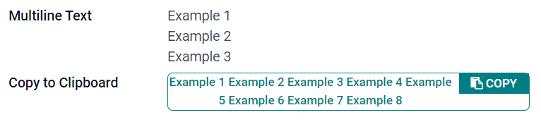
장문 텍스트 (text)
다중 행 텍스트 필드는 긴 텍스트에 사용되며 어떤 유형이든 문자를 입력할 수 있습니다. 필드에 입력할 때 UI에 두 개의 텍스트 줄이 표시됩니다.
클립보드에 복사: 버튼을 클릭하면 값을 복사할 수 있습니다.
Example
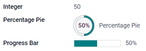
정수 (integer)
정수 필드에는 정수(양수, 음수 또는 0, 소수점 이하 제외)를 입력합니다.
백분율 원그래프: 백분율 원 안에 값을 표시하며, 일반적으로 계산된 값이 나타납니다. 값은 UI에서 편집할 수 없으나 기본값은 설정할 수 있습니다.
진행률 막대: 백분율 막대 옆에 값으로 표시되며, 일반적으로 계산값이 나타납니다. 이 필드는 수동으로 편집할 수 없으나 기본값은 설정할 수 있습니다.
핸들: 드래그 핸들 아이콘이 표시되어 목록 보기 에서 레코드를 수동으로 정렬할 수 있습니다.
Example
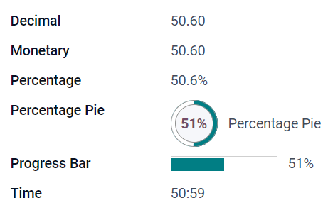
소수 (float)
소수점 이하 필드에는 소수 자리 숫자(양수, 음수 또는 0, 소수점 이하 숫자)를 입력합니다.
참고
십진수는 UI에서 소수점 이하 두 자리로 표시되지만 데이터베이스에는 더 높은 정밀도로 저장됩니다.
통화: :ref:`통화 필드 <studio/fields/simple-fields-monetary>`를 사용하는 것과 유사합니다. 더 많은 기능을 제공하므로 후자를 사용하는 것이 좋습니다.
백분율: 값 뒤에 백분율 문자 `%`를 표시합니다.
백분율 원그래프: 백분율 원 안에 값이 표시되며, 일반적으로 계산된 값이 나타납니다. 필드는 수동으로 편집할 수 없으나 기본값은 설정할 수 있습니다.
진행률 막대: 백분율 막대 옆에 값으로 표시되며, 일반적으로 계산값이 나타납니다. 이 필드는 수동으로 편집할 수 없으나 기본값은 설정할 수 있습니다.
시간: 값은 반드시 hh:mm 형식이어야 하며 최대 59분까지 가능합니다.
Example
통화 (monetary)
통화 필드는 모든 통화 값에 사용할 수 있습니다.
참고
처음으로 화폐 필드를 추가할 때 모델에 기존에 사용하는 필드가 없으면 통화 필드를 추가하라는 메시지가 표시됩니다. Odoo에서는 통화 필드를 추가하도록 제안합니다. 추가하면 화폐 필드를 다시 추가합니다.
Example

Html (html)
Html 필드는 Odoo HTML 편집기를 사용하여 편집할 수 있는 텍스트를 추가하는 데 사용됩니다.
다중 행 텍스트: Odoo HTML 편집기를 비활성화하면 원시 HTML을 편집할 수 있습니다.
Example

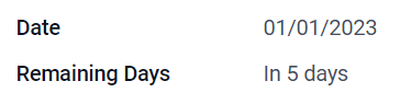
날짜 (date)
날짜 필드는 캘린더에서 날짜를 선택할 때 사용합니다.
Remaining Days: 현재 날짜를 기준으로 선택한 날짜까지 남은 일수가 표시됩니다(예: 5일 후). 이 필드는 :guilabel:`Read only`로 설정해야 합니다.
Example
날짜 및 시간 (datetime)
날짜 및 시간 필드는 달력의 날짜와 시계의 시간을 선택하는 데 사용합니다. 시간을 설정하지 않으면 사용자의 현재 시간이 자동으로 적용됩니다.
날짜 범위 (daterange)
날짜 범위 위젯을 활용하여 시작일과 종료일로 지정된 기간을 한 줄에 표시합니다. 날짜 범위는 여러 날짜에 걸쳐 행사가 개최될 경우 필수 시작일과 종료일을 지정할 수 있으며, 현장 서비스 개입이나 프로젝트 작업의 경우 시작일 또는 종료일을 선택적으로 지정할 수 있습니다.
날짜 범위를 추가하려면 두 가지 필드를 입력해야 합니다. 하나는 날짜 및 시간 필드이며 여기에는 날짜 범위 위젯이 설정되어 있습니다. 다른 하나는 시작일 또는 종료일을 선택하는 필드입니다. 이 기본 필드에는 기존의 날짜 또는 날짜 및 시간 필드, 혹은 이 용도로 특별히 필드를 생성하여 활용할 수 있습니다.
날짜 범위 추가 방법:
날짜 범위의 기본 시작/종료 날짜 필드로 사용할 수 있는 기존 Date 또는 Date & Time 필드를 식별하거나 새 필드를 추가합니다. 날짜 범위가:
필수 시작 날짜와 종료 날짜를 가지는 경우, 이 필드는 시작 날짜 또는 종료 날짜가 될 수 있으며 결과는 동일합니다.
선택적 시작 날짜 또는 종료 날짜를 허용하는 경우, 이 필드는 각각 시작 날짜 또는 종료 날짜입니다.
Date & Time 필드를 추가하고 Widget 필드를 :guilabel:`Date Range`로 설정합니다.
알맞은 :guilabel:`라벨`을 입력합니다.
관련성에 따라 Start date field 또는 End date field 드롭다운에서 기본 시작/종료 날짜 필드를 선택합니다.
날짜 범위에 필수 시작 날짜와 종료 날짜가 있어야 하는 경우 :guilabel:`Always range`를 활성화합니다.
필요에 따라 다른 일반 속성 또는 특정 :ref:`날짜 및 시간 필드 속성 <studio/fields/properties-date-datetime>`을 업데이트한 다음 화면 오른쪽 상단의 :guilabel:`Close`를 클릭합니다.
Example

잔여 일수 (remaining_days)
Remaining Days 위젯은 현재 날짜와 시간을 기준으로 선택한 날짜까지 남은 일수를 표시합니다(예: 5일 후). 이 필드는 :guilabel:`Read only`로 설정해야 합니다.
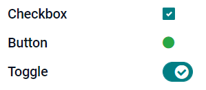
확인란 (boolean)
Checkbox 필드는 값이 참 또는 거짓만 되어야 하는 경우에 사용되며, 체크박스를 선택하거나 선택 해제하여 표시됩니다.
버튼: 옵션 버튼이 표시됩니다. 위젯은 편집 모드로 전환하지 않아도 작동됩니다.
토글: 토글 버튼이 표시됩니다. 위젯은 편집 모드로 전환하지 않아도 동작합니다.
Example
선택 (selection)
Selection 필드는 사용자가 미리 정의된 값 그룹에서 단일 값을 선택해야 하는 경우에 사용됩니다.
배지: 태그와 비슷한 원 모양 안에 값을 표시합니다. 이 값은 UI에서 편집할 수 없으나 기본값은 설정할 수 있습니다.
배지: 선택할 수 있는 모든 값이 직사각형 모양 안에 가로 정렬되어 동시에 표시됩니다.
우선순위: 별표 기호를 값 대신 사용하며 예를 들어 중요성이나 만족도 수준을 나타내는 데 사용할 수 있습니다. 우선순위 필드 를 선택하는 것과 동일한 효과를 있으나, 후자의 경우 4개의 우선순위 값이 이미 사전에 지정되어 있습니다.
옵션: 옵션 버튼으로 선택할 수 있는 값을 전부 표시합니다.
팁
기본적으로 라디오 버튼은 세로로 배열됩니다. :guilabel:`Display horizontally`를 활성화하면 표시 방식을 전환할 수 있습니다.
Status Bar: 선택 가능한 모든 값을 화살표 진행 표시줄로 동시에 표시합니다.
팁
기본적으로 상태 표시줄의 값은 선택 가능합니다. UI에서 값이 편집되는 것을 방지하려면 :guilabel:`Clickable`을 비활성화합니다.
Example

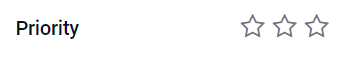
우선순위 (selection)
우선순위 필드는 별 3개로 등급 시스템을 표시하여 중요도나 만족도 수준을 나타낼 때 사용할 수 있습니다. 이 필드의 유형은 선택 필드 로, 우선순위 위젯이 기본값으로 선택되어 우선순위 값 4개가 사전에 설정되어 있습니다. 따라서, 배지(단일), 배지(복수), 라디오 및 선택 위젯은 선택 에서 설명한 것과 동일한 효과를 가지게 됩니다.
팁
값을 추가하거나 삭제하여 사용할 수 있는 별 개수를 변경하려면 값 수정 을 클릭합니다. 첫 번째 값은 별 0개 (즉, 선택하지 않음)가 되므로 예를 들어 값이 4개인 경우에는 별 3개로 평가하는 시스템이 됩니다.
Example
파일 (binary)
File 필드는 모든 유형의 파일을 업로드하거나 양식에 서명하는 데 사용됩니다(Sign 위젯).
Image: 사용자가 이미지 파일을 업로드할 수 있으며, :ref:`폼 보기 <studio/views/general/form>`에 표시됩니다. 이는 :ref:`이미지 필드 <studio/fields/simple-fields-image>`를 사용하는 것과 동일한 효과입니다.
PDF Viewer: 사용자가 PDF 파일을 업로드할 수 있으며, :ref:`폼 보기 <studio/views/general/form>`에서 찾아볼 수 있습니다.
서명: 사용자가 양식에 전자 서명할 수 있습니다. 서명 필드를 선택하는 것과 동일한 효과입니다.
Example

이미지 (binary)
이미지 필드는 이미지를 업로드할 때 사용하고 양식 보기 로 표시됩니다. 이 필드의 유형은 파일 필드 이며, 기본적으로 이미지 위젯이 선택되어 있습니다. 따라서 파일, PDF 뷰어 및 서명 위젯은 파일 에서 설명한 것과 동일하게 적용됩니다.
팁
업로드된 이미지의 표시 크기를 변경하려면크기옵션에서작게,중간또는크게를 선택하세요.
사인 (binary)
서명 필드는 양식에 있는 전자적인 방식의 서명란입니다. 이 필드의 유형은 파일 필드 이며, 기본적으로 서명 위젯이 선택되어 있습니다. 따라서 파일, 이미지 및 PDF 뷰어 위젯은 파일 에서 설명된 것과 동일한 효력을 가집니다.
관계형 필드
참고
기본이 아닌 위젯은 사용 가능한 경우 글머리 기호 또는 하위 제목으로 표시됩니다.
다대일 (many2one)
다대일 필드는 편집 중인 레코드에 다른 레코드 (다른 모델의 레코드)를 연결하는 데 사용됩니다. 연결되면 편집 중인 레코드에 다른 모델의 레코드 이름이 표시됩니다.
Example
판매주문서 모델에서 고객 필드는 연락처 모델과 연결되어 있는 다대일 필드입니다. 이를 통해 여러 개의 판매주문서를 하나 의 연락처(고객)에 연결할 수 있습니다.

팁
연결된 모델에서 새 레코드를 만들지 못하게 하려면 생성 기능 비활성화 를 선택합니다.
팝업창에서 레코드를 열지 못하게 하려면 열기 기능 비활성화 에 표시합니다.
알맞은 레코드만 선택할 수 있게 하려면 도메인 을 클릭하여 필터를 생성합니다.
배지: 태그와 유사한 둥근 모양 안에 값을 표시합니다. UI에서 값을 편집할 수 없습니다.
옵션: 옵션 버튼으로 선택할 수 있는 값을 전부 표시합니다.
일대다 (one2many)
One2Many필드는 현재 모델의 레코드와 다른 모델의 여러 레코드 간의 기존 관계를 표시하는 데 사용됩니다.
Example
연락처 모델에One2Many필드를 추가하여 한 고객의 여러 판매 주문을 볼 수 있습니다.

참고
One2Many필드를 사용하려면 두 모델이Many2One 필드를 사용하여 이미 연결되어 있어야 합니다. One2Many 관계는 독립적으로 존재하지 않으며 기존 Many2One 관계의 역방향 검색이 수행됩니다.
줄 (one2many)
라인필드는 행과 열이 있는 테이블을 생성하는 데 사용됩니다 (예: 판매 주문의 제품 라인).
팁
열을 수정하려면 줄 필드를 클릭한 다음 목록 보기 편집 을 클릭합니다. 사용자가 줄 추가 를 클릭할 때 나타나는 양식을 편집하려면 대신 양식 보기 편집 을 클릭합니다.
Example

다대다 (many2many)
Many2Many필드는 다른 모델의 여러 레코드를 현재 모델의 여러 레코드에 연결하는 데 사용됩니다. Many2Many 필드는Many2One 필드와 마찬가지로생성 비활성화,열기 비활성화,도메인을 사용할 수 있습니다.
Example
작업 모델에서 배정 대상 필드는 연락처 모델과 연결되어 있는 다대다 필드입니다. 이를 통해 한 명의 사용자를 여러 개의 작업에 배정하고 여러 명의 사용자를 하나의 작업에 배정할 수 있습니다.

태그 (다대다)
태그 필드는 다른 모델에 있는 여러 값을 나타내기 위해 사용하며, 둥근 모양으로 표시하여 태그 라고 지칭합니다. 이 필드 유형은 기본값으로 태그 위젯이 선택되어 있는 다대다 필드 입니다. 따라서 체크박스 및 다대다 위젯은 다대다 항목에서 설명한 것과 동일하게 작동합니다.
팁
태그 배경색을 다르게 표시하려면 색상 사용 을 선택합니다.
Example

보기에 필드 추가
스튜디오를 사용하면 다음을 추가할 수 있습니다:
모델의 양식 또는 목록 보기
해당 :doc:`모델 <models_modules_apps>`에 이미 존재하는 필드, 즉 :ref:`기존 필드 <studio/fields/add-existing>`를 해당 모델의 모든 보기에 추가
팁
새 필드를 양식 또는 목록 보기에 추가하면 모델에 저장되고 동일한 모델의 다른 보기에서 기존 필드로 사용할 수 있습니다.
새 필드 추가
팁
새 필드를 추가하기 전에 :ref:`개발자 모드 <developer-mode>`를 활성화하여 구성 중에 필드의 기술적 이름을 확인하고 편집할 수 있도록 하십시오.
새 필드를 추가하려면 다음 단계를 따르십시오.
해당 양식 또는 목록 보기로 이동한 다음 오른쪽 상단의 (스튜디오 토글) 아이콘을 클릭하십시오. 또는 어떤 앱을 열어놓은 상태에서 (스튜디오 토글) 아이콘을 클릭한 다음 해당 양식 또는 목록 보기로 이동하십시오.
추가 탭에서 새 필드 섹션의 해당 :ref:`필드 유형 <studio/fields/field-types>`을 드래그하여 원하는 위치에 드롭하십시오. 새 필드가 :ref:`관계 필드 <studio/fields/relational-fields>`인 경우 팝업에서 해당 상호 필드, 모델 또는 관련 필드를 선택하십시오.
속성 탭에서 필드의 :ref:`속성 <studio/fields/properties>`을 구성하십시오:
UI에서 필드 이름으로 표시될 :guilabel:`레이블`을 입력하십시오. 이는 필드의 기본 기술적 이름을 생성하는 데도 사용됩니다.
레이블 필드 밖의 아무 곳이나 클릭하면 :guilabel:`기술적 이름`이 기본 기술적 이름으로 업데이트되는 것을 확인할 수 있습니다.
참고
새 필드의 기술적 이름`은 구성 프로세스 동안 스튜디오에서 편집할 수 있습니다. 다른 시점에는 필드의 기술적 이름을 :ref:`데이터베이스의 기술 설정을 통해서만 수정할 수 있습니다 <studio/fields/properties-technical-name-change>.
스튜디오를 사용하여 추가된 새 필드의 기술적 이름은 기본적으로
x_studio_접두사가 붙습니다.
선택적으로 드롭다운을 통해 다른 :guilabel:`위젯`을 선택하십시오. :ref:`필드 유형 <studio/fields/field-types>`의 기본 위젯이 기본적으로 선택됩니다.
선택적으로 기타 :ref:`필드 속성 <studio/fields/properties>`을 구성하십시오.
오른쪽 상단의 :guilabel:`닫기`를 클릭하여 스튜디오를 닫습니다.
기존 필드 추가
모델에 존재하지만 현재 보기에 표시되지 않는 필드를 추가하려면 다음 단계를 따르세요:
관련 보기로 이동한 다음 오른쪽 상단의 (스튜디오 전환) 아이콘을 클릭하세요. 또는 앱이 열려 있는 상태에서 (스튜디오 전환) 아이콘을 클릭한 다음 관련 보기로 이동하세요.
왼쪽 패널의 추가 탭에서 기존 필드 :icon:`fa-caret-right`를 클릭하면 현재 보기에 표시되지 않는 모델의 모든 필드 목록이 나타납니다.
관련 필드를 원하는 위치로 드래그하여 놓으세요.
속성 탭에서 현재 보기의 필드에 대한 관련 :ref:`속성 <studio/fields/properties>`을 구성하세요.
참고
필요한 경우 레이블, 위젯, 특정 사용자 그룹에 대한 필드 가시성, 필드가 숨김, 필수 또는 읽기 전용 상태인지 여부 등 다양한 속성을 보기마다 독립적으로 구성할 수 있습니다.
오른쪽 상단의 :guilabel:`닫기`를 클릭하여 스튜디오를 닫습니다.
필드 속성
대부분의 필드 유형과 위젯 조합에 대해 일련의 일반 속성 <studio/fields/properties-general>`을 구성할 수 있습니다. 선택한 특정 필드 유형과 위젯에 따라 추가 속성을 사용할 수 있습니다. 예를 들어 :guilabel:`날짜 및 시간 또는 날짜 범위 위젯을 사용하는 날짜 및 시간 필드에는 구성할 수 있는 다양한 :ref:`특정 속성 <studio/fields/properties-date-datetime>`이 있습니다.
일반 속성
클래스: `Bootstrap <https://getbootstrap.com/docs/5.3/examples/cheatsheet/>`_이나 Odoo에 정의된 다른 사용자 정의 클래스를 사용하여 UI에서 필드가 스타일링되고 표시되는 방식을 사용자 정의하세요.
보이지 않음: 사용자가 UI에서 필드를 볼 필요가 없을 때 이 속성을 활성화하세요. 특정 상황에 따라 필수 필드만 표시하여 UI를 깔끔하게 정리하는 데 도움이 됩니다.
필수: 계속하기 전에 사용자가 항상 필드를 작성해야 하는 경우 이 속성을 활성화하세요.
읽기 전용: 사용자가 필드를 수정할 수 없도록 하려면 이 속성을 활성화하세요.
팁
레이블: UI에 표시되는 필드 이름으로, 레이블은 필드의 기술 이름을 생성하는 데 사용됩니다.
도움말 툴팁: 필드의 목적을 설명하려면 설명을 추가하세요. 필드 레이블 옆의 물음표 위에 마우스를 올려놓으면 툴팁 상자 안에 텍스트가 표시됩니다.
기술 이름: 스튜디오에서 필드의 기술 이름을 보려면(새 필드를 구성하는 동안 원하는 경우 편집) :ref:`개발자 모드 <developer-mode>`를 활성화하세요.
팁
이 필드를 업데이트해야 하지만 스튜디오를 통해 더 이상 편집할 수 없는 경우 기술 이름을 :ref:`데이터베이스의 기술 설정을 통해 수정 <studio/fields/properties-technical-name-change>`할 수 있습니다.
위젯: 필드의 기본 모양이나 기능을 변경하려면 사용 가능한 위젯 중 하나를 선택하세요.
플레이스홀더: 필드를 작성하는 방법에 대한 예시를 제공하려면 고정 플레이스홀더 텍스트를 추가하세요. 값이 입력될 때까지 텍스트가 연한 회색으로 표시됩니다.
동적 플레이스홀더: 필드를 작성하는 방법에 대한 예시로 선택한 필드의 값을 제공합니다. 값이 입력될 때까지 텍스트가 연한 회색으로 표시됩니다.
기본값: 레코드가 생성될 때 필드에 기본값을 표시하려면 값을 추가하세요.
그룹에 대한 가시성 허용: 필드를 볼 수 있는 사용자를 제한하려면 하나 이상의 사용자 액세스그룹을 선택하세요.
그룹에 대한 가시성 금지: 특정 사용자가 필드를 보지 못하도록 하려면 하나 이상의 사용자 액세스그룹을 선택하세요.
날짜 및 시간 필드 속성
날짜 및 시간 또는 날짜 범위 위젯을 사용하는 날짜 및 시간 필드의 경우 다음과 같은 특정 속성을 사용할 수 있습니다:
최소 정밀도: 날짜 선택기에서 선택해야 하는 가장 작은 날짜 단위를 결정합니다. 가능한 값은
일,월,년또는 `10년`입니다. 값을 선택하지 않으면 사용자는 날짜 선택기에서 일을 선택해야 합니다.최대 정밀도: 날짜 선택기를 탐색하는 데 사용할 수 있는 가장 큰 날짜 단위를 결정합니다. 가능한 값은
일,월,년또는 `10년`입니다. 값을 선택하지 않으면 사용자는 10년 단위로 날짜 선택기를 탐색할 수 있습니다.미래 날짜에 대한 경고: 미래 날짜를 선택하면 경고 아이콘을 표시하려면 이 속성을 활성화하세요.
Condensed display: Enable this property to show days, months and hours with no leading zeros, e.g.,
4/2/2025 8:05:00instead of04/02/2025 08:05:00.시간 표시: 이 속성은 날짜 및 시간 필드에 기본적으로 활성화되어 있습니다. 읽기 전용 필드에서 날짜만 표시하려면 이 속성을 비활성화하세요. 예를 들어 목록 보기를 덜 복잡하게 유지할 수 있습니다.
Show seconds: This property is enabled by default for Date & Time fields. Disable the property to show only hours and minutes.
시간 간격: 시간 선택기에 표시되는 분 간격을 지정하려면 값을 입력하세요. 예를 들어 15분 간격을 허용하려면 15를 입력하세요. 기본값은 5분으로 설정되어 있습니다.
:guilabel:` 가장 빠른 수락일`: 날짜 선택기에서 선택할 수 있는 가장 빠른 날짜를 ISO 형식(예:
YYYY-MM-DD)으로 입력합니다. 현재 날짜를 항상 가장 빠른 수락일로 설정하려면오늘을 입력합니다. 날짜 선택기에서 가장 빠른 수락일 이전의 날짜는 회색으로 표시되어 선택에서 제외됩니다.:guilabel:` 가장 나중 수락일`: 날짜 선택기에서 선택할 수 있는 가장 나중이 되는 날짜를 ISO 형식(예:
YYYY-MM-DD)으로 입력합니다. 현재 날짜를 항상 가장 나중이 되는 수락일로 설정하려면오늘을 입력합니다. 날짜 선택기에서 가장 나중 수락일 이전의 날짜는 회색으로 표시되어 선택에서 제외됩니다.
필드 속성 수정
필드의 속성을 수정하려면 다음 단계를 따르세요:
관련 보기로 이동한 다음 오른쪽 상단의 (스튜디오 전환) 아이콘을 클릭하세요. 또는 앱이 열려 있는 상태에서 (스튜디오 전환) 아이콘을 클릭한 다음 관련 보기로 이동하세요.
관련 필드를 클릭하세요.
속성 탭에서 :ref:`필드 속성 <studio/fields/properties>`을 원하는 대로 변경하세요.
팁
레이블, 위젯, 특정 사용자 그룹에 대한 필드 표시 여부, 필드가 숨김, 필수, :guilabel:`읽기 전용`인지 여부 등 다양한 속성을 뷰마다 독립적으로 구성할 수 있습니다.
오른쪽 상단의 :guilabel:`닫기`를 클릭하여 스튜디오를 닫습니다.
참고
필드의 기술 이름`(:ref:`개발자 모드 <developer-mode>`가 활성화된 스튜디오에서 표시됨)은 스튜디오에서 수정할 수 없으며, :ref:`데이터베이스의 기술 설정을 통해 <studio/fields/properties-technical-name-change> 수정할 수 있습니다.
필드의 기술 이름 수정
필드의 기술 이름을 수정하려면 :ref:`개발자 모드 <developer-mode>`를 활성화한 후 다음 단계를 따르세요:
스튜디오에서 필드를 연 상태에서 필드의 기술 이름을 복사하세요.
스튜디오에서 모든 뷰에서 :ref:`필드를 제거 <studio/fields/remove>`한 다음 :guilabel:`닫기`를 클릭하여 스튜디오를 닫으세요.
:menuselection:`설정 앱 –> 기술 –> 필드`로 이동하세요.
복사한 기술 이름을 검색창에 붙여넣은 다음 관련 필드를 여세요.
필요에 따라 :guilabel:`필드 이름`을 수정하세요.
필드의 기술 이름이 업데이트되면 기존 필드 목록에서 관련 뷰에 :ref:`필드를 (다시) 추가 <studio/fields/add-existing>`할 수 있습니다.
중요
필드의 기술 이름을 업데이트할 때 사용자 정의 필드에 필요한 최소한 x_ 접두사를 유지해야 합니다. 스튜디오를 사용하여 생성된 필드의 경우 x_studio_ 접두사를 유지하여 해당 필드를 더 쉽게 식별할 수 있도록 하세요.
뷰에서 필드 제거
뷰에서 필드를 제거하려면 다음 단계를 따르세요: