字段和小组件
字段构成了数据库的 模型。如果将模型视为一张表格或电子表格,那么字段就是列,而记录则是每一行。字段还定义了其中存储的数据类型。字段数据在 UI(用户界面) 上的呈现和格式化方式由其控件决定。
使用 Studio 可以实现以下操作:
向数据库添加新字段。从技术角度来看,Odoo 中有 15 种字段类型。但是,您可以在工作室中从 20 种字段类型中进行选择,因为某些字段类型在使用不同的默认小部件时可用多次;
添加现有字段,,即模型中已存在的字段,到该模型的任何视图中;
修改字段属性;或
工作室字段与属性字段
使用 Studio 创建的字段会作为列保存在 Odoo 数据库中。另一方面,属性字段 则作为伪字段存在;它会被关联到同一上级记录的所有记录共用(例如:任务所属的项目、产品所属的产品类别),但不会以字段列的形式存入数据库。
Example
使用 Studio 在任务的表单视图中添加一个名为 截止日期 的字段,该字段将在数据库中的所有任务中显示。向任务添加一个名为 特殊说明 的属性字段,则只会让该字段*在同一项目下的所有任务*中显示,其他项目的任务不受影响。
字段类型
字段大致可分为两类:
简单字段
注解
如果存在非默认控件,它们将以项目符号或子标题的形式呈现。
文件(char)
:guilable:`文本`字段用于包含任何字符的短文本。填写该字段时显示一行文本。
:guilable:`标记`:显示圈内值,类似于标记。该值不能在用户界面上编辑,但可以设置默认值。
复制到剪贴板:用户可以点击按钮复制值。
电子邮件:该值变为可点击的*电子邮件*链接。
图片:使用URL显示图片。该值不能手动编辑,但可以设置默认值。
注解
这与直接选择 图片字段 的工作原理不同,因为当使用带有 图片 控件的 文本 字段时,图片不会存储在 Odoo 中。例如,如果您想节省磁盘空间,这会很有用。
电话:该值变为可点击的*电话*链接。
小技巧
勾选:guilabel:
启用短信,添加直接从字段旁的Odoo发送短信的选项。URL:该值变为可点击的URL。
Example

多行文本(text)
:guilable:`多行文本`字段用于包含任何类型字符的较长文本。填写该字段时,用户界面上显示两行文本。
复制到剪贴板:用户可以点击按钮复制值。
Example

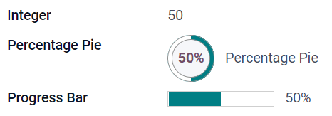
整数(integer)
:guilable:`整数`字段用于所有整数(:dfn:`positive, negative, or zero, without a decimal`)。
:guilable:`百分比饼图`:显示百分比饼图值,通常为计算得出的值。该值无法在用户界面上编辑,但可以设置默认值。
进度条:显示百分比条旁的值,通常为计算得出的值。该字段无法手动编辑,但可以设置默认值。
处理:显示拖动手柄图标,用于在:ref:`List view <studio/views/multiple-records/list>`中手动排序记录。
Example
小数(float)
小数`字段用于所有小数(:dfn:`positive, negative, or zero, with a decimal)。
注解
小数在用户界面上显示为两位小数,保存在数据库中时精度更高。
货币金额:与使用 货币金额 字段类似。建议使用后者,因为它提供较多功能。
百分比:在数值后显示百分比符号。
:guilable:`百分比饼图`:显示百分比饼图值,通常为计算得出的值。该字段无法手动编辑,但可以设置默认值。
进度条:显示百分比条旁的值,通常为计算得出的值。该字段无法手动编辑,但可以设置默认值。
时间:数值须为*小时:分钟*格式,最大分钟值为59。
Example

货币(monetary)
:guilabel:`货币`字段用于所有货币值。
注解
首次添加:guilable:`货币`字段时,如果模型上不存在:guilabel:`币种`字段,则会提示添加:gullable:`币种`字段。Odoo为您添加:guilable:`币种`字段。添加完成后,应再次添加:guilable:`货币`字段。
Example

超文本标记语言(html)
:guilabel:`超文本标记语言`字段用于添加可使用Odoo HTML编辑器编辑的文本。
多行文本:禁用Odoo HTML编辑器,以便允许编辑原超文本标记语言。
Example

日期(date)
:guilabel:`日期`字段用于从日历选择日期。
剩余天数:从目前日期起计,距离选取的日期还剩下多少天,例如: 剩余 5 天 。此栏位应设为 仅读。
Example

日期和时间(datetime)
:guilabel:`日期和时间`字段用于从日历选择日期,从钟表选择时间。如果未设置时间,则自动采用用户的当前时间。
日期范围(daterange)
日期范围 小工具适用于显示包括开始日期及结束日期的时间段,以一行显示全部资料。日期范围可将开始及结束日期设为必填(例如:表示多天活动的日期),也可将开始或结束日期设为可选填(例如:用于上门介入工作或项目任务)。
加入日期范围时,需要有两个字段:一个是附有 日期范围 小工具的 日期时间 字段,另一个是设为开始日期 或 结束日期的字段。底层的参考字段可以是现有的 日期 或 :guilabel:`日期时间`字段,也可以是专门为此用途而建立的字段。
要加入日期范围:
确定一个现有的 日期 或 日期时间 字段,用作底层的开始或结束日期参考字段,或新增一个字段。如果日期范围是:
必须填写开始及结束日期,此字段可以是开始日期或结束日期,选择两者的结果相同。
允许选填开始日期或结束日期,此字段便会分别是开始日期或结束日期。
小技巧
为避免重复显示相同资讯,你可将底层的开始/结束日期字段,设定为 不显示,或点击 从视图中移除,将该日期从视图画面中移除,使之无法看见。
加入一个 日期时间 字段,并将 小工具 栏位设定为 日期范围。
输入适当的 标签。
根据需要,在 开始日期字段 或 结束日期字段 下拉式选单中,选择相应的底层开始/结束日期字段。
若日期范围必须包括开始日期及结束日期,请启用 总是使用范围。
更新任何其他需要更新的 一般属性 或 日期时间栏位特定属性,然后按一下画面右上角的 关闭。
Example

剩余天数(remaining_days)
剩余天数 小工具显示从目前的日期及时间起计,距离选取的日期还剩下多少天,例如:剩余 5 天 。此栏位应设为 仅读。
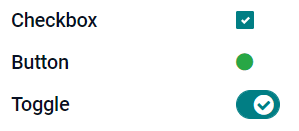
复选框(boolean)
:guilabel:`复选框`字段用于值只能为是或否时,选中或取消选中复选框,以进行指示。
按钮:显示为单选按钮。该小组件可在不切换至编辑模式的情况下工作。
切换:显示为切换按钮。该小组件可在不切换至编辑模式的情况下工作。
Example
选择(selection)
:guilabel:`选择`字段用于用户从一组预定义值中选择一个值。
:guilable:`标记`:显示圈内值,类似于标记。该值不能在用户界面上编辑,但可以设置默认值。
多个标记:在水平排列的矩形内同时显示所有可选值。
优先级别:显示为星星图示,而非数值,可用作表示重要程度或满意度等。与选用 优先等级 字段的效果相同,但后者已预先定义了 4 种优先级别数值。
单选: 同时显示所有可选值的单选按钮。
小技巧
默认情况下,单选按钮是以垂直方式排列。您可启用 水平显示 选项,以切换显示方式。
状态栏:以箭头进度条同时显示所有可选值。
小技巧
默认情况下,状态栏上的值是可选取。禁用 可点击,可防止在用户界面上编辑值。
Example

优先级(selection)
优先级别 字段以三星评分格式显示,可用作表示重要程度或满意度。此字段类型是 选择字段,默认会选取 优先级别 小工具,并有 4 个预先定义的优先级别值。因此, 徽章 、 单选按钮 及 选单 小工具的效果,与 选单 章节所述相同。
小技巧
要通过添加或删除值来更改可用星的数量,点击:guilable:编辑值。请注意,第一个值等于0星(即未作选择),因此,三星评级系统具有4个值。
Example

文件(binary)
:guilabel:`文件`字段用于上传任何类型的文件,或 签署表单(:guilabel:`签署`小组件)。
图片:用户可以上传图像文件,然后将其显示在 表单视图 中。这与使用 :ref:`图片 <studio/fields/simple-fields-image>`字段的效果相同。
PDF查看器:用户可以上传PDF文件,上传后,可以在:ref:`Form view <studio/views/general/form>`中查看该文件。
电子签名:用户可通过电子形式签署表单。与选择 电子签名 字段的效果相同。
Example

图片(binary)
图片`字段用于上传图片并在 :ref:`表单视图 <studio/views/general/form>`中显示。该字段类型是 :ref:`文件 <studio/fields/simple-fields-file>`字段,默认情况下选择了 :guilabel:`图片 小工具。因此,文件、PDF 阅读工具 和 电子签名 小工具的效果,与 文件 中描述的效果相同。
小技巧
要更改上传图片的显示大小,在:guilable:尺寸`选项下选择:guilabel:`小、:guilale:`中`或:guilalb:`大`。
签署(binary)
电子签名 字段用于对表单进行电子签名。该字段类型是 文件字段,默认选择 电子签名`小工具。因此,:guilabel:`文件、图片 和 PDF 阅读工具 小工具有与 文件 中描述的相同效果。
关系字段
注解
如果存在非默认控件,它们将以项目符号或子标题的形式呈现。
Many2One(many2one)
:guilabel:`Many2One`字段用于将另一记录(来自另一模型)链接至正在编辑的记录。来自另一模型的记录名称将显示在正在编辑的记录中。

小技巧
要防止用户在链接的模型中创建新记录,勾选:guilable:
禁用创建。要防止用户在弹窗中打开记录,勾选:guilable:
禁用打开。要帮助用户只选择正确的记录,点击:guilable:
域,创建筛选器。
标记:显示圈内值,类似于标记。该值不能在用户界面上编辑。
单选: 同时显示所有可选值的单选按钮。
One2Many(one2many)
:guilabel:`One2Many`字段用于显示当前模型中的记录和另一模型中的多个记录间的现有关系。

注解
要使用 一对多 字段,两个模型必须已经用 多对一字段 连接。一对多关系不会独立存在,系统会进行反向搜寻,寻找目前已有的多对一关系。
多行(one2many)
:guilabel:`多行`字段用于创建有多行和多列的表格(例如,销售订单中的多个产品行)。
小技巧
要修改列,点击:guilable:多行`字段,然后点击:gullable:`编辑列表视图。要编辑用户点击:guilable:Add a line`时弹出的表单,改为点击:gullable:`编辑表单视图。
Example

Many2Many(many2many)
多对多 (Many2Many)字段用于将另一模型中的多项记录,连结至目前模型中的多项记录。与 多对一 字段一样,多对多字段也可使用 禁止建立 、 禁止开启 及 范围 功能。
Example
在*任务*模型中,:guilable:`受托人`字段为指向*联系人*模型的:guilabel:`Many2Many`字段,允许向单个用户分配**多个**任务,以及向**多个**用户分配给同一任务。

多个复选框:用户可以通过多个复选框选择多个值。
标签:用户可选取多个以圆角形状显示的值,这些值也称为“标签”。这与选用 标签 字段的效果相同。
标签(many2many)
标签`字段用于显示来自另一个模型的多个值,这些值以圆形显示,也称为**标签**。此字段类型是 :ref:`多对多字段 <studio/fields/relational-fields-many2many>,默认选择 标签 小工具。因此,复选框`和 :guilabel:`多对多 小工具有与 多对多 中描述的相同效果。
小技巧
要显示具有不同背景颜色的标记,勾选:guilable:使用颜色。
Example

在视图中添加字段
使用 Studio 可以添加以下内容:
小技巧
在表单或列表视图中添加新字段,将其保存到模型中,并使其作为现有字段在同一模型的其他视图中可用。
添加新字段
小技巧
在添加新字段之前,请先启用 开发者模式,以便在配置过程中查看并编辑该字段的技术名称。
要添加新字段,请按照以下步骤操作:
导航至相应的表单或列表视图,然后点击右上角的 )图标。或者,在打开任何应用时,点击 )图标,然后导航至相应的表单或列表视图。
在 添加 选项卡中,从 新建字段 区域拖动相应的 字段类型,并将其拖放到所需位置。如果新字段是 关系字段,请在弹出窗口中选择相应的互相关字段、模型或关联字段。
在 的 属性 选项卡中,配置字段的 属性:
输入 标签,该标签将作为字段名称显示在用户界面上;此标签还将用于生成该字段的默认技术名称。
点击 标签 字段外的任意位置,即可看到 技术名称 字段更新为默认的技术名称。
注解
新字段的 技术名称 可在 Studio 的配置过程中进行编辑。在其他任何时候,字段的技术名称只能 通过数据库的技术设置 进行修改。
使用 Studio 添加的新字段,其技术名称默认以
x_studio_为前缀。
您也可以通过下拉菜单选择其他 工具;系统默认会选中 字段类型 对应的默认工具。
此外,还可以配置其他任何 字段属性。
点击右上角的 关闭 按钮以关闭 Studio。
添加已有字段
若要添加一个在模型中存在但在当前视图中未显示的字段,请按照以下步骤操作:
导航至相应的视图,然后点击右上角的 )图标。或者,在打开任何应用时,点击 )图标,然后导航至相应的视图。
在 添加 选项卡的左侧面板中,点击 现有字段 ,即可显示当前视图中尚未包含的所有模型字段列表。
将相关字段拖动并放到所需位置。
在 的 属性 选项卡中,为当前视图中的字段配置相应的 属性。
注解
如果需要,可以为不同视图独立配置各种属性,例如:guilabel:
标签、小部件、特定用户组的字段可见性,以及字段是否为:guilabel:不可见、必填`或:guilabel:`只读。点击右上角的 关闭 按钮以关闭 Studio。
字段属性
对于大多数 字段类型和控件 的组合,均可配置一系列 通用属性。根据所选的具体字段类型和控件,还可使用其他属性。例如,使用 日期与时间 或 日期范围 控件的 日期与时间 字段,可配置多种 特定属性。
一般属性
类别:使用 Bootstrap 或 Odoo 中定义的其他自定义类,来定制字段在用户界面上的样式和显示方式。
隐藏:若用户无需在操作介面看到该字段,便可启用此属性。这有助简化用户操作介面,只会显示个别情况需要显示的字段。
必填:若用户必须先完成填写该字段才可继续操作,可启用此属性。
仅读:如果不应让用户修改该字段,可以启用此属性。
小技巧
标签:这是用户界面上的字段名称;标签用于生成字段的技术名称。
帮助工具提示:要解释字段的用途,请添加说明。将鼠标悬停在字段标签旁的问号上时,文本将显示在工具提示框内。
技术名称:要在工作室中查看字段的技术名称(并在配置新字段期间根据需要进行编辑),请激活:ref:
开发者模式 <developer-mode>。小技巧
如果此字段需要更新但无法再通过工作室编辑,则可以:ref:`通过数据库的技术设置修改 <studio/fields/properties-technical-name-change>`技术名称。
小组件:要更改某字段的默认外观或功能,选择可用小组件中的一个。
占位符:要提供如何填写字段的示例,请添加固定的占位符文本。该文本以浅灰色显示,直到输入值为止。
动态占位符:用于提供所选字段的值,作为填写该字段的示例。在输入值之前,该文本显示为浅灰色。
默认值:若要在建立记录时,在字段中显示默认值,可加入此值。
允许向群组显示:要限制哪些用户可以查看字段,请选择一个或多个用户访问 群组。
禁止向群组显示:若想防止部份用户看见此字段,可选取一个或多个 “用户访问存取 群组”。
日期时间字段属性
对于使用:guilabel:`日期和时间`或:guilabel:`日期范围`小部件的:guilabel:`日期和时间`字段,有一些特定的属性可用:
最小精度:确定在日期选择器中必须选择的最小日期单位。可能的值为
Day、Month、Year或Decade。如果未选择值,则用户必须在日期选择器中选择日期。最大精度:确定可用于导航日期选择器的最大日期单位。可能的值为
Day、Month、Year或Decade。如果未选择值,则用户可以按十年导航日期选择器。警告未来日期:启用此属性后,若选取了未来日期,系统会显示警告图示。
简洁显示:启用此属性以显示不带前导零的日期、月份和小时,例如,
4/2/2025 8:05:00`而不是`04/02/2025 08:05:00。显示时间:日期时间 字段默认会启用此属性。对于仅读字段,停用此属性会只显示日期。举例,如此设定可使列表视图画面较简洁。
显示秒数:对于日期和时间字段,此属性默认启用。禁用此属性以仅显示小时和分钟。
时间间隔:此值决定时间选择器所显示的分钟间隔。例如:输入“15”可设定每隔 15 分钟有可选时间。预设值为 5 分钟。
最早接受日期:以 ISO 格式输入日期选择器中可选择的最早日期,即
年-月-日。如果当前日期始终是最早接受的日期,则输入今天。在日期选择器上,最早接受日期之前的日期为灰色。最新接受日期:输入日期选择器中可选择的 ISO 格式的最新日期,即
年-月-日。如果当前日期总是最新日期,请输入今天。在日期选择器上,晚于最新接受日期的日期将显示为灰色。
修改字段的属性
要修改字段的属性,请按照以下步骤操作:
导航至相应的视图,然后点击右上角的 )图标。或者,在打开任何应用时,点击 )图标,然后导航至相应的视图。
点击相关字段。
在 的 属性 选项卡中,对 字段属性 进行所需修改。
小技巧
可以针对不同的视图独立配置各种属性,例如 标签、小部件、特定用户组对字段的可见性,以及字段是否为 不可见、必填 或 只读。
点击右上角的 关闭 按钮以关闭 Studio。
注解
字段的 技术名称`(在启用 :ref:`开发者模式 <developer-mode> 时可在 Studio 中查看)无法在 Studio 中修改;此操作需 通过数据库的技术设置 进行。
修改字段的技术名称
要修改字段的技术名称,请启用 开发者模式,然后按照以下步骤操作:
在 Studio 中打开该字段后,复制该字段的技术名称。
从 Studio 中的 *所有* 视图中删除字段,然后点击 关闭 以关闭 Studio。
导航至 。
将复制的技术名称粘贴到搜索栏中,然后打开相关字段。
根据需要修改:guilabel:
字段名称。
一旦字段的技术名称已更新,该字段就可以从现有字段列表中:ref:添加(回)到相关视图 <studio/fields/add-existing>。
重要
更新字段的技术名称时,请确保至少保留 x_ 前缀,这是任何自定义字段所必需的;对于使用工作室创建的字段,保留 x_studio_ 前缀以便更容易识别此类字段。
从视图中移除字段
要从视图中删除字段,请按照以下步骤操作:
导航至相应的视图,然后点击右上角的 )图标。或者,在打开任何应用时,点击 )图标,然后导航至相应的视图。
点击相关字段。
滚动到 属性 选项卡的底部,然后点击 从视图中移除。
点击 确定 以确认此操作。
小技巧
如果需要,已删除的字段可以轻松:ref:
添加回视图 <studio/fields/add-existing>。如果意图是整理视图,也可以:ref:
修改字段 <studio/fields/modify>`并使其在相关视图上:guilabel:`不可见。