Kampagnenmetriken
Kampagnenmetriken sind detaillierte Statistiken und Analysen innerhalb einer Marketingkampagne, die deren Erfolg und Effektivität messen. Ausgelöste Marketingaktivitäten füllen relevante Aktivitätsblöcke mit Echtzeitmetriken im Kampagnendetailformular.
Aktivitätsanalyse
Im Abschnitt Arbeitsablauf eines Kampagnendetailformulars in der Marketing-Automatisierungsapp, wo sich die verschiedenen Kampagnenaktivitäten befinden, finden Sie eine Sammlung nützlicher Daten zu jedem einzelnen Aktivitätsblock, wie z. B. die Anzahl der Gesendeten Mitteilungen, den Prozentsatz der Nachrichten, die Angeklickt wurden, und mehr.
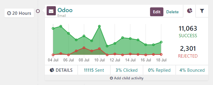
To the left of the activity block, the configured trigger time is displayed as a duration (either Hours, Days, Weeks, or Months) if it corresponds to period after the workflow begins.
Bemerkung
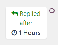
Wenn die Auslösezeit von einer anderen Aktivität oder auslösenden Aktion abhängt (z. B. E-Mail: Beantwortet, usw.), wird die Zeit zusammen mit der notwendigen Aktion angezeigt, damit diese Aktivität aktiviert wird (z. B. Beantwortet nach 2 Stunden).
Im Aktivitätsblock steht ein Symbol für jeden Aktivitätstyp. Ein ✉️ (Briefumschlag)-Symbol bedeutet, dass es sich bei der Aktivität um eine E-Mail handelt. Drei winzige, ineinander greifende Symbole ⚙️ (Zahnrad) bedeuten, dass es sich bei der Aktivität um eine interne Aktion handelt. Und ein kleines, einfaches 📱 (Handy)-Symbol bedeutet, dass es sich bei der Aktivität um eine SMS handelt.
Tipp
Der Name des Aktivitätstyps wird auch in einer kleineren Schriftgröße unter dem Aktivitätstitel angezeigt.
Neben dem Aktivitätssymbol am oberen Rand des Aktivitätsblocks befindet sich der Titel der Aktivität. Rechts vom Aktivitätstitel befinden sich die Schaltflächen Bearbeiten und Löschen.
Klicken Sie auf Bearbeiten, um das Pop-up-Formular Öffnen: Aktivitäten für die betreffende Aktivität, in der Sie diese Aktivität ändern können. Klicken Sie auf die Schaltfläche Löschen, um die betreffende Aktivität vollständig aus dem Arbeitsablauf zu löschen.
Reiter „Aktivitätsgrafik“
In jedem Aktivitätsblock ist der Reiter Grafik (Tortendiagramm-Symbol) standardmäßig geöffnet und zeigt die entsprechenden Metriken als einfaches Liniendiagramm an. Die Erfolgsmetriken werden in grün dargestellt und die abgelehnten Metriken in rot.
Numerische Darstellungen der Aktivitäten Erfolg und Abgelehnt werden rechts neben dem Liniendiagramm angezeigt.
Tipp
Wenn Sie den Mauszeiger über einen beliebigen Punkt im Liniendiagramm des Aktivitätsblocks bewegen, erhalten Sie eine detailliertere Aufschlüsselung der Daten für dieses bestimmte Datum.
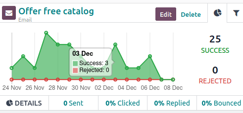
Unterhalb des Diagramms im Aktivitätsblock für E-Mail- oder SMS-Aktivitätstypen bietet eine Reihe von zugänglichen Daten eine Vogelperspektive der Kampagnenaktivität, einschließlich: Gesendet (numerisch), Angeklickt (prozentual), Beantwortet (prozentual), und Unzustellbar (prozentual).
Tipp
Wenn Sie auf eine dieser Statistiken in der Zeile DETAILS unterhalb des Liniendiagramms klicken, wird eine separate Seite angezeigt, die jeden einzelnen Datensatz für diesen bestimmten Datenpunkt enthält.
Reiter „Aktivitätsfilter“
Neben dem Reiter Grafik im Aktivitätsblock gibt es die Möglichkeit, einen Reiter Filter zu öffnen (dargestellt durch ein Filter/Trichter-Symbol).
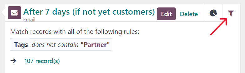
Wenn Sie in einem Aktivitätsblock im Reiter Filter klicken, sehen Sie, welche spezifischen Filter für diese bestimmte Kampagnenaktivität zur Verfügung stehen und wie viele Datensätze in der Datenbank diesen spezifischen Kriterien entsprechen.
Tipp
Durch Klick auf den Link Datensätze unter dem angezeigten Filter erscheint ein separates Pop-up-Fenster mit einer Liste aller Datensätze, die den entsprechenden Kampagnenaktivitätstypen entsprechen
Link-Tracker
Odoo verfolgt alle in Marketingkampagnen verwendeten URLs. Um auf diese URLs zuzugreifen und sie zu analysieren, navigieren Sie zu . Sie gelangen dann auf die Seite Link-Statistiken, auf der Sie alle kampagnenbezogenen URLs analysieren können.
Die Standardansicht auf der Seite Link-Statistiken ist die Ansicht Balkendiagramm, aber in der oberen linken Ecke sind verschiedene Ansichtsoptionen verfügbar. Sie haben die Möglichkeit, die Statistiken als Liniendiagramm oder Tortendiagramm anzuzeigen.
Außerdem gibt es auch die Option, Statistiken als Gestapelt anzuzeigen, und die Daten können auch in Absteigender oder Aufsteigender Reihenfolge geordnet werden.
Ganz links von den Ansichtsoptionen befindet sich das Dropdown-Menü Werte. Wenn Sie darauf klicken, können Sie die Anzahl der Klicks oder die gesamte Anzahl anzeigen lassen. Und rechts vom Dropdown-Menü Werte haben Sie die Möglichkeit, beliebige Daten in eine Tabellenkalkulation einzufügen, indem Sie auf die Schaltfläche In Tabellenkalkulation einfügen klicken.
In der oberen rechten Ecke der Seite Link-Statistik, ganz rechts von der Suchleiste, können Sie außerdem zwischen folgenden Ansichten wählen: der Standardansicht Grafik, der Tabellenansicht Pivot und der Ansicht Liste.
Nachverfolgungen
Odoo verfolgt alle Aktivitäten, die in jeder Marketingkampagne verwendet werden. Die Daten zu diesen Aktivitäten können auf der Seite Nachverfolgungen abgerufen und analysiert werden. Sie finden diese Seite, indem Sie zu navigieren.
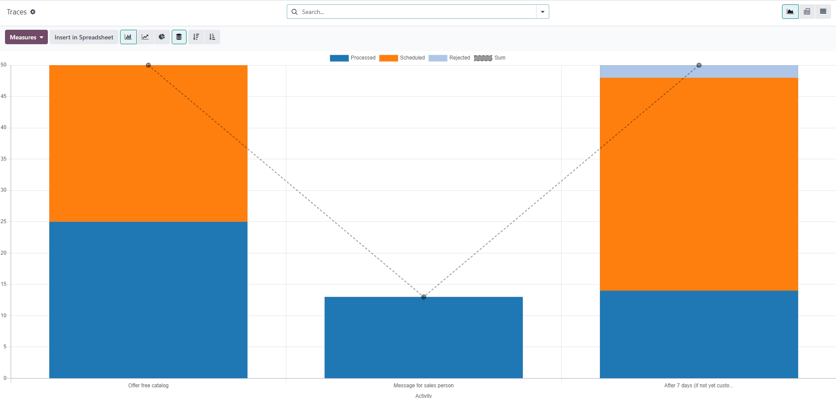
Die Standardansicht auf der Seite Nachverfolgungen ist die Ansicht Balkendiagramm, aber in der oberen linken Ecke sind verschiedene Ansichtsoptionen verfügbar. Sie haben die Möglichkeit, die Statistiken als Liniendiagramm oder Tortendiagramm anzuzeigen.
Am oberen Rand des Diagramms befindet sich ein Farbschlüssel, der den Benutzer darüber informiert, welche Aktivitäten Verarbeitet, Geplant und Abgelehnt wurden. Außerdem gibt es einen Umrissindikator, der den Benutzer über die Summe bestimmter Aktivitäten informiert.
Außerdem gibt es neben den vielseitigen Ansichtsoptionen oben links auf der Seite Nachverfolgungen auch die Option, Statistiken als Gestapelt anzuzeigen, und die Daten können auch in Absteigender oder Aufsteigender Reihenfolge geordnet werden.
Ganz links von den Ansichtsoptionen befindet sich das Dropdown-Menü Werte. Wenn Sie darauf klicken, können Sie die Dokument-ID oder die gesamte Anzahl anzeigen lassen. Und rechts vom Dropdown-Menü Werte haben Sie die Möglichkeit, beliebige Daten in eine Tabellenkalkulation einzufügen, indem Sie auf die Schaltfläche In Tabellenkalkulation einfügen klicken.
In der oberen rechten Ecke der Seite Link-Statistik, ganz rechts von der Suchleiste, können Sie außerdem zwischen folgenden Ansichten wählen: der Standardansicht Grafik, der Tabellenansicht Pivot und der Ansicht Liste.
Teilnehmer
Odoo verfolgt alle Teilnehmer im Zusammenhang mit jeder Marketingkampagne verwendet werden. Die Daten zu diesen Teilnehmern können auf der Seite Teilnehmer abgerufen und analysiert werden. Sie finden diese Seite, indem Sie zu navigieren.
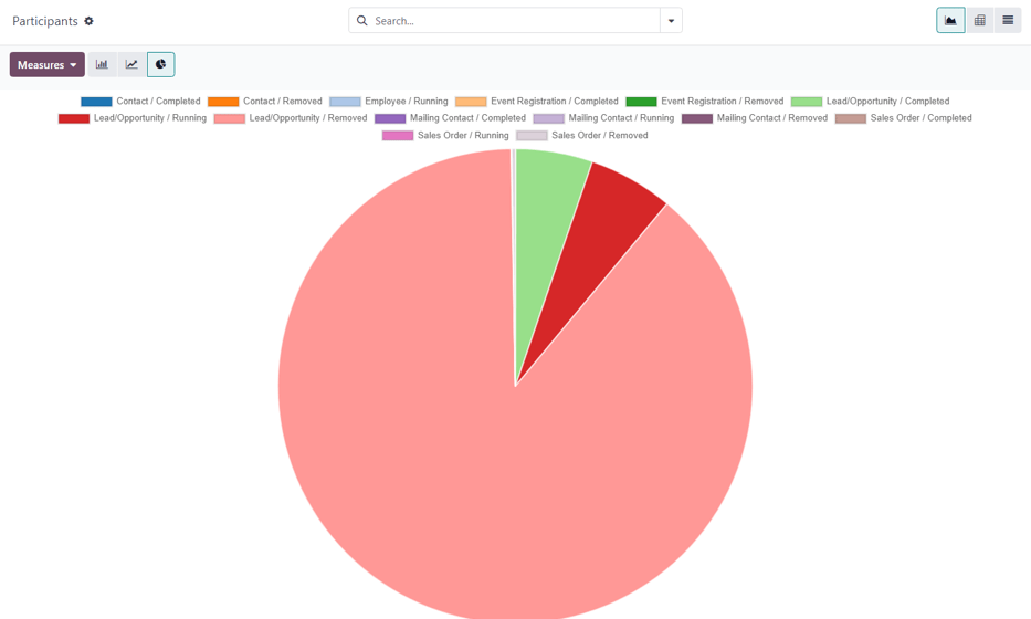
Die Standardansicht auf der Seite Teilnehmer ist die Ansicht Tortendiagramm, aber in der oberen linken Ecke sind verschiedene Ansichtsoptionen verfügbar. Sie haben die Möglichkeit, die Statistiken als Liniendiagramm oder Balkendiagramm anzuzeigen.
Oben auf der Grafik gibt es einen Farbschlüssel, der die Art der Teilnehmer in der Grafik beschreibt.
Ganz links von den Ansichtsoptionen befindet sich das Dropdown-Menü Werte. Wenn Sie darauf klicken, können Sie die Datensatz-ID oder die gesamte Anzahl anzeigen lassen. Und rechts vom Dropdown-Menü Werte haben Sie die Möglichkeit, beliebige Daten in eine Tabellenkalkulation einzufügen, indem Sie auf die Schaltfläche In Tabellenkalkulation einfügen klicken.
In der oberen rechten Ecke der Seite Link-Statistik, ganz rechts von der Suchleiste, können Sie außerdem zwischen folgenden Ansichten wählen: der Standardansicht Grafik, der Tabellenansicht Pivot und der Ansicht Liste.