Attendees report
The Odoo Events application creates custom reports based on event-related data and analytics.
The following documentation focuses on reporting options related to event Attendees.
Attendees reporting page
To access the Attendees reporting page, navigate to .
Reporting views
Once opened, the Attendees page offers five different view options.
By default, the Attendees page opens in the (Graph) view, allowing users to visually compare attendance data across events.
The graph view provides three available charts to display different insights about event attendance:
(Bar)/ (Line): Compare attendance trends across events.
(Pie): View attendance distribution across events.
For more information about customizing the graph view, see the Reporting documentation.
The (pivot) view displays a pivot table, allowing users to break down subsets of attendee-related data into specific categories or groups for more precise analysis.
For example, using the Group By options, users can organize an event’s total registration count (subset) by its count for each ticket type (group) to draw more granular insights about each ticket type’s popularity across events.

For more information about using the pivot view, see the Reporting documentation.
The (Kanban) view displays a Kanban, providing users with an at-a-glance overview of all registered attendees across events along with their ticket type and registration status.
By applying specific Group By options, users can group all attendees by specific criteria (e.g., registration status or ticket type) into separate, vertical stages to get a quick overview of their attendees’ records.
Observera
In Attendees reporting, only attendees without a specified ticket type can be dragged between stages.

For more information about using the Kanban view, see the Kanban documentation.
The (list) view displays a list of all registered attendees along with additional information such as contact information and registration status.
The list view provides users the option to view detailed records of their attendees in a centralized view. By applying the Group By options, users can then collapse long lists of records into smaller groups by specific criteria such as event or ticket type.

For more information about using the List view, see the List documentation.
The (cohort) view displays the percentage of event registrations per time interval over a certain time period.
The cohort view allows users to view broader registration patterns over a customizable time frame. For example, users can track the change in percentage of registrations over days, weeks, months, or years to identify trends at specific moments in time.

For more information about using the Cohort view, see the Cohort documentation.
The option to select a measure from the Measures drop-down menu is available only on the Kanban, pivot, and cohort views. Additionally, only the Count option is available as a measure for the Attendees reporting page.
Filteralternativ
The Filters column in the search bar’s drop-down menu sorts attendee data by specific criteria in any given view. Multiple filters can be selected at once.
Kolumnen Filters har följande alternativ:
Ongoing Events: Filter by ongoing events.
Taken: Filter by events with sold tickets.
Unconfirmed: Filter by unconfirmed attendees.
Registered: Filter by registered attendees.
Registration Date: Filter by a specific registration date. Click the (down) arrow to reveal a list of month, quarter, and year options.
Event Start Date: Filter by a specific event start date. Click the (down) arrow to reveal a list of month, quarter, and year options.
Attended Date: Filter by a specific attendance date. Click the (down) arrow to reveal a list of month, quarter, and year options.
Last 30 days: Filter by the last 30 days of attendee data.
Archived: Filter by archived attendee records.
Add Custom Filter: Create a custom filter to analyze event-related attendee data.
Alternativ för Gruppera efter
The Group By column in the search bar’s drop-down menu sorts attendee data by specific criteria in any given view. Multiple grouping criteria can be selected at once.
Observera
Grouping options are not available in the Cohort view.
Kolumnen Group By har följande alternativ:
Partner: Group data based on the partner of attendees’ registered events.
Event: Group data based on attendees’ registered events.
Ticket Type: Group data based on the type of event ticket purchased by attendees.
Status: Group data based on attendees’ registration status.
Registration Date: Group data based on a specific registration date. Click the (down) arrow to reveal a list of day, week, month, quarter, and year options.
Campaign: Group data based on marketing campaigns.
Add Custom Group: Create a custom group to organize data by additional fields. Click the (down) arrow to reveal a drop-down of grouping options. Multiple selections can be made.
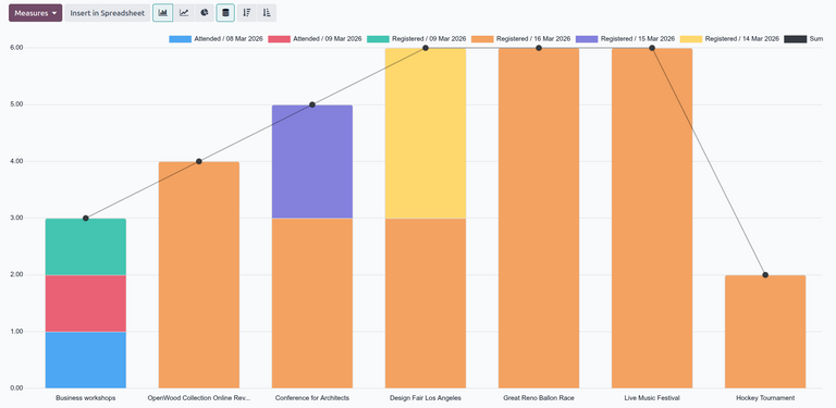
Example
A local production company recently organized a music festival and wants to measure the distribution of ticket registrations across concerts. Using the event attendance report, the production company created a graph showing the count of ticket registrations in the last 30 days, grouped by individual events and attendees’ ticket types.
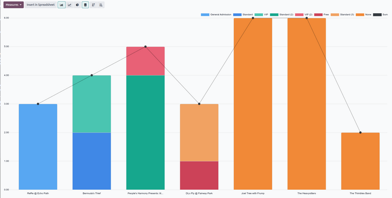
To create this report, use the default graph view, with the (Bar) and (Stacked) options selected. Remove the default filters in the search bar.
Then, click the (down) arrow to the right of the search bar to open the drop-down menu of filter and grouping options.
Select the Last 30 days filter from the Filters column to filter the data.
Next, select the Event and Ticket Type options from the Group By column in that sequential order. This groups the data by event, then by ticket type.
Viktigt
The order in which the options are selected in the Group By columns directly affects how the data is grouped and displayed in the report.
Se även