Dashboards
Odoo Dashboards stelt je in staat om interactieve dashboards te raadplegen, ermee te communiceren, te personaliseren en te bouwen die realtime gegevens uit je Odoo-database op een gemakkelijk te begrijpen manier weergeven. Door gegevens uit verschillende Odoo-bronnen op één locatie te centraliseren, bieden dashboards een overzicht van belangrijke bedrijfscijfers die je kunnen helpen bij het monitoren van bedrijfsprestaties en het nemen van weloverwogen beslissingen.
Odoo-spreadsheets dienen als basis voor dashboards, waarbij tabellen en grafieken worden gebruikt om dynamische Odoo-gegevens te structureren en visualiseren. Gegevensbronnen verbinden de onderliggende spreadsheet van een dashboard met je database, zodat de meest recente gegevens worden opgehaald telkens wanneer het dashboard wordt geopend of vernieuwd.
Met Odoo Dashboards kunnen gebruikers, afhankelijk van hun toegangsrechten:
dashboards raadplegen en ermee communiceren, inclusief standaard, vooraf geconfigureerde dashboards
globale filters gebruiken om alle gegevens die op een dashboard worden weergegeven te filteren
een snapshot van een dashboard delen met interne gebruikers die niet over de juiste toegangsrechten beschikken of met externe gebruikers
aangepaste dashboards bouwen met Odoo Spreadsheet
dashboards personaliseren om te wijzigen welke gegevens worden getoond, de lay-out of de beschikbare filters
toegangsrechten beheren voor dashboards
veelgeraadpleegde Odoo-weergaven centraliseren in een persoonlijk Mijn dashboard
Tip
Zodra een spreadsheet is omgezet in een dashboard, is deze alleen toegankelijk via de Dashboards-app.
In tegenstelling tot andere Odoo-dashboards is Mijn Dashboard niet gebaseerd op Odoo Spreadsheet, maar op Odoo-weergaven.
Dashboards gebruiken
Wanneer de Dashboards-app wordt geopend, toont het linkerpaneel alle standaard, vooraf geconfigureerde dashboards en aangepaste dashboards waartoe een gebruiker toegang heeft gekregen, gegroepeerd per sectie.
Klik op een dashboardnaam om dat dashboard in de hoofdweergave te openen.

Tip
Klik op het (dubbele chevron)-icoon bovenaan het linkerpaneel om het linkerpaneel in te klappen en de beschikbare ruimte voor dashboards te maximaliseren.
Markeer een dashboard als favoriet door op het (Favoriet schakelen)-icoon in de rechterbovenhoek te klikken. Favoriete dashboards worden gegroepeerd in een sectie Favorieten bovenaan het linkerpaneel voor eenvoudige toegang.
Gegevens filteren en sorteren
Filteren en sorteren stellen je in staat om te beheren welke gegevens worden weergegeven en hoe ze worden weergegeven. Dit kan helpen om de weergave af te stemmen op specifieke bedrijfsvragen.
Filteren beperkt de gegevens die in grafieken en tabellen worden gepresenteerd, zodat je je alleen kunt richten op records die aan specifieke criteria voldoen, bv. verkoopgegevens alleen bekijken voor een specifiek verkoopteam.
Sorteren rangschikt de gegevens die in tabelkolommen worden gepresenteerd opnieuw, zodat je de gegevens vanuit verschillende perspectieven kunt bekijken, bv. producten bekijken op omzet van hoogste naar laagste.
Pas globale filters toe
Als er globale filters zijn geconfigureerd voor een dashboard, is er een zoekbalk beschikbaar boven het dashboard.
Tip
Globale filters zijn beschikbaar voor alle standaarddashboards. Aanvullende globale filters kunnen worden toegevoegd door een gebruiker met de juiste toegangsrechten.
Het is ook mogelijk om naar waarden te zoeken door rechtstreeks in de zoekbalk te typen; de getoonde zoekcategorieën weerspiegelen de beschikbare globale filters.
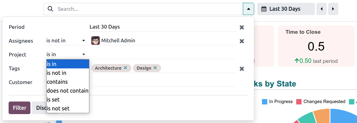
Globale filters toepassen:
Klik in de zoekbalk of klik op het dropdown icoon om toegang te krijgen tot alle filters die beschikbaar zijn voor dat dashboard.
Selecteer voor het relevante filter een voorwaardelijke operator uit de eerste dropdown, bv. staat in, en voer vervolgens, indien van toepassing, de juiste waarde in of selecteer deze.
Klik op Filter.
Voor dashboards met een datumfilter kan dit filter worden ingesteld via de zoekbalk of via de knop met het agenda icoon.

Tip
Het Aangepast bereik onderaan de periodeselector toont ofwel een handmatig ingevoerd aangepast bereik, indien relevant, ofwel de begin- en einddatum van de geselecteerde periode.
Verwijder een waarde uit een filter door op het verwijderen icoon naast de naam van de waarde te klikken; leeg een filter door op het verwijderen icoon helemaal rechts van het filter te klikken.
Gegevens sorteren
Afhankelijk van het dashboard en de betreffende tabel kan het mogelijk zijn om de gegevens per kolom te sorteren door op de kolomkop te klikken. Een pijl omlaag of pijl omhoog icoon naast een kolomkop geeft aan dat de kolom respectievelijk in aflopende of oplopende volgorde is gesorteerd. Als bij het zweven over andere kolomkoppen een sorteer icoon verschijnt, kan de kolom worden gesorteerd.
Tip
Als voorwaardelijke opmaak is toegepast op een tabel, blijft de oorspronkelijke opmaak behouden wanneer de tabel opnieuw wordt gesorteerd op een andere kolom.
Example
In dit voorbeeld was de tabel oorspronkelijk gesorteerd op omzet per CRM-label, in afnemende volgorde. Voorwaardelijke opmaak was gedefinieerd om de proportionele omzet te visualiseren met behulp van gegevensbalken. Wanneer de tabel opnieuw wordt gesorteerd op aantal leads in aflopende volgorde, weerspiegelen de gegevensbalken nog steeds de omzet per label in afnemende volgorde.

Toegang tot onderliggende records
Hoewel dashboards een gebruiksvriendelijke samenvatting van belangrijke gegevens bieden, maakt inzoomen op de onderliggende gegevens een meer gedetailleerde analyse mogelijk. Dit kan nuttig zijn voor het onderzoeken van afwijkingen of het verschaffen van de volledige context die nodig is voor besluitvorming.
Open onderliggende databaserecords: Klik op de relevante waarde in een tabel of op een datapunt in een grafiek om toegang te krijgen tot databaserecords waarnaar een dashboard verwijst. Hiermee open je ofwel het individuele record, of, in het geval van grafieken of tabellen die geconsolideerde gegevens weergeven, een lijst van de records waarnaar wordt verwezen.
Open onderliggende databaseweergaven: Klik op de titel van de grafiek of tabel om toegang te krijgen tot de weergave waaruit de gegevens voor een specifieke grafiek of tabel worden opgehaald. Hiermee open je de bijbehorende lijstweergave, draaitabelweergave of grafiekweergave.
Tip
Keer terug naar een dashboard na het inzoomen op onderliggende records of weergaven door op de breadcrumb Dashboards in de linkerbovenhoek te klikken.
Grafieken uitvouwen, kopiëren of downloaden
Bekijk grafieken op volledig scherm door over een grafiek te zweven en op het icoon te klikken.
Het is ook mogelijk om een grafiek te kopiëren of te downloaden door over de grafiek te zweven en op het (verticale ellips) icoon te klikken, vervolgens op Kopieer als afbeelding of Download te klikken, afhankelijk van wat relevant is.
Tip
Een tijdreeksgrafiek uitvouwen naar volledig scherm maakt een meer gedetailleerde analyse mogelijk.
Tijdreeksgrafieken analyseren
Tijdreeksgrafieken, d.w.z. grafieken die gegevens over tijd weergeven, kunnen nauwkeuriger worden geanalyseerd door:
inzoomen op een gekozen tijdspanne.
Granulariteit aanpassen
Voor veel tijdreeksgrafieken is het mogelijk om de granulariteit van de tijdseenheid op de x-as aan te passen.
Zweef hiervoor over de grafiek, klik op het (dropdown)-icoon en selecteer vervolgens de gewenste granulariteit.

Inzoomen op een tijdspanne en scrollen
Wanneer een tijdreeksgrafiek op volledig scherm is uitgevouwen, stelt een schuifregelaar onder de grafiek je in staat om:
in te zoomen op een specifieke tijdspanne door de uiteinden van de schuifregelaar te slepen om de gewenste tijdspanne te selecteren;
wanneer je hebt ingezoomd, door de grafiek te scrollen terwijl het zoomniveau behouden blijft door de schuifregelaar naar links of rechts te slepen.
Pas de grootte van de schuifregelaar aan om terug te keren naar de oorspronkelijke weergave.
Example
In dit voorbeeld van het Magazijn Dagelijkse Activiteiten-dashboard toont de grafiek verplaatsingen die nog niet zijn toegewezen aan een verantwoordelijke gebruiker, per dag. Het zoomniveau van de grafiek is aangepast om gegevens voor vijf dagen te tonen, en de huidige positie van de schuifregelaar maakt het mogelijk om gegevens van de laatste vijf dagen te tonen.

Standaarddashboards
Afhankelijk van welke apps zijn geïnstalleerd, is standaard een reeks standaarddashboards beschikbaar.
Deze vooraf geconfigureerde dashboards zijn ontworpen om de meest relevante inzichten te bieden voor het onderwerp in kwestie, en gebruikers met de juiste toegangsrechten kunnen ze raadplegen en ermee werken. Dashboard-specifieke filters, beschikbaar via de zoekbalk, maken het mogelijk om het hele dashboard te filteren op geselecteerde waarden.
Standaarddashboards kunnen worden gepersonaliseerd door een gebruiker met de juiste toegangsrechten. Bijvoorbeeld dashboardelementen zoals tabellen en grafieken, of globale filters kunnen worden toegevoegd, bewerkt of verwijderd.
Belangrijk
Bij het personaliseren van een standaarddashboard wordt ten zeerste aanbevolen om het dashboard te dupliceren en eventuele wijzigingen aan te brengen in de gedupliceerde versie. Standaarddashboards worden bij elke Odoo-versie-upgrade opnieuw geïnstalleerd, wat betekent dat eventuele aanpassingen aan de originele versie verloren gaan.
Configuratie-instellingen
Notitie
Alleen een gebruiker met de juiste toegangsrechten kan instellingen voor dashboards en dashboardsecties configureren of wijzigen.
Ga naar om dashboards en dashboardsecties te beheren. De volgende acties zijn mogelijk op het niveau van dashboardsecties:
Wijzig de volgorde van dashboardsecties door het (versleephandvat)-icoon te gebruiken om een sectie naar een nieuwe positie te verplaatsen.
Dupliceer een dashboardsectie door de relevante sectienaam te selecteren, op de knop Acties te klikken en vervolgens Dupliceren. De dashboards binnen de sectie worden niet gedupliceerd.
Verwijder een dashboardsectie door de relevante sectienaam te selecteren, op de knop Acties te klikken en vervolgens Verwijderen.
Tip
Standaard, vooraf geïnstalleerde dashboardsecties kunnen niet worden verwijderd; aangepaste dashboardsecties kunnen daarentegen wel worden verwijderd.
Maak een nieuwe dashboardsectie door te klikken op Nieuw en vervolgens de sectienaam in te voeren. Bij het maken van een nieuwe sectie is het mogelijk om direct een dashboard aan de nieuwe sectie toe te voegen door te klikken op Een spreadsheet toevoegen.
Klik op een individuele dashboardsectie om alle dashboards binnen die sectie weer te geven. De volgende acties zijn mogelijk:
Wijzig de volgorde van een dashboard binnen zijn sectie door het (versleephandvat)-icoon te gebruiken om het dashboard naar een nieuwe positie te verplaatsen.
Bewerk de naam van een dashboardsectie of dashboard door op de naam te klikken en deze te wijzigen.
Voeg gebruikersgroepen toe of verwijder deze om toegang tot het dashboard te beheren.
Selecteer één of meer bedrijven als het dashboard in een multi-bedrijven-database alleen zichtbaar moet zijn voor gebruikers van een specifiek bedrijf of bedrijven. Als dit veld leeg wordt gelaten, is het dashboard zichtbaar voor alle gebruikers met de juiste toegangsrechten, ongeacht welk bedrijf momenteel geselecteerd is in de database.
Maak de publicatie van een dashboard ongedaan door de schakelaar Is gepubliceerd uit te schakelen.
Bewerk de onderliggende spreadsheet van een dashboard door op Bewerken te klikken op de regel van het relevante dashboard.
Belangrijk
Bij het personaliseren van een standaarddashboard wordt ten zeerste aanbevolen om het dashboard te dupliceren en eventuele wijzigingen aan te brengen in de onderliggende spreadsheet van de gedupliceerde versie. Standaarddashboards worden bij elke Odoo-versie-upgrade opnieuw geïnstalleerd, wat betekent dat eventuele aanpassingen aan de originele versie verloren gaan.
Verwijder een dashboard door op het (prullenbak) icoon te klikken.
Tip
Een standaarddashboard dat is verwijderd, wordt opnieuw geïnstalleerd bij de volgende Odoo-versie-upgrade.
Voeg een nieuw dashboard toe aan de sectie door op Een spreadsheet toevoegen te klikken. Er zijn twee opties:
Om een bestaande spreadsheet om te zetten in een dashboard en aan de nieuwe sectie toe te voegen, selecteer je de relevante spreadsheet en klik je op Bevestigen. Terug in het sectieoverzicht werk je indien nodig de velden Groep en Bedrijf bij.
Om vanaf nul een dashboard te maken, selecteer je Leeg rekenblad. Om terug te keren naar het sectieoverzicht, klik je op de naam van de sectie in de linkerbovenhoek, boven de menubalk. Werk de velden Groep en Bedrijf indien nodig bij.
Notitie
Nadat een spreadsheet is omgezet in een dashboard, kan deze alleen nog worden geopend en bewerkt via de Dashboards-app.
Tip
Een nieuw aangemaakt dashboard is standaard toegankelijk voor gebruikers die behoren tot de standaard interne gebruikersgroep. Bewerk dit indien nodig via de Configuratie-instellingen van de relevante dashboardsectie.
Het is ook mogelijk om een rekenblad om te zetten in een dashboard en het toe te voegen aan een dashboardsectie vanaf het rekenblad in de Documenten-app.
Toegangsrechten en delen
Dashboards gebruiken
Het recht om een dashboard te bekijken en ermee te werken is gebaseerd op gebruikersgroepen en wordt beheerd in de Configuratie-instellingen van de Dashboards-app. Alleen gebruikers die deel uitmaken van een groep die toegang heeft gekregen tot een specifiek dashboard zien dat dashboard in het linkerpaneel wanneer de Dashboards-app wordt geopend. Gebruikers met Dashboard / Admin toegangsrechten kunnen alle dashboards bekijken.
De zichtbaarheid van dynamische Odoo-gegevens binnen een dashboard wordt echter apart afgehandeld. Dit is gebaseerd op de toegangsrechten van een gebruiker tot het model waaruit de gegevens zijn opgehaald, en houdt rekening met eventuele recordregels die de toegang kunnen beperken.
Belangrijk
Gebruikersrechten worden in aanmerking genomen wanneer een gebruiker een dashboard opent, waarbij het dashboard alleen wordt gevuld met gegevens die de gebruiker mag zien. Dit betekent dat een gebruiker in theorie een dashboard zou kunnen bekijken, maar door gebrek aan geschikte rechten niet de Odoo-gegevens zou kunnen zien die de maker van het dashboard wilde tonen.
Daarom is het cruciaal om gebruikersrechten in overweging te nemen bij het verlenen van dashboardtoegang aan groepen.
Example
Het verlenen van toegang tot het Verkoop dashboard aan de gebruikersgroep Verkoop / Gebruiker: Alleen eigen documenten zou weinig zin hebben. Hoewel gebruikers die tot die groep behoren het dashboard zouden kunnen bekijken en ermee kunnen werken, zouden ze alleen gegevens met betrekking tot hun eigen verkopen zien, waardoor het algehele dashboard misleidend wordt.
Toegangsrechten voor het bekijken van dashboards beheren
Om de rechten van gebruikers voor het bekijken en werken met een dashboard te beheren:
Ga in de Dashboards-app naar .
Open vanuit de lijst met dashboardsecties de relevante sectie.
In de kolom Groep op de regel van het relevante dashboard:
voeg een gebruikersgroep toe door op het veld te klikken totdat een vervolgkeuzelijst met gebruikersgroepen verschijnt, selecteer vervolgens de juiste gebruikersgroep. Klik in de vervolgkeuzelijst op Meer zoeken om toegang te krijgen tot de volledige lijst met gebruikersgroepen;
verwijder een gebruikersgroep door op de relevante groepsnaam te klikken en vervolgens op (Verwijderen) te klikken.
Dashboards bouwen, personaliseren en configureren
Alleen gebruikers met Dashboards / Admin toegangsrechten kunnen dashboards personaliseren of dashboardinstellingen configureren. Om een dashboard vanaf nul te bouwen, moet een gebruiker zowel Dashboards / Admin als minimaal voor de Documenten-app Documenten / Gebruiker toegangsrechten hebben.