Building blocks
Building blocks, also known as snippets, are how users design and layout pages. They are important XML elements of your design.
The building blocks are classified into two types:
Structure blocks: visually used as “whole rows” and distributed into multiples categories (Intro, Columns, Content, Images, People, etc)
Inner Content blocks: used inside other building blocks
At the end of this chapter, you will be able to create custom snippets and to add them into a dedicated category.
File structure
The view templates live under views/snippets/:
views
└── snippets
    ├── snippets.xml
    └── s_snippet_name.xml
Client-side assets live under static/src/ and are grouped by purpose:
static
└── src
   ├── snippets
   │   └── s_snippet_name
   │       ├── snippet_name.js
   │       ├── snippet_name.edit.js
   │       ├── 000.scss
   │       └── 000.xml
   └── website_builder
       ├── snippet_name_option.js
       ├── snippet_name_option.xml
       └── snippet_name_option_plugin.js
Tip
JS Files under /snippets are interactions:
example
with the s_floating_blocks snippet and the base
Interaction class.
Demo page
Demo data have to be installed to access this page:
https://your-database.com/website/demo/snippets
Layout
Snippets are editable by the user using the Website Builder. Some Bootstrap classes are important as they trigger some Website Builder options.
Wrapper
The standard main container of any snippet is a section. Any section element can be edited like a
block of content that you can move or duplicate.
<section class="s_snippet_name" data-name="..." data-snippet="...">
   <!-- Content -->
</section>
For inner content snippets, any other HTML tag can be used.
<div class="s_snippet_name" data-name="..." data-snippet="...">
   <!-- Content -->
</div>
Attribute |
Description |
|---|---|
class |
Unique class name for this snippet |
data-name |
Displayed in the right panel as the name of the snippet. If not found, it will fall back to Block. |
data-snippet |
Used by the system to identify the snippet |
The system automatically adds the data-name and data-snippet attributes during the drag and
drop based on the template’s name.
Waarschuwing
Those attributes should be specifically added when a snippet is declared on a theme page.
Waarschuwing
Avoid adding a section tag inside another section tag: this will trigger twice the Website
Builder’s options. You can use inner content snippets instead.
Tip
To write the content of a static page with standard snippets, there are two possible approaches:
- Pre-build the custom static pages with the Website Builder: Drag & drop snippets, then
copy/paste the code into your file and clean it up.
- Code everything directly: But beware of compatibility with the Website Builder. It
requires certain classes, names, id, data, etc. to work properly. A good practice is to seek out the snippets code created in standard code in the Odoo source files. Pay attention that the Website Builder sometimes adds classes to the snippets after dropped in the page.
Elements
There is a list of “features” we can enable/disable by using specific CSS classes.
Sizing
Any large Bootstrap columns directly descending from a .row element (respecting Bootstrap
structure) will be triggered by the Website Builder to make them resizable.
.row > .col-lg-*
Add padding on columns and <section>.
class="pt80 pb80"
Notitie
pb* and pt* are the Odoo classes used to control the handlers. Their values are
increased by multiples of 8, till a max of 256 (0, 8, 16, 24, 32, 40, 48, …).
Enable the columns selector.
<div class="container s_allow_columns">
Disable the columns amount option.
<div class="row s_nb_column_fixed">
Disable the size option for all child columns.
<div class="row s_col_no_resize">
Disable the size option for one specific column.
<div class="col-lg-* s_col_no_resize">
Colors
Add a background based on the color palette for columns and <section>.
class="o_cc o_cc*"
Disable the background color option for all columns.
<div class="row s_col_no_bgcolor">
Disable the background color option of one specific column.
<div class="col-lg-* s_col_no_bgcolor">
Add a black color filter with an opacity of 50%.
<section>
   <div class="o_we_bg_filter bg-black-50" />
   <div class="container">
      <!-- Content -->
   </div>
</section>
Add a white color filter with an opacity of 85%.
<section>
   <div class="o_we_bg_filter bg-white-85" />
   <div class="container">
      <!-- Content -->
   </div>
</section>
Add a custom color filter.
<section>
   <div class="o_we_bg_filter" style="background-color: rgba(39, 110, 114, 0.54) !important;" />
   <div class="container">
      <!-- Content -->
   </div>
</section>
Add a custom gradient filter.
<section>
   <div class="o_we_bg_filter" style="background-image: linear-gradient(135deg, rgba(255, 204, 51, 0.5) 0%, rgba(226, 51, 255, 0.5) 100%) !important;" />
   <div class="container">
      <!-- Content -->
   </div>
</section>
Features
Non-editable areas
Make an element not editable.
<div class="o_not_editable">
Make an element not removable.
<div class="oe_unremovable">
Backgrounds
Add a background image and have it centered.
<div class="oe_img_bg o_bg_img_center" style="background-image: url('...')">
Add parallax effect.
<section
   class="parallax s_parallax_is_fixed s_parallax_no_overflow_hidden"
   data-scroll-background-ratio="1">
   <span
      class="s_parallax_bg oe_img_bg o_bg_img_center"
      style="background-image: url('...'); background-position: 50% 75%;" />
   <div class="container">
      <!-- Content -->
   </div>
</section>
Notitie
A video background can be set on a section. Refer to the Media chapter of this documentation.
Text highlights
Text highlights are SVG files that can be incorporated onto specific words or phrases to emphasize them. Text highlights offer customizable options for colors and thickness.

<h2>
   Title with
   <span
      class="o_text_highlight o_text_highlight_fill"
      style="--text-highlight-width: 10px !important; --text-highlight-color: #FFFF00;">
      <span class="o_text_highlight_item">
         highlighted text
         <svg fill="none" class="o_text_highlight_svg o_content_no_merge position-absolute overflow-visible top-0 start-0 w-100 h-100 pe-none">
            <!-- SVG path -->
         </svg>
      </span>
   </span>
</h2>
CSS custom property |
Description |
|---|---|
|
Thickness of the SVG borders |
|
Color of the SVG object |
Grid layout
Grid Layout is a powerful and flexible layout system in CSS that enables users to design complex building block layouts with ease.
Use
Enable the Grid Layout by adding the o_grid_mode CSS class on the row. The number of rows in
your grid is defined by the data-row-count attribute. The grid always contains 12 columns. The
grid gap, specified in the style attribute, determines the gaps (or gutters) between rows and
columns.
<div class="row o_grid_mode" data-row-count="13" style="gap: 20px 10px">
   <!-- Content -->
</div>
Items in a grid
Add items in the grid with the o_grid_item class. If the grid item contains an image, use the
o_grid_item_image class.
<div class="row o_grid_mode" data-row-count="13">
   <div class="o_grid_item g-height-* g-col-lg-*" style="grid-area: 2 / 1 / 7 / 8; z-index: 3;">
      <!-- Content -->
   </div>
   <div class="o_grid_item o_grid_item_image g-height-* g-col-lg-*" style="grid-area: 1 / 6 / 9 / 13; z-index: 2;">
      <img src="..." alt="..." >
   </div>
</div>
The dimensions and position of a grid item are defined by the grid-area that can be explicitly set
in the style attribute along with the z-index.
The g-height-* and g-col-lg-* classes are generated by the Website Builder for editing purposes.
Grid item padding
<div class="row o_grid_mode" data-row-count="13" style="gap: 20px 10px;">
   <div class="o_grid_item g-height-* g-col-lg-*" style="--grid-item-padding-y: 20px; --grid-item-padding-x: 15px; grid-area: 2 / 1 / 7 / 8; z-index: 3;">
      <!-- Content -->
   </div>
</div>
CSS custom property |
Description |
|---|---|
|
Vertical paddings (Y axis) |
|
Horizontal paddings (X axis) |
Compatibility system
- When a snippet has a
data-vcss,data-vjsand/ordata-vxmlattribute, it means it is an updated version, not the original one.
<section class="s_snippet_name" data-vcss="001" data-vxml="001" data-vjs="001">
   <!-- Content -->
</section>
These data attributes indicate to the system which file version to load for that
snippet (e.g., 001.js, 002.scss).
Custom snippet
Some more specific needs will require the creation of custom snippets. Here is how to create a custom snippet/
Template
Create first the snippet template. Then, add it to the list and make it available via the Website Builder.
1. Declaration
First, create the template of the custom snippet:
/website_airproof/views/snippets/s_airproof_snippet.xml¶<?xml version="1.0" encoding="utf-8"?>
<odoo>
<template id="s_airproof_snippet" name="...">
<section class="s_airproof_snippet">
<!-- Content -->
</section>
</template>
</odoo>
Waarschuwing
data-name and data-snippet attributes have to be specified when a snippet is declared on a
theme page. Otherwise, the snippet won’t be recognised by the Website Builder and issues might
occur whenever a database upgrade is done. Additionally, remember that the name attribute is
shown as the name of your custom snippet in the Blocks section of the options panel.
Tip
Use Bootstrap native classes as much as possible.
Prefix all your custom classes.
Use underscore lowercase notation to name classes, e.g.,
.x_nav,.x_nav_item.Avoid using ID attribute within your
sectionas several instances of a snippet may appear throughout the page (An ID attribute has to be unique on a page).
Add the custom snippet to the list of standard snippets, so the user can drag and drop it on the page, directly from the edit panel.
2. Group creation
Add a group at the top of the list (feel free to put it where needed in this list).
/website_airproof/views/snippets/snippets.xml¶<template id="snippets" inherit_id="website.snippets" name="Airproof - Snippets">
<!-- Create the group -->
<xpath expr="//snippets[@id='snippet_groups']/*[1]" position="before">
<t snippet-group="airproof"
t-snippet="website.s_snippet_group"
string="Airproof"
t-thumbnail="/website_airproof/static/src/img/wbuilder/s_airproof_group_thumbnail.svg" />
</xpath>
</template>
Attribute |
Description |
|---|---|
snippet-group |
ID of the group |
t-snippet |
Inherited template ID |
string |
Group name displayed to the users |
t-thumbnail |
The path to the thumbnail of the group |
1. Snippet addition
Then add the custom snippet into the <snippets id="snippet_structure"> which contains
all existing ones on the same level. The Website Builder will split them automatically into
categories by reading the group attribute on the <t t-snippet="">
/website_airproof/views/snippets/snippets.xml¶<template id="snippets" inherit_id="website.snippets" name="Airproof - Snippets">
<!-- Create the group -->
<xpath expr="//snippets[@id='snippet_groups']/*[1]" position="before">
<t snippet-group="airproof"
t-snippet="website.s_snippet_group"
string="Airproof" t-thumbnail="/website_airproof/static/src/img/wbuilder/s_airproof_group_thumbnail.svg" />
</xpath>
<!-- Add the custom snippet to the group -->
<xpath expr="//snippets[@id='snippet_structure']/*[1]" position="before">
<t t-snippet="website_airproof.s_airproof_snippet" string="Custom snippet" group="airproof">
<keywords>Snippet</keywords>
</t>
</xpath>
</template>
Attribute |
Description |
|---|---|
t-snippet |
The snippet template to use |
group |
The group in which the snippet is added. |
<keywords> |
Keywords entered by the user in the search field in the Snippets panel |
Inner content snippet
To make a custom snippet appear in the Inner content list, add it to snippet_content
instead:
/website_airproof/views/snippets/snippets.xml¶<template id="snippets" inherit_id="website.snippets" name="Airproof - Snippets">
<!-- Add the custom snippet to the group -->
<xpath expr="//snippets[@id='snippet_content']/*[1]" position="before">
<t t-snippet="website_airproof.s_airproof_snippet"
string="Custom snippet"
t-thumbnail="/website_airproof/static/src/img/wbuilder/s_airproof_snippet.svg" />
</xpath>
</template>
Inner content selectors
To make a custom snippet “inner content” (droppable in another building block), add its selector
to the so_content_addition_selector resource, which contains all selectors for existing inner
content building blocks.
/website_airproof/static/src/website_builder/airproof_snippet_option_plugin.js¶export class AirproofSnippetOptionPlugin extends Plugin {
static id = "airproofSnippetOption";
resources = {
so_content_addition_selector: [".s_airproof_snippet"],
};
}
Belangrijk
Don’t forget to add a
t-thumbnailand remove thegroupattribute as this kind of building blocks is directly available in the right options panel of the Website Builder.Don’t forget to add the snippet to the list of all available “Inner content” snippets.
Options
Options allow users to edit a snippet’s appearance and behavior using the Website Builder. Options are OWL components defined in JavaScript and rendered with XML templates. Each option is registered through a builder plugin and loaded in the editor assets.
Notitie
Add the JavaScript and XML files to the website.website_builder_assets bundle in your module.
Component and template
Define the option component and register it in a builder plugin.
/website_airproof/static/src/website_builder/airproof_snippet_option_plugin.js¶import { BaseOptionComponent } from "@html_builder/core/utils";
import { Plugin } from "@html_editor/plugin";
import { registry } from "@web/core/registry";
export class AirproofSnippetOption extends BaseOptionComponent {
static template = "website_airproof.AirproofSnippetOption";
static selector = ".s_airproof_snippet";
static applyTo = ":scope > .row";
}
export class AirproofSnippetOptionPlugin extends Plugin {
static id = "airproofSnippetOption";
resources = {
builder_options: [AirproofSnippetOption],
};
}
registry.category("website-plugins").add(
AirproofSnippetOptionPlugin.id,
AirproofSnippetOptionPlugin
);
Then define the XML template rendered in the options panel.
/website_airproof/static/src/website_builder/airproof_snippet_option.xml¶<templates xml:space="preserve">
<t t-name="website_airproof.AirproofSnippetOption">
<BuilderRow label.translate="Layout">
<BuilderSelect>
<BuilderSelectItem classAction="''">Default</BuilderSelectItem>
<BuilderSelectItem classAction="'s_airproof_snippet_portrait'">Portrait</BuilderSelectItem>
<BuilderSelectItem classAction="'s_airproof_snippet_square'">Square</BuilderSelectItem>
<BuilderSelectItem classAction="'s_airproof_snippet_landscape'">Landscape</BuilderSelectItem>
</BuilderSelect>
</BuilderRow>
<BuilderRow label.translate="Space">
<BuilderButtonGroup>
<BuilderButton classAction="'mt-0'">1</BuilderButton>
<BuilderButton classAction="'mt-3'">2</BuilderButton>
<BuilderButton classAction="'mt-5'">3</BuilderButton>
</BuilderButtonGroup>
</BuilderRow>
</t>
</templates>
Option logic
Define option behavior in JavaScript on the BaseOptionComponent class and register any
BuilderAction used by the template in the builder plugin resources.
Plugin API
Builder plugins register option components, actions, and editor hooks through the resources
object. They are added to the website-plugins registry category to be accessible by the editor.
Plugin instances are created when the editor starts and destroyed when the editor closes, they
live for the whole editor session.
Property |
Purpose |
|---|---|
|
Declare required plugins before setup runs. |
|
Expose shared methods to other plugins. |
|
Initialize plugin state. |
Resources |
Purpose |
|---|---|
|
Register |
|
Register |
|
Define snippet drop rules ( |
|
Extend the list of inner content selectors. |
Handlers |
Editor lifecycle hooks registered on the plugin. |
|
Called after a snippet is dropped and inserted in the DOM. |
|
Called after an element is cloned and inserted in the DOM. |
|
Called just before an element is removed. |
|
Called after an element has been removed. |
|
Called on a cleaned clone of the DOM before saving. |
|
Called at the beginning of the save process. |
|
Called after the save process completes. |
Zie ook
BaseOptionComponent API
Option components inherit from BaseOptionComponent and define static metadata plus optional
component behavior.
They are instantiated when the current selection matches their selector, and destroyed when the
selection changes and no longer matches, resulting in a short lifecycle.
Property |
Description |
|---|---|
|
OWL template name rendered in the options panel. |
|
CSS selector that binds the option to elements. |
|
CSS selector of elements to exclude from the match. |
|
CSS selector targeting a child element of the matched snippet. |
|
Child builder components used in the template. |
|
Initialize component state. |
Binding
selector
Option components declare a selector property that controls when they appear.
selector binds the option component to elements matching a CSS selector (class, ID, etc). The
option appears when a matching element is selected.
export class AirproofSnippetOption extends BaseOptionComponent {
   static selector = "section, h1, .custom_class, #custom_id";
}
It can be used in combination with exclude or applyTo.
applyTo
applyTo allows the option to apply to a child element of the matched selector.
export class AirproofSnippetOption extends BaseOptionComponent {
   static selector = ".s_airproof_snippet";
   static applyTo = ".row";
}
exclude
exclude removes specific selectors from the match.
<ul> tag (without .navbar-nav class) is selected¶export class AirproofSnippetOption extends BaseOptionComponent {
static selector = "ul";
static exclude = ".navbar-nav";
}
dropzone_selector (dropIn)
dropIn defines the elements the snippet can be dropped into.
export class AirproofSnippetOptionPlugin extends Plugin {
   static id = "airproofSnippetOption";
   resources = {
      dropzone_selector: {
         selector: ".s_airproof_snippet",
         dropIn: ".x_custom_location",
      },
   };
}
dropzone_selector (dropNear)
dropNear defines the elements the snippet can be dropped next to.
export class AirproofSnippetOptionPlugin extends Plugin {
   static id = "airproofSnippetOption";
   resources = {
      dropzone_selector: {
         selector: ".s_airproof_snippet_card",
         dropNear: ".card",
      },
   };
}
Layout & fields
Use builder components to compose the options panel UI.
<BuilderRow>
Create a labeled row to group option fields. Use label.translate for the row title and level to
indent nested rows.
<BuilderRow label.translate="My option">
   <BuilderSelect>...</BuilderSelect>
   <BuilderButtonGroup>...</BuilderButtonGroup>
</BuilderRow>
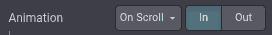
The perfect example for this case is the Animation row:
<BuilderButton>
This tag is used inside <BuilderButtonGroup> or on its own.
<BuilderButtonGroup>
   <BuilderButton classAction="'mt-0'">1</BuilderButton>
   <BuilderButton classAction="'mt-3'">2</BuilderButton>
   <BuilderButton classAction="'mt-5'">3</BuilderButton>
</BuilderButtonGroup>
Add classAction to indicate which class is applied to the targeted element when this choice is
selected. Like any XML node, add other attributes to improve the style and/or the user experience.
<BuilderButton
   icon="'fa-align-right'"
   title.translate="Align right"
   classAction="'ms-auto'" />
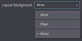
<BuilderSelect>
Formats the option as a dropdown list.
<BuilderSelect>
   <BuilderSelectItem classAction="''">Default</BuilderSelectItem>
   <BuilderSelectItem classAction="'s_layout_variant'">Variant</BuilderSelectItem>
</BuilderSelect>
<BuilderButtonGroup>
Formats the option as buttons next to each other and handles selection state.
<BuilderButtonGroup>...</BuilderButtonGroup>
<BuilderCheckbox>
Formats the option as a toggle switch.
<BuilderCheckbox
   classAction="'s_airproof_snippet_tooltip'" />

<BuilderRange>
Formats the option as a slider.
<BuilderRange> can be used to set a numeric value:
<BuilderRange
   action="'setSpeed'"
   min="0"
   max="10"
   step="1"
   displayRangeValue="true" />
It can also be used to map each step to an entry in actionParam:
<BuilderRange
   action="'setClassRange'"
   actionParam="['o_spc-none', 'o_spc-small', 'o_spc-medium', 'o_spc-big']"
   max="3" />
<BuilderNumberInput> and <BuilderTextInput>
Format the option as a numeric or text field.
unit, saveUnit and step are optional¶<BuilderNumberInput
styleAction="'animation-duration'"
unit="'s'"
saveUnit="'ms'"
step="0.1" />

<BuilderNumberInput> comes with optional props:
Attribute |
Description |
|---|---|
|
Shows the expected unit of measure. |
|
Set the unit of measure to which the value entered by the user is converted and saved. |
|
Set the numerical value by which the field can be incremented. |
<BuilderList>
Render and edit a list of items (add, remove, reorder) in the options panel. Useful for prefilled values, custom options, or settings that map to a list of objects.
<BuilderList
   action="'setPrefilledOptions'"
   addItemTitle.translate="Add"
   itemShape="{ value: 'number', description: 'text' }"
   default="{ value: '50', description: 'Add a description here' }"
   columnWidth="{ value: 'w-25' }"
   sortable="true" />
Prop |
Description |
|---|---|
|
Field types per column. Supported types: |
|
Default values for new items. Keys must match |
|
Optional list of available records (JSON list). When set, the add button becomes a dropdown. |
|
Extra values injected when creating a new item (e.g., record ID). |
|
Allow drag-and-drop reordering (default: true). |
|
Hide specific columns by name. |
|
CSS classes applied per column (e.g., |
|
Prevent removing the last remaining item. |
<BuilderColorPicker>
Formats the option as a color/gradient to choose from.
<BuilderColorPicker
   action="'selectFilterColor'"
   defaultOpacity="50"
   enabledTabs="['custom', 'gradient']" />

Attribute |
Description |
|---|---|
|
Restrict the available picker tabs (e.g., |
|
Default color shown when no selection is applied. |
|
Default alpha value for the picker. |
Actions
Builder components trigger BuilderAction classes. Use shorthand action props or declare custom
actions and reference them by action id in the template.
Core actions
Core actions are available as shorthand props on builder components.
Action/prop |
Description |
|---|---|
|
Add/remove CSS classes on the target element. |
|
Set an inline style property on the target element. |
|
Set or remove a DOM attribute. |
|
Set or remove a dataset key (without the |
|
Apply one class from a predefined list based on the selected range value. |
|
Call a custom action registered in the builder plugin. |
Action lifecycle
BuilderAction classes can implement a lifecycle that the builder invokes depending on the widget:
Method |
Description |
|---|---|
|
Prepare asynchronous data before a component is used. |
|
Load data before |
|
Apply the action to the targeted element. |
|
Reset the action when a new choice supersedes it. |
|
Return the current value for input widgets. |
|
Return whether the action is active for selectable widgets. |
|
Decide which selectable item wins when multiple are valid. |
Custom actions
To create custom behaviors, define a BuilderAction and register it in your builder plugin.
/website_airproof/static/src/website_builder/airproof_snippet_option_plugin.js¶import { BuilderAction } from "@html_builder/core/builder_action";
import { Plugin } from "@html_editor/plugin";
import { registry } from "@web/core/registry";
export class AirproofLayoutAction extends BuilderAction {
static id = "airproofLayout";
apply({ editingElement, params: { mainParam } }) {
editingElement.classList.toggle("s_airproof_snippet_portrait", mainParam === "portrait");
editingElement.classList.toggle("s_airproof_snippet_square", mainParam === "square");
}
isApplied({ editingElement, params: { mainParam } }) {
return editingElement.classList.contains(`s_airproof_snippet_${mainParam}`);
}
}
export class AirproofSnippetOptionPlugin extends Plugin {
static id = "airproofSnippetOption";
resources = {
builder_actions: { AirproofLayoutAction },
};
}
registry.category("website-plugins").add(
AirproofSnippetOptionPlugin.id,
AirproofSnippetOptionPlugin
);
Finally, the custom action can be called from the XML template.
<t t-name="website_airproof.AirproofSnippetOption">
   <BuilderRow label.translate="Layout">
      <BuilderButtonGroup action="'airproofLayout'">
         <BuilderButton actionParam="'portrait'">Portrait</BuilderButton>
         <BuilderButton actionParam="'square'">Square</BuilderButton>
      </BuilderButtonGroup>
   </BuilderRow>
</t>
Zie ook
Dynamic Content templates
By default, Dynamic Content blocks have a selection of templates available in the Website Builder. Custom templates can also be added to the list automatically by use the same naming convention for the template id attribute.
Call the template
The selected dynamic snippet replaces the <div class="dynamic_snippet_template"/> placeholder by
the right template based on the data-template-key and the custom CSS class:
<section
   data-snippet="s_blog_posts"
   data-name="Blog Posts"
   class="s_blog_post_airproof s_dynamic_snippet_blog_posts s_blog_posts_post_picture_size_default s_dynamic pt64 pb64 s_blog_post_card o_colored_level o_dynamic_snippet_loading"
   data-template-key="website_airproof.dynamic_filter_template_blog_post_airproof"
   data-custom-template-data="{
      blog_posts_post_author_active:true,
      blog_posts_post_teaser_active:true,
      blog_posts_post_date_active:true,
      blog_posts_post_category_active:true,
      blog_posts_post_new_active:true
   }"
   data-number-of-records="16"
   data-filter-by-blog-id="-1"
   data-filter-id="1"
   data-extra-classes="g-3"
   data-column-classes="col-12 col-sm-6 col-lg-4 col-xxl-3">
   <div class="s_dynamic_snippet_container container">
      <div class="row s_nb_column_fixed">
            <section class="s_dynamic_snippet_holder d-none px-4 placeholder-glow o_colored_level">
               <div class="row">
                  <span class="placeholder col-3 rounded" />
                  <span class="placeholder col-2 offset-7 rounded" />
                  <span class="placeholder mt-3 col-6 rounded" />
               </div>
               <div class="row mt-4">
                  <span class="placeholder col-12 rounded" style="height: 250px;" />
               </div>
            </section>
            <section class="s_dynamic_snippet_title oe_unremovable oe_unmovable flex-column flex-md-row mb-lg-0 pb-3 pb-md-0 s_col_no_resize o_colored_level d-flex justify-content-between">
               <div>
                  <h2 class="h3">Our latest content</h2>
                  <p class="lead">Check out what's new in our company!</p>
               </div>
               <div>
                  <a title="See All" href="/blog">
                     See all<span class="fa fa-long-arrow-right ms-2" />
                  </a>
               </div>
            </section>
            <section class="s_dynamic_snippet_content oe_unremovable oe_unmovable o_not_editable col s_col_no_resize o_colored_level">
               <div class="css_non_editable_mode_hidden">
                  <div class="missing_option_warning alert alert-info fade show d-none d-print-none rounded-0">
                        Your Dynamic Snippet will be displayed here... This message is displayed because you did not provide enough options to retrieve its content.<br/>
                  </div>
               </div>
               <div class="dynamic_snippet_template" />
            </section>
      </div>
   </div>
</section>
data-custom-template-data can receive any custom data needed for the template rendering as a JSON
string. It allows to set some variables used in the template to show/hide elements (author,
publication date, …) or to pass any specific information needed for the content rendering.
Examples
/website_airproof/views/snippets/s_snippet_name.xml¶<template id="dynamic_filter_template_blog_post_airproof" name="...">
<div t-foreach="records"
t-as="data"
class="s_blog_posts_post"
data-extra-classes="g-3"
data-column-classes="col-12 col-sm-6 col-lg-4 col-xxl-3">
<t t-set="record" t-value="data['_record']" />
<!-- Content -->
</div>
</template>
Attribute |
Description |
|---|---|
id |
The ID of the template. Has to start with |
name |
Human-readable name of the template |
data-extra-classes |
CSS classes added on the parent |
data-column-classes |
CSS classes added on the parent column of the blog post cards. |
/website_airproof/views/snippets/s_snippet_name.xml¶<template id="dynamic_filter_template_product_product_airproof" name="...">
<t t-foreach="records"
t-as="data"
data-number-of-elements="4"
data-number-of-elements-small-devices="1"
data-number-of-records="8">
<t t-set="record" t-value="data['_record']" />
<!-- Content -->
</t>
</template>
Attribute |
Description |
|---|---|
id |
The ID of the template. Has to start with |
name |
Human-readable name of the template |
data-number-of-elements |
Number of products per slide on desktop |
data-number-of-elements-small-devices |
Number of products per slide on mobile |
data-number-of-records |
The total amount of fetched products |
/website_airproof/views/snippets/s_snippet_name.xml¶<template id="dynamic_filter_template_event_event_airproof" name="...">
<t t-foreach="records"
t-as="data"
data-extra-classes="g-3"
data-column-classes="col-12 col-sm-6 col-lg-4 col-xxl-3"
data-number-of-records="16">
<t t-set="record" t-value="data['_record']._set_tz_context()" />
<!-- Content -->
</t>
</template>
Attribute |
Description |
|---|---|
id |
The ID of the template. Has to start with |
name |
Human-readable name of the template |
data-extra-classes |
CSS classes added on the parent |
data-column-classes |
CSS classes added on the parent column of the event cards. |
data-number-of-records |
The total amount of fetched events |
Dynamic products
The dynamic products snippet introduces a bunch of micro-styling options under Cards
Design. To set one of these options, insert the related CSS class into the section. Aside from
some exceptions that rely on CSS variables, adding the class sets the option to the right value.
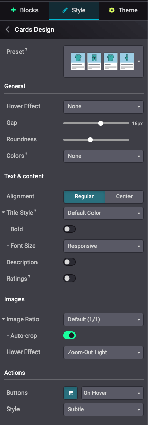
Card options
Here is non-exhaustive list of these available options:
Option |
Description |
CSS Classes / Values |
|---|---|---|
Hover Effect |
Background color on hover |
|
Background Zoom on hover |
|
|
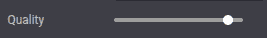
Gap |
Spacing between product cards (from 0 to 28px) |
For example: |
Roundness |
Border radius of the product cards |
|
|
||
|
||
|
||
|
||
|
||
Colors |
Applies color combinations defined in the Theme tab |
|
|
||
|
||
|
||
|
Option |
Description |
CSS Classes |
|---|---|---|
Alignement |
Regular: Left aligned |
No class required |
Center: Centered |
|
|
Title Style |
Product title uses Link Color |
No class required |
Product title uses Default Color |
|
|
Bold |
Product title uses Bold font weight |
|
Font Size |
Product title uses Responsive font size |
No class required |
Product title uses Theme Default font size |
|
|
Description |
Displays product description |
|
Ratings |
Displays product ratings |
|
Option |
Description |
CSS Classes |
|---|---|---|
Image Ratio |
Default (1/1) |
No class required |
Landscape (4/3) |
|
|
Horizontal (6/5) |
|
|
WideScreen (16/9) |
|
|
Portrait (4/5) |
|
|
Vertical (2/3) |
|
|
Auto-crop |
Crops images automatically |
|
Hover Effect |
None |
No class required |
Zoom-In |
|
|
Zoom-In Light |
|
|
Zoom-Out |
|
|
Zoom-Out Light |
|
|
Image Shadow |
|
Option |
Description |
CSS Classes |
|---|---|---|
Buttons |
: Shows an Add to Cart button |
|
Always shows Inline action button |
|
|
Shows action buttons On Hover |
|
|
Style |
Subtle |
|
Promote |
|
|
Theme colors |
|
Card presets
Instead of being separately set, a Preset can also be selected. This has a layout class
(Catalog or List), a specific styling class and all the class options (see above). This dynamic
snippet is forced to catalog display (o_wsale_products_opt_layout_catalog) and one of the
following preset:
Preset |
CSS Class |
|---|---|
Thumbnails |
|
Chips |
|
Cards |
|
Grid |
|