
レポート
Odoo Live Chat includes several reports that allow for the monitoring of operator performance and the identification of trends in customer conversations.
対応可能なレポート
The following reports are included in the Live Chat app:
注釈
The Live Chat Ratings Report can also be accessed through the Report menu. For more information on this report, and on the Live Chat rating process, see Live Chat Ratings.
利用可能なすべてのレポートのドロップダウンメニューにアクセスするには、:menuselection:`ライブチャット --> 報告書`に移動します。
セッション履歴
*セッション履歴*レポートには、セッション日、参加者名と国、セッション所要時間、メッセージ数、評価を含む、ライブチャットセッションの概要が表示されます。また、ライブチャットセッションの完全なトランスクリプトへのアクセスも提供します。
To access this report, navigate to .

このレポートの情報は、エクスポートしたり、スプレッドシートに挿入したりできます。
Click the ⚙️ (gear) icon to the right of the History page title, in the top-left corner. Doing so reveals a drop-down menu.
ドロップダウンメニューから、:guilabel:`すべてエクスポート`をクリックしてすべてのセッションをスプレッドシートにエクスポートするか、:guilabel:`スプレッドシートにリストを挿入`をクリックして、新規または既存のスプレッドシートに情報を挿入します。
To only export select sessions, first select the desired sessions to be exported from the list, by clicking the checkbox to the left of each individual session. With the sessions selected, click the ⚙️ (gear) Actions icon in the top-center of the page, and click Export or Insert list in spreadsheet.
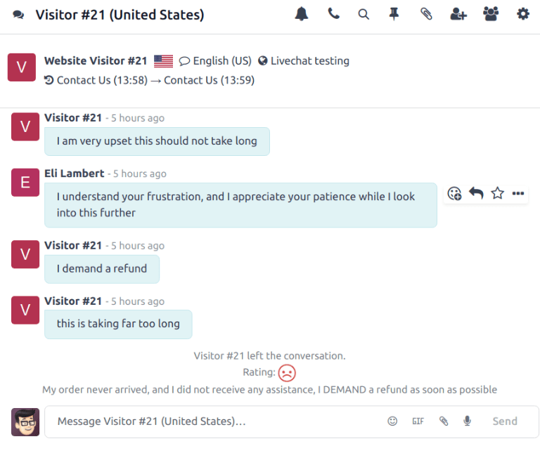
To view the transcript of an individual conversation, click anywhere on the entry line. This opens the Discuss thread for the conversation.
In the Discuss thread, the conversation view displays the entire transcript of the conversation. At the top of the conversation, there is a list of the web pages the visitor browsed before beginning their chat session, along with corresponding time stamps. If the visitor left a rating, it is included at the end of the transcript.
セッション統計
*セッション統計*レポートは、ライブチャットセッションの統計的概要を提供します。このレポートのデフォルトビューでは、作成日でグループ化されたセッションが表示されます。
このレポートにアクセスするには、:menuselection:`ライブチャット --> 報告書 --> セッション統計`に移動します。

セッション統計 レポートの積み重ね棒グラフビューで、結果は作成日時(時間)でグループ化され、次に評価でグループ化されています。
別の指標を表示するには、レポートの左上にある:guilabel:`測定`ドロップダウンメニューをクリックします。このレポートで利用可能な指標には、次のものがあります。
発言者数: 会話の参加者数。
活動日数: オペレーターの最初のセッションからの日数。
セッション所要時間(分): 会話の所要時間(分単位)。
訪問者が匿名か: 会話の参加者が匿名かどうかを示します。
セッションごとのメッセージ数: 会話で送信されたメッセージの総数。この指標はデフォルトビューに含まれています。
評価:入力された場合、セッション終了時にオペレーターが受け取った評価。
セッション未評価:会話終了時にセッションが評価を**受けなかった**ことを示します。
応答時間(秒):オペレーターがチャット申請に応答するまでの平均時間(秒単位)。
訪問者は満足:肯定的な評価が入力されたかどうかを示します。訪問者が否定的または中立的な評価を行った場合、*不満足*と見なされます。
カウント:セッションの総数。
オペレーター分析
*オペレーター分析*レポートは、個々のライブチャット作業者のパフォーマンスを監視するために使用されます。
レポートにアクセスするには、に移動します。
このレポートのデフォルト表示は棒グラフで、今月のデフォルト検索フィルターで示されるように、当月の会話のみを表示します。会話は作業者ごとにグループ化されます。
別の指標を表示するには、レポートの左上にある:guilabel:`測定`ドロップダウンメニューをクリックします。このレポートで利用可能な指標には、次のものがあります。
セッション数:作業者が参加したセッション数。この指標はデフォルトで含まれています。
平均期間:会話の平均期間(秒単位)。
平均評価:作業者が受け取った平均評価。
応答時間:作業者がチャット申請に応答するまでの平均時間(秒単位)。
カウント:セッションの総数。

View and filter options
On any Odoo report, the view and filter options vary, depending on what data is being analyzed, measured, and grouped. See below for additional information on the available views for the Live Chat reports.
注釈
The Sessions History report is only available in list view.
ピボットビュー
The pivot view presents data in an interactive manner. The Session Statistics and Operator Analysis reports are available in pivot view.
The pivot view can be accessed on a report by selecting the grid icon at the top-right of the screen.
To add a group to a row or column, click the ➕ (plus sign) icon next to Total, and then select one of the groups from the drop-down menu that appears. To remove one, click the ➖ (minus sign) icon, and de-select the appropriate option.
グラフビュー
The graph view presents data in either a bar, line, or pie chart. The Session Statistics and Operator Analysis reports are available in graph view.
Switch to the graph view by selecting the line chart icon at the top-right of the screen. To switch between the different charts, select the desired view's corresponding icon at the top-left of the chart, while in graph view.
ちなみに
Both the bar chart and line chart can utilize the stacked view option. This presents two or more groups of data on top of each other, instead of next to each other, making it easier to compare data.