일반 테마
Odoo offers various options to shape your website’s theme, including its colors, fonts, and layout.
When setting up your website for the first time, you are prompted to select a theme. Hover your mouse over the themes to see an extended preview of each one. Click on a theme to select it.
참고
If you leave without selecting a theme, your website is created using the default one.
필요한 경우 나중에 테마를 변경할 수 있습니다.
In the website builder, the Theme tab offers various options to customize your website’s general theme. To access it, click Edit and go to the Theme tab.
Once you have made the desired changes, click on Save to confirm and apply them to your website.
테마
In the Website section, click on Switch Theme to open the theme selector. Hover your mouse over the themes to see an extended preview of each one. Click on a theme to apply it to your website.
색상
Odoo’s website editor features two main types of colors: theme colors and status colors.
테마 색상
Theme colors refer to the set of colors displayed across all pages of your website. These are made of five colors: three main colors and two light and dark colors.
To edit your website’s colors, go to the Colors section in the website editor, then:
Click on the color dot you want to change, then select a Solid color or click on Custom to pick a specific color tone manually (or add its #HEX or RGBA code).
Click on the paint palette icon and choose a color palette. As a result, all color customizations are reset; click a color dot to change a specific color.
선택한 팔레트에 대해 Odoo에서 색상 사전 설정 이 자동으로 생성됩니다. 이 팔레트는 미리 지정된 색상 조합으로 다양한 웹사이트 요소에 적용되어 체계적이면서도 시각적으로 매력적인 디자인을 제공합니다. 색상 팔레트를 선택하면 사전 설정된 내용에 따라 버튼, 배경, 텍스트 등 여러 가지 빌딩 블록의 요소에 색상이 적용되는 방식을 지정합니다. 사전 설정 내용을 수정하려면 색상 사전 설정 을 클릭하고 원하는 사전 설정 항목을 클릭하여 추가적으로 사용자 지정을 할 수 있습니다. 각 색상 사전 설정에는 빌딩 블록의 배경, 텍스트, 제목, 링크, 기본 버튼 및 보조 버튼의 색상 등이 포함되어 있습니다.

To apply a color preset to a building block on your site, select the building block, go to the Customize tab, click the color dot located next to Background, and choose a Theme.
참고
색상 사전 설정을 변경하면 사전 설정 기본값 및 해당 사전 설정이 사용되는 빌딩 블록 색상이 자동으로 업데이트됩니다.
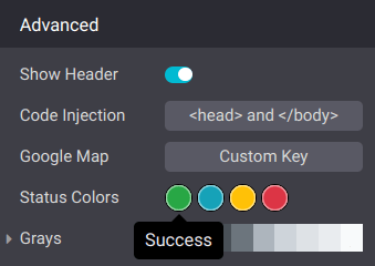
상태 색상
상태 색상을 이용하여 작업 상태(예: 성공, 경고 등)를 나타낼 수 있습니다. 팝업 메시지에도 사용되어 사용자 및 웹사이트 방문자에게 피드백을 제공할 수도 있습니다. 웹사이트 상태 색상 을 사용자 지정하려면 고급 섹션으로 스크롤한 후 점을 클릭하면 색상이 변경됩니다.
Example
페이지 레이아웃
웹사이트 섹션의 페이지 레이아웃 옵션을 활용하여 페이지에서 구성 요소와 웹사이트 요소의 전반적인 표시 및 간격을 변경할 수 있습니다. 드롭다운 메뉴를 클릭하여 원하는 레이아웃을 선택하세요. 페이지 레이아웃 에서 이미지 를 선택하거나, 패턴 에 있는 이미지를 적용하거나, 배경을 비워두는 방식으로 배경 을 맞춤 설정할 수 있습니다.
폰트
Odoo allows you to customize the font family and size for specific elements on your website, including paragraphs, headings, buttons, and input fields.
Font Family: In the Paragraph, Headings, and Button sections, select a font from the dropdown menu.
글꼴 크기: 단락, 제목, 버튼, 입력 필드 섹션에서 글꼴 크기 필드를 이용하여 기본 크기를 설정합니다. :icon:`fa-caret-right`(화살표) 아이콘을 클릭하면 섹션이 확장되고 크기(예: 제목 수준, 버튼 크기 등)를 사용자 지정할 수 있습니다.
Additionally, each element-specific section offers extra styling options, such as Line Height and Margins, for further customization.
사용자 지정 폰트
Odoo에서 기본적으로 제공되지 않는 글꼴도 웹사이트에서 사용할 수 있습니다. 사용자 지정 글꼴을 추가하려면 글꼴 모음 필드의 드롭다운 메뉴를 클릭한 후 드롭다운 메뉴 하단에 있는 사용자 지정 글꼴 추가 를 선택합니다. 팝업창에서 다음과 같이 진행합니다:
Google 글꼴을 추가하려면 Google 글꼴 선택 을 클릭한 후 목록에서 원하는 글꼴을 클릭합니다. 웹사이트를 운영하고 있는 지역이 유럽 연합의 GDPR을 비롯한 법률 준수가 요구되는 지역인 경우 Google 서버에서 글꼴 제공 옵션을 선택 해제합니다. 이렇게 하면 Google 글꼴이 Google 서버가 아닌 웹사이트 서버에 저장됩니다.
To upload a custom font from your computer, click on Choose File.
완료되면 저장 후 새로고침 하세요.
버튼 스타일
To customize the style of your website’s primary and secondary buttons, navigate to the Button section in the website editor and edit the relevant options:
기본 스타일 또는 보조 스타일 필드 옆 화살표를 클릭한 후 각 버튼 유형에 적용할 수 있는 스타일(채우기, 윤곽선 또는 평면) 중 하나를 선택합니다. 윤곽선 을 선택하면 테두리 너비 옵션이 아래에 표시되어 버튼 윤곽선의 너비를 조정할 수 있습니다.
Adjust the Padding to change the size of the spacing (in pixels) around the buttons’ labels.
버튼의 테두리 모양을 맞춤형으로 변경하려면 둥근 모서리 옵션을 활용합니다.
Add an animation when a button is clicked in the On Click Effect dropdown menu.

팁
You can define custom Small and Large sizes for the buttons’ Padding, Font Size, and Round Corners: Click on the (arrow) icon and use the related fields.

링크 스타일
In the Link section, click on Link Style to choose the appearance of links on your website. Select No Underline, Underline On Hover, or Always Underline in the dropdown menu.