Reporting
The Reporting section of the Payroll app offers a variety of reports to choose from, organized by location.
The Payroll report, Work Entry Analysis report, and Salary Attachment Report are default reports in the Payroll app, and are available for all companies, regardless of location.
Beneath the three default reports are all localization-based reports, organized by country, in alphabetical order. These reports contain all the various information for the offered benefits and local tax laws.
To view all the available reports for the database, including all the localization-specific ones, navigate to to view the available reports in a drop-down menu. Click on a specific report to view it.
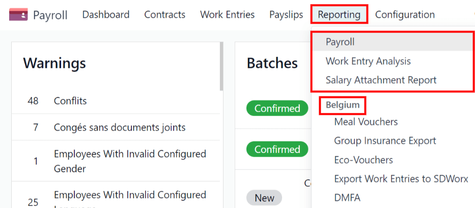
If a report is unavailable to a user, an Invalid Operation pop-up window appears, stating: You must be logged in to a (country) company to use this feature, where “(country)” is the specific country the company is configured for.
Default reports
Payroll
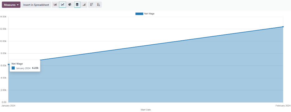
Click on to display the Payroll
Analysis report. This report shows all the payslips generated in the last 365 days, due to the
default filter: Last 365 Days Payslip.
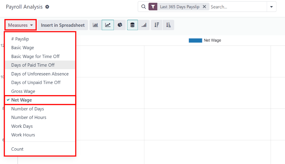
The report can display metrics for a variety of parameters. Click the Measures box to view a drop-down menu with the various metric options to display. The default options available include:
# Payslip
Basic Wage
Basic Wage for Time Off
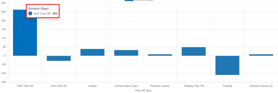
Days of Paid Time Off
Days of Unforeseen Absence
Days of Unpaid Time Off
Gross Wage
Net Wage
Number of Days
Number of Hours
Work Days
Work Hours
Count
Net Wage is the default metric for the Payroll report.
Line chart
A line chart is the default view for the Payroll report. If a different view is selected, click the Line Chart button (represented by a 📈 (chart increasing) icon) in the menu bar to change the view back to a line chart.
Several options are available for the line chart. Click the corresponding button to activate the selection, and change the way the data is presented. These icons appear at the end of the chart options. The various options are:
Stacked: data is presented with each metric in its own line, “stacked” on top of each other. This helps visualize the distribution and variances between different categories.
Cumulative: data is presented with each metric on an individual line, with the total amount calculated by combining all the lines. This provides a comprehensive view of the cumulative data.
Descending: data is shown with the largest values on the left side of the chart, gradually decreasing towards the smallest values on the right side, along the x-axis. This arrangement helps emphasize trends or outliers at the extremes.
Ascending: data is presented with the smallest values on the left side of the chart, increasing towards the largest values on the right side, along the x-axis. This arrangement can be useful for highlighting progressive growth or trends.
Note
These options can be combined to create a variety of views.
Bar chart
To display the data in a bar chart, click on the Bar Chart button (represented by a 📊 (bar chart) icon) in the menu bar.
Click the Stacked icon to view the bar chart in a stacked format (where multiple values appear in each column). Cumulative bar charts are useful for visualizing the progression over time or other categories.
An option to display the columns in Descending or Ascending order appears at the end of the options.
Tip
Clicking an option enables it. To turn off the option, click it again. When the option is enabled the icon appears lighter, with a turquoise outline. When it is inactive, it appears gray, with no outline.
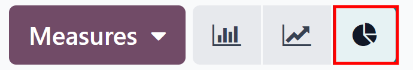
Pie chart
To display the data in a pie chart, click on the Pie Chart button (represented by a (pie chart) icon) in the menu bar. There are no additional options available in this view.
Pivot table
To display the data in a pivot table, click on the Pivot button (represented by a (pivot) icon) located in the far-right side of the top menu bar.
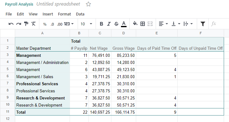
The default information displayed includes the number of payslips (# Payslip), the Net Wage, the Gross Wage, the number of Days of Paid Time Off, and the number of Days of Unpaid Time Off. The information is organized by department.
To display more information on the report, click the Measures button to reveal a drop-down menu. Then, click on any other metric to display it on the pivot table.

To sort the entries by a specific column, such as Net Wage, click on the column name twice. The first click selects the column, and the second click sorts the information in descending order.
To export the data in an XLSX format, click the Download xlsx button, represented by a ⬇️ (down arrow above a horizontal bar) icon, located at the far-right of the available icons. The information is then downloaded into a spreadsheet.
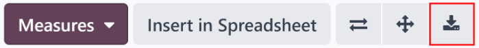
Any report can be inserted into a spreadsheet by clicking the Insert in Spreadsheet button. A Select a spreadsheet to insert your (type of report) pop-up window appears, asking which spreadsheet to place the information in. Select an existing spreadsheet or dashboard, or select a new Blank spreadsheet. Click the Confirm button to move to a spreadsheet view with the report added to it.
Note
If the Documents app is not installed, the Insert in Spreadsheet option places the newly-created spreadsheet in the Dashboards app.
If the Documents application is installed, the spreadsheet has the option to be stored in either the Dashboards app or Documents app.
Filters
At the top of each report, the default filters are shown inside the Search… box.
Click the ⬇️ (down arrow) icon in the search bar to display the available Filters. Filters show information that match the specific filter parameters.
Example
The Work Entries Analysis report has two default filters, the Current month:(Month)
(Year) filter, and the Validated filter.

The Payroll report has only one default filter, the Last 365 Days Payslip filter.
The Salary Attachment Report has only one default filter, the Payslip End Date:
(Year) filter.
All reports can include custom filters, or group information, by different metrics (employee, department, company, etc.).
Some reports have the option to compare the current report to the previous time period or year (a Comparison option).
Click on a parameter to select it and activate it. The report is immediately updated with the new parameters.
The updated report can be set as a favorite report, meaning the parameters are stored for quick access in the future. To do that, click Save the current search, under the Favorites section, located in the search bar drop-down mega menu of filter options. Doing so reveals two options and a Save button.
To set the current report as the default configuration when the report is accessed, check the box next to Default filter. If the current report should be accessible to everyone in the database, check the box next to Share.
Finally, click Save, which saves the currently configured report. Then, it appears beneath the Favorites in the search bar drop-down mega menu of filter options.