欄位及小工具
欄位構建資料庫的 模型。如果您將模型視為表格或試算表,欄位就是列,記錄就是各個行。欄位還定義了儲存在其中的資料類型。欄位資料在 使用者介面 上的呈現和格式化方式由其小工具控制。
使用 Studio,可以:
欄位類型
欄位可大致分為兩類:
簡單欄位
簡單欄位包括基本的資料值,例如文字、數字、檔案等。
備註
若有非預設的小工具可用,會在下方以點列符號或子標題的形式交代。
文字(char)
文字 欄位適用於儲存任何字符的簡短文本。填寫這種欄位時,系統會顯示一行的文字輸入位置。
徽章:以圓角形狀顯示資料值,類似標籤。該值不可在操作介面上編輯,但可設定預設值。
複製至剪貼板:使用者可按一下按鈕,複製該值。
電郵:該值會變成可點按的 傳送電子郵件 (mailto)連結。
圖片:顯示資料值網址的圖片。該值不可手動編輯,但可設定預設值。
備註
此方式與直接選擇 圖片欄位 不同。若使用附有 圖片 小工具的 文字 欄位,圖片不會儲存在 Odoo 中。舉例,如果想節省儲存空間,這方式會很有用。
電話:該值會變成可點按的 撥打電話 (tel)連結。
小訣竅
勾選 啟用短訊 會加入選項,可直接在欄位旁邊,透過 Odoo 發送 SMS 電話短訊。
網址:該值會變成可點按的 URL 網址。
Example

多行文字(text)
多行文字 欄位適用於包含任何類型字符、字數較多的長文本。填寫該欄位時,操作介面會顯示兩行的文字輸入位置。
複製至剪貼板:使用者可按一下按鈕,複製該值。
Example

整數(integer)
整數 欄位適用於所有整數數字( 正數、負數或零,沒有小數部份 )。
百分比圓形圖:以百分比圓形圖顯示數值,通常為計算得出的值。該值不可在操作介面上編輯,但可設定預設值。
進度列:在百分比進度列旁邊顯示數值,通常為計算得出的值。該欄位不可手動編輯,但可設定預設值。
把手:顯示拖曳把手圖示,用於在 列表檢視畫面 中,將記錄手動排序。
Example

小數(float)
小數 (或稱浮點數)欄位,適用於所有小數數字( 正數、負數或零,帶有小數部份 )。
備註
小數在用戶操作介面上,會顯示為兩個小數位的小數,但在資料庫中,其實是以更高精確度儲存。
貨幣金額:與使用 貨幣金額 欄位類似。建議使用後者,因為它提供較多功能。
百分比:在數值後方顯示百分比符號
%。百分比圓形圖:以百分比圓形圖顯示數值,通常為計算得出的值。該欄位不可手動編輯,但可設定預設值。
進度列:在百分比進度列旁邊顯示數值,通常為計算得出的值。該欄位不可手動編輯,但可設定預設值。
時間:數值必須為 hh:mm (小時:分鐘)格式,分鐘數值最大為 59。
Example

貨幣金額(monetary)
貨幣金額 欄位適用於所有貨幣值。
備註
你首次加入 貨幣金額 欄位時,若模型未有 貨幣 欄位,系統會提示你加入貨幣欄位,以設定幣種。Odoo 可為你加入適用的 貨幣 欄位。完成後,便可加入 貨幣金額 欄位。
Example

HTML(html)
HTML 欄位適用於加入可使用 Odoo HTML 編輯器編輯的文字。
多行文字:會停用 Odoo HTML 編輯器,以便允許編輯 HTML 原文。
Example

日期(date)
日期 欄位可從日曆中選擇日期。
剩餘天數:從目前日期起計,距離選取的日期還剩下多少天,例如: 剩餘 5 天 。此欄位應設為 唯讀。
Example

日期時間(datetime)
日期時間 欄位可從日曆中選擇日期,並從時鐘選擇時間。若未有設定時間,會自動採用使用者目前的時間。
日期範圍(daterange)
日期範圍 小工具適用於顯示包括開始日期及結束日期的時間段,以一行顯示全部資料。日期範圍可將開始及結束日期設為必填(例如:表示多天活動的日期),也可將開始或結束日期設為可選填(例如:用於上門介入工作或專案任務)。
加入日期範圍時,需要有兩個欄位:一個是附有 日期範圍 小工具的 日期時間 欄位,另一個是設為開始日期 或 結束日期的欄位。底層的參考欄位可以是現有的 日期 或 日期時間 欄位,也可以是專門為此用途而建立的欄位。
要加入日期範圍:
確定一個現有的 日期 或 日期時間 欄位,用作底層的開始或結束日期參考欄位,或新增一個欄位。如果日期範圍是:
必須填寫開始及結束日期,此欄位可以是開始日期或結束日期,選擇兩者的結果相同。
允許選填開始日期或結束日期,此欄位便會分別是開始日期或結束日期。
小訣竅
為避免重複顯示相同資訊,你可將底層的開始/結束日期欄位,設定為 不顯示,或按一下 從檢視中移除,將該日期從檢視畫面中移除,使之無法看見。
加入一個 日期時間 欄位,並將 小工具 欄位設定為 日期範圍。
輸入適當的 標籤。
根據需要,在 開始日期欄位 或 結束日期欄位 下拉式選單中,選擇相應的底層開始/結束日期欄位。
若日期範圍必須包括開始日期及結束日期,請啟用 總是使用範圍。
更新任何其他需要更新的 一般屬性 或 日期時間欄位特定屬性,然後按一下畫面右上角的 關閉。
Example

剩餘天數(remaining_days)
剩餘天數 小工具顯示從目前的日期及時間起計,距離選取的日期還剩下多少天,例如: 剩餘 5 天 。此欄位應設為 唯讀。
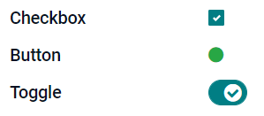
勾選方格(boolean)
勾選方格 欄位適用於資料值只可以是「真」或「假」的情況,以方格有否被勾選去表示。
按鈕:顯示為單選圓鈕。該小工具無需切換至編輯模式也可運作。
切換:顯示為切換按鈕。該小工具無需切換至編輯模式也可運作。
Example
選單(selection)
選單 欄位適用於提供選項清單,用戶可從一組預先定義的值中,選擇其中一個值。
徽章:以圓角形狀顯示資料值,類似標籤。該值不可在操作介面上編輯,但可設定預設值。
徽章:以長方形形狀顯示可選值,所有已選取的值會同時顯示,以水平方式排列。
優先級別:顯示為星星圖示,而非數值,可用作表示重要程度或滿意度等。與選用 優先等級 欄位的效果相同,但後者已預先定義了 4 種優先級別數值。
單選圓鈕:以單選圓鈕顯示可選的值,所有可選值會同時顯示。
小訣竅
預設情況下,單選圓鈕是以垂直方式排列。你可啟用 水平顯示 選項,以切換顯示方式。
狀態列:以箭嘴進度列顯示可選值,所有可選值會同時顯示。
小訣竅
預設情況下,狀態列上的資料值可點按選取。你可停用 可點按 選項,防止使用者在操作介面編輯這些值。
Example

優先級別(selection)
優先級別 欄位以三星評分格式顯示,可用作表示重要程度或滿意度。此欄位類型是 選擇欄位,預設會選取 優先級別 小工具,並有 4 個預先定義的優先級別值。故此, 徽章 、 單選圓鈕 及 選單 小工具的效果,與 選單 章節所述相同。
小訣竅
若要透過增加或刪除可選值,去更改可用的星星圖示數目,請按一下 編輯值。請留意,設定的首個資料值是等於 0 星,即未作選擇。因此,4 個可選值會顯示為 3 粒星的評分系統,如此類推。
Example

檔案(binary)
檔案 欄位可用作上載任何類型的檔案,或用作簽署表單( 電子簽名 小工具)。
Example

圖片(binary)
圖片 欄位可用作上載圖片,並在 表單檢視畫面 中顯示。此欄位類型是 檔案 欄位,預設已選取 圖片 小工具。故此,檔案 、 PDF 檢視工具 及 電子簽名 小工具的效果,與 檔案 章節所述相同。
小訣竅
若要變更上載圖片的顯示大小,請在 大小 選項下,選擇 小 、 中 或 大。
電子簽名(binary)
電子簽名 欄位適用於透過電子形式簽署表單。此欄位類型是 檔案 欄位,預設已選取 電子簽名 小工具。故此,檔案、圖片 及 PDF 檢視工具 小工具的效果,與 檔案 章節所述相同。
小訣竅
若想讓使用者在繪製簽名時可使用 自動完成 功能,請選擇其中一個可用的 自動完成依據 欄位(只限模型中的 文字、多對一(Many2One) 及 相關欄位)。系統會使用所選欄位的資料,自動產生簽名圖樣。
關係欄位
關係欄位用作連結及顯示其他模型的記錄資料。
備註
若有非預設的小工具可用,會在下方以點列符號交代。
多對一 Many2One(many2one)
多對一 (Many2One)欄位適用於將另一項記錄(儲存於另一模型)連結至正在編輯的記錄。使用的另一模型記錄名稱,會於正在編輯的記錄中顯示。
Example
舉例,在 銷售單 模型中,客戶 欄位其實是指向 聯絡人 模型的 多對一 欄位。「多對一」的意思,是允許 多張 銷售單連結至 同一名 聯絡人(即客戶)。

小訣竅
若要防止使用者在已連結的模型中建立新的記錄,可勾選 禁止建立。
若要防止使用者以彈出視窗開啟記錄查看,可勾選 禁止開啟。
為協助使用者選取正確的記錄,請按一下 範圍,以建立篩選器。
徽章:以圓角形狀顯示資料值,類似標籤。該值不可在操作介面上編輯。
單選圓鈕:以單選圓鈕顯示可選的值,所有可選值會同時顯示。
一對多 One2Many(one2many)
一對多 (One2Many)欄位可用作顯示目前模型內的記錄與另一模型中多項記錄之間,已存在的現有關係。
Example
例如,你可在 聯絡人 模型中加入 一對多 欄位,便可查看 一名 個別客戶的 多張 銷售單。

備註
要使用 一對多 欄位,兩個模型必須已透過 多對一欄位 連結。一對多關係不會獨立存在,系統會進行反向搜尋,尋找目前已有的多對一關係。
資料行(one2many)
資料行 欄位是用於建立由資料列(橫列)及直欄構成的表格,例如銷售單的產品資料行。
小訣竅
若要修改直欄,請按一下 資料行 欄位,然後按 編輯列表檢視。若要編輯使用者按下 加入資料行 時彈出的表單,請按一下 編輯表單檢視。
Example

多對多(many2many)
多對多 (Many2Many)欄位用於將另一模型中的多項記錄,連結至目前模型中的多項記錄。與 多對一 欄位一樣,多對多欄位也可使用 禁止建立 、 禁止開啟 及 範圍 功能。
Example
舉例,在 任務 模型中, 受指派人 欄位是一個指向 聯絡人 模型的 多對多 欄位。這樣便可允許一名使用者被指派至 多項 任務,同時也允許 多名 使用者被指派至同一個任務。

勾選方格:使用者可使用勾選方格,選取多個值。
標籤:使用者可選取多個以圓角形狀顯示的值,這些值也稱為「標籤」。這與選用 標籤 欄位的效果相同。
標籤(many2many)
標籤 欄位可用於顯示多個來自另一模型的值,這些值以圓角形狀顯示,也稱為 標籤 。此欄位類型是 多對多欄位,預設已選取 標籤 小工具。故此, 勾選方格 及 多對多 小工具的效果,與 多對多 章節所述相同。
小訣竅
若要使用不同背景顏色顯示不同標籤,請勾選 使用顏色。
Example

將欄位加入視圖
使用 Studio 可以加入:
小訣竅
將新欄位加入表單或列表視圖,可將其儲存到模型,並使其作為現有欄位在同一模型的其他視圖中可用。
加入新欄位
小訣竅
在加入新欄位*之前*啟用 開發者模式,以便在配置期間查看並編輯欄位的技術名稱。
若要加入新欄位,請依照以下步驟操作:
導覽至相關表單或清單檢視,然後按一下右上角的 (切換 Studio) 圖示。或者,在任何應用程式開啟時,按一下 (切換 Studio) 圖示,然後導覽至相關表單或清單檢視。
在 加入 分頁中,從 新欄位 區段拖曳相關:ref:
欄位類型 <studio/fields/field-types>,並將其放置在所需位置。如果新欄位是:ref:關聯欄位 <studio/fields/relational-fields>,請在彈出視窗中選擇相關的對應欄位、模型或相關欄位。在 屬性 分頁中,配置欄位的:ref:
屬性 <studio/fields/properties>:輸入要在使用者介面上顯示為欄位名稱的 標籤;這也用於產生欄位的預設技術名稱。
按一下 標籤 欄位外的任意位置,即可看到 技術名稱 已更新為預設技術名稱。
備註
新欄位的 技術名稱 可以在配置過程中於 Studio 中編輯。在其他任何時候,欄位的技術名稱只能:ref:
透過資料庫的技術設定進行修改 <studio/fields/properties-technical-name-change>。使用 Studio 加入的新欄位技術名稱預設會加上
x_studio_前綴。
可選擇透過下拉式選單選擇不同的 小工具;預設會選擇該:ref:`欄位類型 <studio/fields/field-types>`的預設小工具。
可選擇配置任何其他:ref:
欄位屬性 <studio/fields/properties>。
按一下右上角的 關閉 以關閉 Studio。
加入現有欄位
若要加入模型上存在但目前檢視中不存在的欄位,請依照以下步驟操作:
導覽至相關檢視,然後按一下右上角的 (切換 Studio) 圖示。或者,在任何應用程式開啟時,按一下 (切換 Studio) 圖示,然後導覽至相關檢視。
在 加入 分頁的左側面板中,按一下 現有欄位 以顯示目前檢視中不存在的所有模型欄位清單。
拖曳相關欄位並將其放置在所需位置。
在 屬性 分頁中,為目前檢視中的欄位配置相關:ref:
屬性 <studio/fields/properties>。備註
如有需要,可以為不同檢視獨立配置各種屬性,例如 標籤、小工具、特定使用者群組的欄位可見性,以及欄位是否為 隱藏、必填 或 唯讀。
按一下右上角的 關閉 以關閉 Studio。
欄位屬性
對於大多數:ref:欄位類型和小工具 <studio/fields/field-types>`組合,都可以配置一系列:ref:`一般屬性 <studio/fields/properties-general>。根據所選的特定欄位類型和小工具,還有其他可用屬性。例如,使用 日期與時間 或 日期範圍 小工具的 日期與時間 欄位具有各種可配置的:ref:特定屬性 <studio/fields/properties-date-datetime>。
一般屬性
隱藏:若使用者無需在操作介面看到該欄位,便可啟用此屬性。這有助簡化使用者操作介面,只會顯示個別情況需要顯示的欄位。
必填:若使用者必須先完成填寫該欄位才可繼續操作,可啟用此屬性。
唯讀:若不應讓使用者修改該欄位,可啟用此屬性。
小訣竅
標籤:這是使用者介面上的欄位名稱;標籤用於產生欄位的技術名稱。
幫助提示:若想提供註釋,解釋欄位的用途,可加入工具提示描述。使用者以滑鼠停留在欄位顯示標籤旁邊的問號圖示時,便會出現提示文字,以工具提示方塊顯示。
技術名稱:要在Studio中查看欄位的技術名稱(並在配置新欄位時根據需要編輯),請啟動:ref:
開發人員模式 <developer-mode>。小訣竅
如果此欄位需要更新但無法再透過Studio編輯,則可以:ref:`透過資料庫的技術設定修改 <studio/fields/properties-technical-name-change>`技術名稱。
小工具:若要變更欄位的預設外觀或功能,可選用其中一個可用的小工具。
佔位符:若想提供如何填寫欄位的範例,可加入佔位文字。使用者輸入資料值之前,佔位文字會在欄位內,以淺灰色顯示。
預設值:若要在建立記錄時,在欄位中顯示預設值,可加入此值。
允許向群組顯示:若想限制哪些使用者可看見此欄位,可選取一個或多個「使用者存取 群組 」。
禁止向群組顯示:若想防止部份使用者看見此欄位,可選取一個或多個「使用者存取 群組 」。
日期時間欄位屬性
設定了 日期時間 或 日期範圍 小工具的 日期時間 欄位,可使用以下特別屬性:
時間間隔:此值決定時間選擇器所顯示的分鐘間隔。例如:輸入「15」可設定每隔 15 分鐘有可選時間。預設值為 5 分鐘。
警告未來日期:啟用此屬性後,若選取了未來日期,系統會顯示警告圖示。
顯示時間: 日期時間 欄位預設會啟用此屬性。對於唯讀欄位,停用此屬性會只顯示日期。舉例,如此設定可使列表檢視畫面較簡潔。
最早接受日期:日期選擇器可選取的最早日期,以 ISO 格式輸入,即
YYYY-MM-DD(年年年年-月月-日日)。若最早接受的日期必定是目前日期,請輸入today(今天)。在日期選擇器中,最早接受日期之前的日期會以灰色顯示。最遲接受日期:日期選擇器可選取的最遲日期,以 ISO 格式輸入,即
YYYY-MM-DD(年年年年-月月-日日)。若最遲接受的日期必定是目前日期,請輸入today(今天)。在日期選擇器中,最遲接受日期之後的日期會以灰色顯示。
修改欄位的屬性
要修改欄位的屬性,請按照以下步驟操作:
修改欄位的技術名稱
要修改欄位的技術名稱,請啟動:ref:開發人員模式 <developer-mode>,然後按照以下步驟操作:
在 Studio 中開啟欄位後,複製該欄位的技術名稱。
從 Studio 的*所有*檢視中移除欄位,然後按一下 關閉 以關閉 Studio。
導覽至 。
將複製的技術名稱貼到搜尋列中,然後開啟相關的欄位。
視需要修改 欄位名稱。
更新欄位的技術名稱後,即可從現有欄位清單中 將欄位加入(回)相關的檢視。
重要
更新欄位的技術名稱時,請務必至少保留 x_ 前綴,這是所有自訂欄位的必要條件;對於使用 Studio 建立的欄位,請保留 x_studio_ 前綴,以便更容易識別這類欄位。
從檢視中移除欄位
若要從檢視中移除欄位,請依照下列步驟操作:
導覽至相關檢視,然後按一下右上角的 (切換 Studio) 圖示。或者,在任何應用程式開啟時,按一下 (切換 Studio) 圖示,然後導覽至相關檢視。
按一下相關欄位。
捲動至 屬性 分頁的底部,然後按一下 從檢視中移除。
按一下 確定 以確認動作。