화면
화면은 모델에 있는 데이터를 표시할 수 있는 인터페이스입니다. 하나의 모델에는 여러 개의 화면이 있을 수 있는데, 동일한 데이터를 다르게 표시한다는 점에서만 차이가 있습니다. 스튜디오에서 다음의 네 가지 카테고리로 화면을 설정합니다:ref:일반 <studio/views/general>, 다중 레코드, 타임라인 및 보고.
팁
To change the default view of a model, go to .
참고
내장된 XML 편집기를 사용하여 보기를 수정할 수 있습니다. 수정하려면 개발자 모드 를 활성화한 후 편집하려는 보기로 이동하여 보기 탭을 선택한 다음 </> XML 을 클릭합니다.
중요
XML 편집기로 화면을 편집하는 경우, 업그레이드나 모듈 업그레이드를 할 때 초기화된 후 유지가 되지 않기 때문에 직접 표준 화면 및 상속된 화면을 변경하지 마시기 바랍니다. 항상 스튜디오 상속 화면이 제대로 선택되어 있는지 확인합니다. 실제로 새로운 필드를 끌어다 놓아서 스튜디오 화면을 수정하는 경우, 특정 스튜디오에서 상속된 화면 및 화면에서의 수정된 부분을 해당 XPath가 자동으로 생성되어 정의합니다.
일반 보기
참고
아래에 설명되어 있는 설정은 별도로 지정하지 않는 한 보기에 있는 보기 탭에서 확인할 수 있습니다.
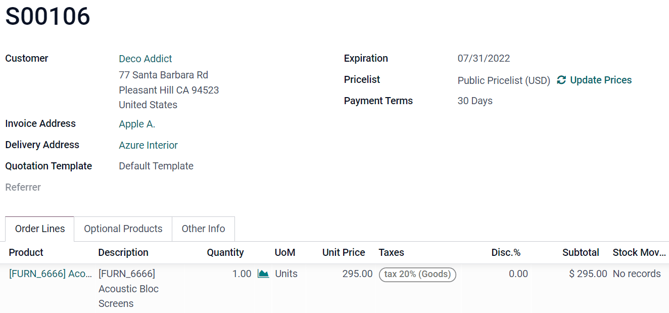
양식
The Form view is used when creating and editing records, such as contacts, sales orders, products, etc.
To structure a form, drag-and-drop the Tabs and Columns element found under the + Add tab.
To prevent users from creating, editing, or deleting records, untick Can Create, Can Edit, or Can Delete.
Example
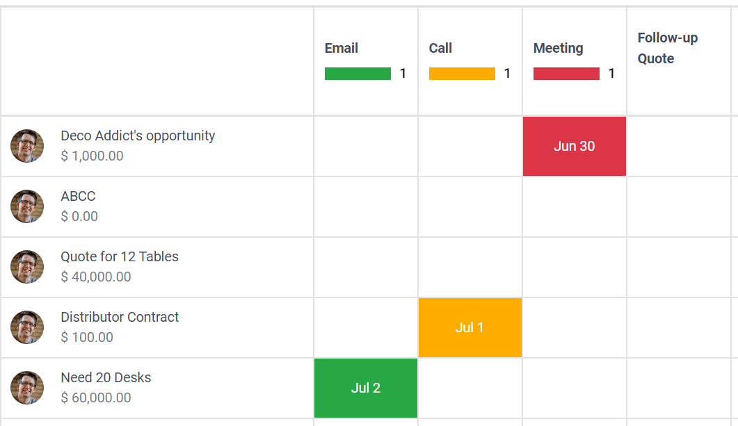
활동
The Activity view is used to schedule and have an overview of activities (emails, calls, etc.) linked to records.
참고
이 보기는 스튜디오 내에서만 XML 코드를 편집하여 수정할 수 있습니다.
Example
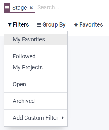
검색
The Search view is added on top of other views to filter, group, and search records.
To add custom Filters and structure them using Separators, go to the + Add tab and drag and drop them under Filters.
To add an existing field under the search dropdown menu, go to the + Add tab and drag-and-drop it under Autocompletion Fields.
Example
여러 레코드 보기
참고
아래에 설명되어 있는 설정은 별도로 지정하지 않는 한 보기에 있는 보기 탭에서 확인할 수 있습니다.
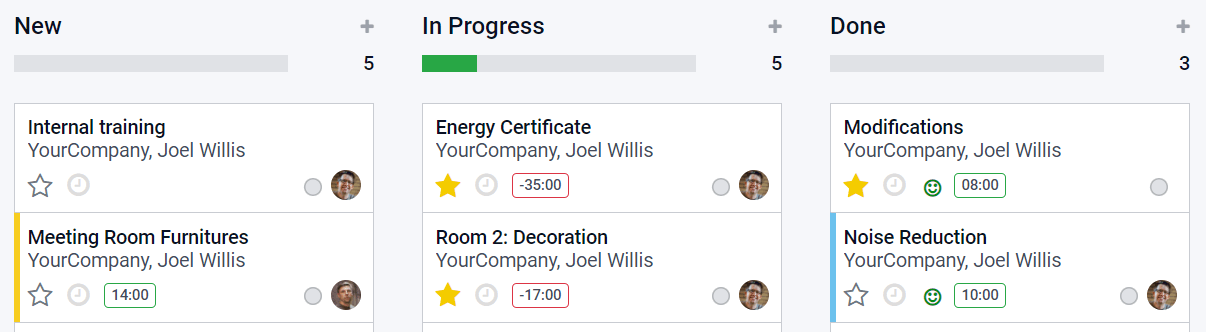
칸반
The Kanban view is often used to support business flows by moving records across stages or as an alternative way to display records inside cards.
참고
If the Kanban view exists, it is used by default to display data on mobile devices instead of the List view.
사용자가 새 레코드를 만들지 못하게 하려면 만들 수 있음 을 선택 해제합니다.
보기 내에서 최소한의 형식으로 직접 레코드를 생성하려면 빠른 생성 을 활성화합니다.
To change the way records are grouped by default, select a new group under Default Group by.
Example
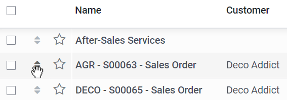
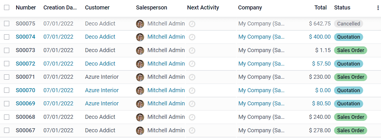
목록
The List view is used to overview many records at once, look for records, and edit simple records.
To prevent users from creating, editing, or deleting records, untick Can Create, Can Edit, or Can Delete.
To create and edit records directly within the view, select either New record on top or New record at the bottom under Editable.
참고
이렇게 하면 목록 보기에서 양식 보기 레코드를 열 수 없습니다.
한 번에 여러 개의 레코드를 편집하려면 대량 편집 사용 을 선택합니다.
레코드 정렬 방식에 대한 기본값을 변경하려면 정렬 기준 에서 필드를 선택합니다.
팁
To add a drag handle icon to reorder records manually, add an Integer field with the Handle widget.
Example
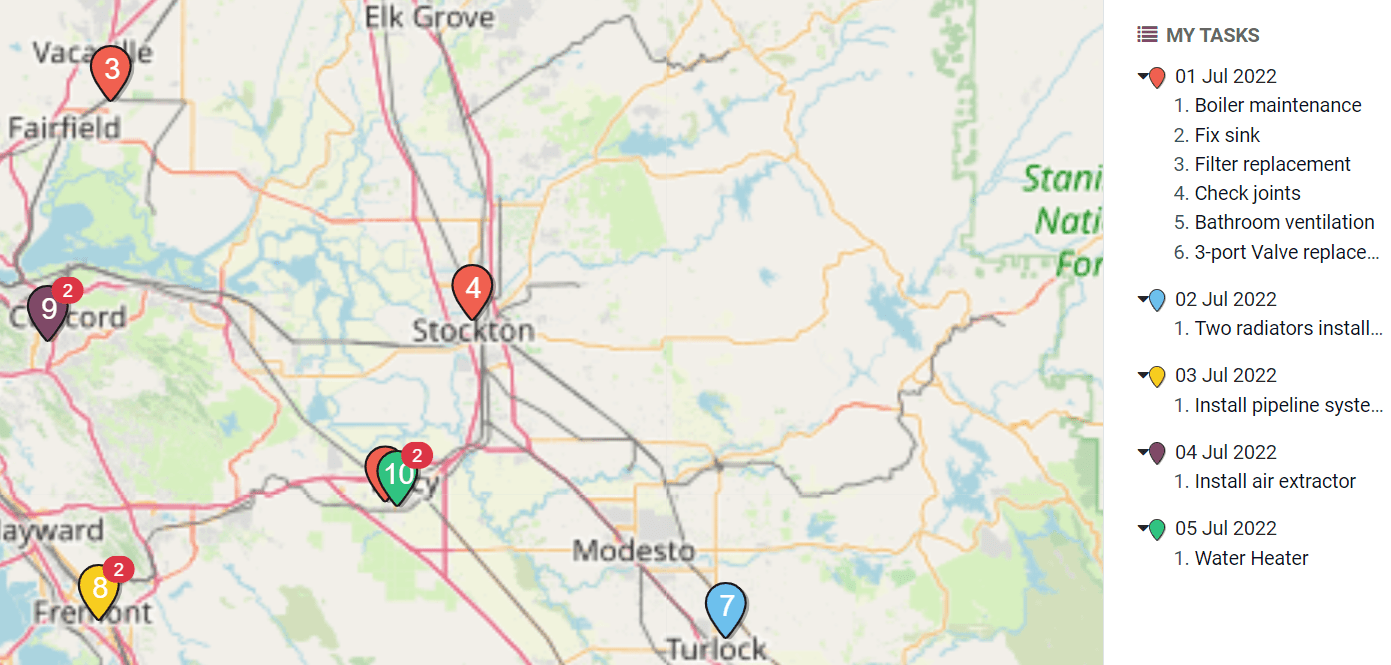
지도
The Map view is used to display records on a map. For example, it is used in the Field Service app to plan an itinerary between different tasks.
참고
연락처 모델에 연결된 다대일 필드 는 보기를 활성화하는 데 필요합니다. 연락처 주소는 지도에 레코드를 배치하는 데 사용되기 때문입니다.
To select which kind of contact should be used on the map, select it under Contact Field.
To hide the name or the address of the record, tick Hide name or Hide Address.
다른 필드에 있는 정보를 추가하려면 추가 필드 에서 선택합니다.
To have a route suggested between the different records, tick Enable Routing and select which field should be used to sort records for the routing.
Example
타임라인 보기
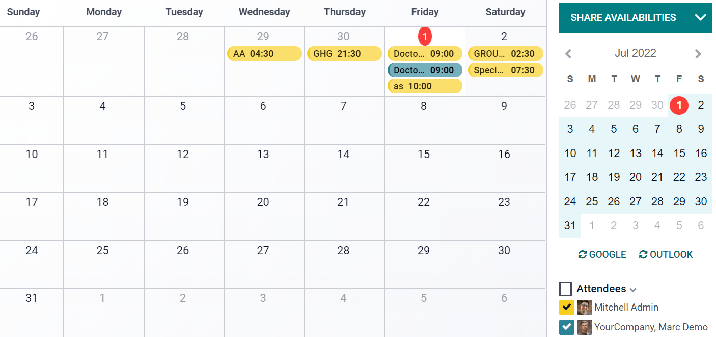
캘린더
The Calendar view is used to overview and manage records inside a calendar.
To create records directly within the view instead of opening the Form view, enable Quick Create.
참고
이 기능은 이름 만으로 빠르게 생성 할 수 있는 특정 모델에서만 작동합니다. 그러나 대부분의 모델에서는 빠른 생성이 지원되지 않으며 양식 보기를 열어 필수 필드를 입력해야 합니다.
캘린더에 있는 레코드에 색상을 지정하려면 색상 에 있는 필드를 선택합니다. 이 필드 값이 같은 레코드는 같은 색상으로 표시됩니다.
참고
As the number of colors is limited, the same color can end up being assigned to different values.
하루 종일 지속되는 행사를 캘린더 상단에 표시하려면, 확인란 필드 에 행사가 하루 종일 지속되는 행사인지 여부를 선택합니다.
To choose the default time scale used to display events, select Day, Week, Month, or Year under Default Display Mode.
참고
행사 기간을 지정하는 모델에서 지연 필드 를 사용하면 소수 또는 정수 를 선택하여 행사 기간을 시간 단위로 표시할 수 있습니다. 필드입니다. 그러나 종료일 필드 를 설정하면 :guilabel:`지연 필드`는 고려되지 않습니다.
Example
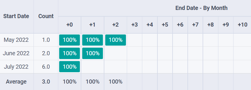
코호트
The Cohort view is used to examine the life cycle of records over a time period. For example, it is used in the Subscriptions app to view the subscriptions’ retention rate.
To display a measure (i.e., the aggregated value of a given field) by default on the view, select a Measure Field.
To choose which time interval is used by default to group results, select Day, Week, Month, or Year under Interval.
코호트 모드 를 변경하려면 유지율 즉 일정 기간 동안 유지되는 레코드의 비율, 100% 부터 시작하여 시간이 지남에 따라 감소 또는 이탈율 일정 기간 동안 이탈하는 레코드의 비율, 0% 부터 시작하여 시간이 지남에 따라 증가 중에서 하나를 선택합니다.
타임라인 (즉, 열)이 진행되는 방식을 변경하려면 앞으로 (0에서 +15까지) 또는 뒤로 (-15에서 0까지) 중에서 하나를 선택합니다. 대부분의 경우 타임라인에서는 앞으로 를 사용합니다.
Example
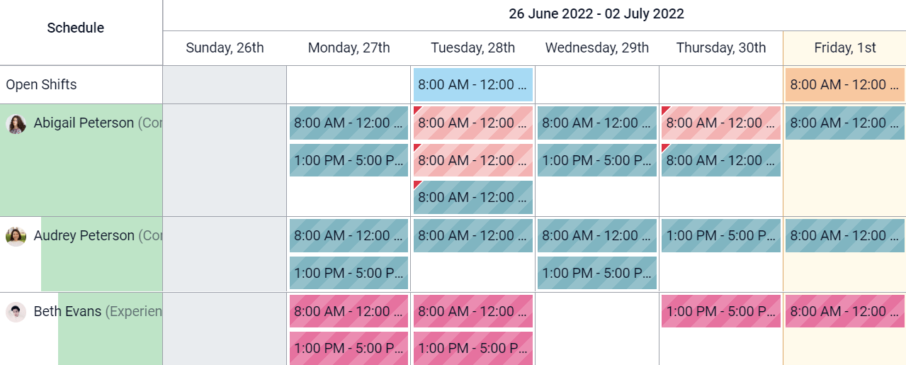
간트 차트
The Gantt view is used to forecast and examine the overall progress of records. Records are represented by a bar under a time scale.
레코드 생성이나 편집을 하지 못하게 하려면 생성 가능 또는 편집 가능 을 선택 해제합니다.
To fill cells in gray whenever a record should not be created there (e.g., on weekends for employees), tick Display Unavailability.
참고
기본 모델에서는 반드시 이 기능이 지원되어야 하며, 이 기능은 스튜디오를 통해 추가할 수 없습니다. 프로젝트, 휴가, 일정 수립 및 제조 관리 앱에서 지원됩니다.
총계 행을 하단에 표시하려면 총계 행 표시 를 선택합니다.
여러 개의 레코드를 한 행으로 축소하려면 첫 번째 수준에서 축소 를 선택합니다.
To choose which way records are grouped by default on rows (e.g., per employee or project), select a field under Default Group by.
To define a default time scale to view records, select Day, Week, Month, or Year under Default Scale.
보기에 있는 레코드에 색상을 지정하려면 색상 에 있는 필드를 선택합니다. 이 필드 값이 같은 레코드는 같은 색상으로 표시됩니다.
참고
색상 수가 제한되어 있으므로 동일한 색상을 다른 값에 지정할 수 있습니다.
각각의 시간 척도를 나누는 정밀도를 분기 단위 시간, 30분 단위 시간 또는 시간 중에서 지정합니다. 이 단위는 일 단위 정밀도, 반일 또는 일 혹은 주 단위 정밀도, 월 단위 정밀도 아래에서 선택할 수 있습니다.
Example
조회수 보고
참고
아래에 설명되어 있는 설정은 별도로 지정하지 않는 한 보기에 있는 보기 탭에서 확인할 수 있습니다.
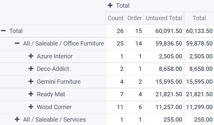
피벗 테이블
피벗 보기는 레코드에 있는 데이터를 대화형 방식으로 탐색하고 분석하는 데 사용합니다. 숫자 데이터를 집계하고, 카테고리를 만들며, 데이터를 다양한 수준으로 확장 및 축소하여 데이터 드릴다운을 하는 데 특히 유용합니다.
셀 아래에 데이터가 집계된 레코드에 액세스하려면 셀에서 레코드 액세스 를 선택합니다.
To divide the data into different categories, select field(s) under Column grouping, Row grouping - First level, or Row grouping - Second level.
To add different types of data to be measured using the view, select a field under Measures.
To display a count of records that made up the aggregated data in a cell, tick Display count.
Example
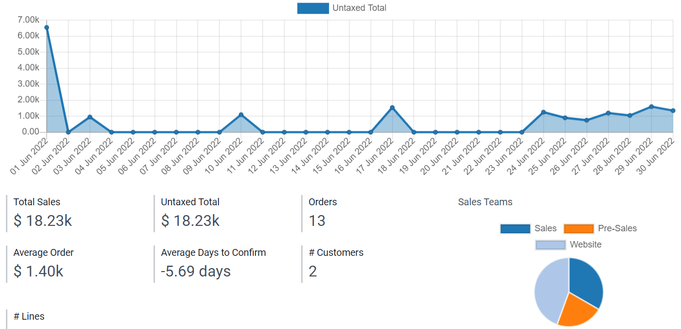
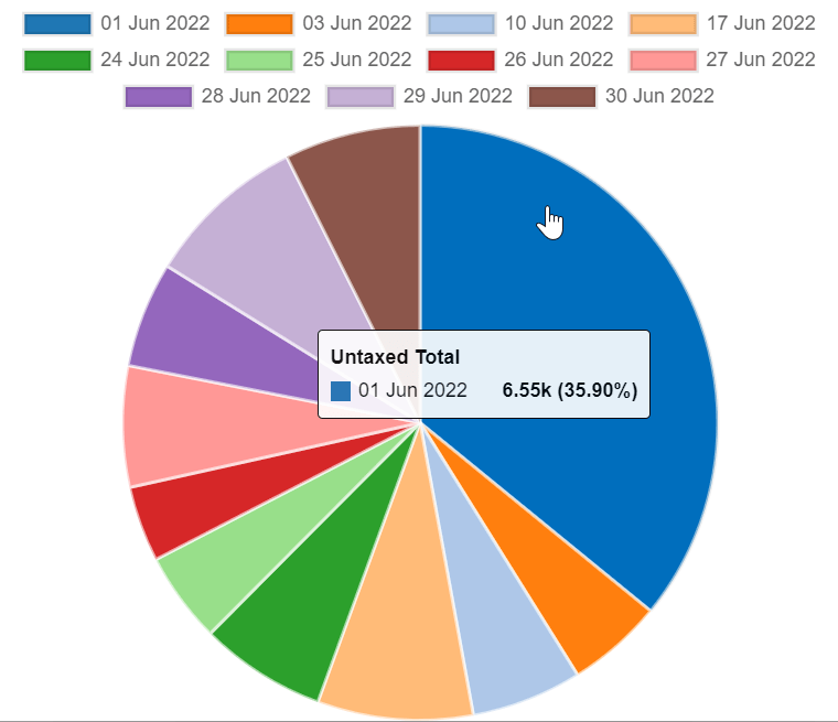
그래프
The Graph view is used to showcase data from records in a bar, line, or pie chart.
기본 그래프를 변경하려면 유형 에서 막대, 선 또는 원 을 선택합니다.
To choose a default data dimension (category), select a field under First dimension and, if needed, another under Second dimension.
To select a default type of data to be measured using the view, select a field under Measure.
막대 그래프 및 선 그래프 전용: 여러 가지 데이터 카테고리를 값을 기준으로 정렬하려면 :guilabel: ‘정렬’ 메뉴 아래에 있는 오름차순 (가장 낮은 값에서 가장 높은 값으로) 또는 내림차순 (가장 높은 값에서 가장 낮은 값으로)을 선택합니다.
For Bar and Pie charts only: To access all records whose data is aggregated under a data category on the chart, tick Access records from graph.
For Bar charts only: When using two data dimensions (categories), display the two columns on top of each other by default by ticking Stacked graph.
Example
현황판
The Dashboard view is used to display multiple reporting views and key performance indicators. Which elements are displayed on the view depends on the configuration of the other reporting views.
Example