While a contact form is all about getting information like name, email address and phone number, a bit of thought does have to go into the design.
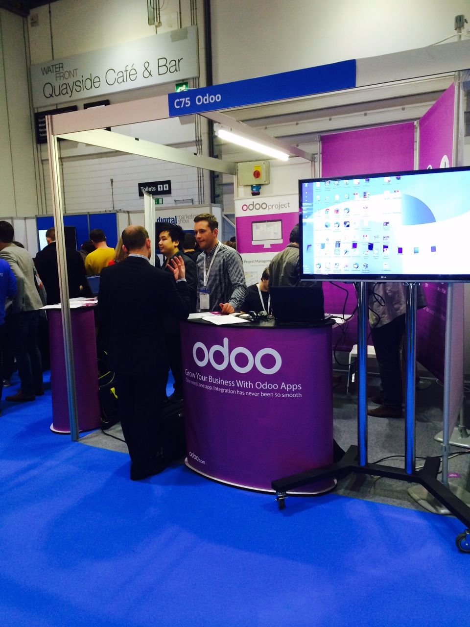
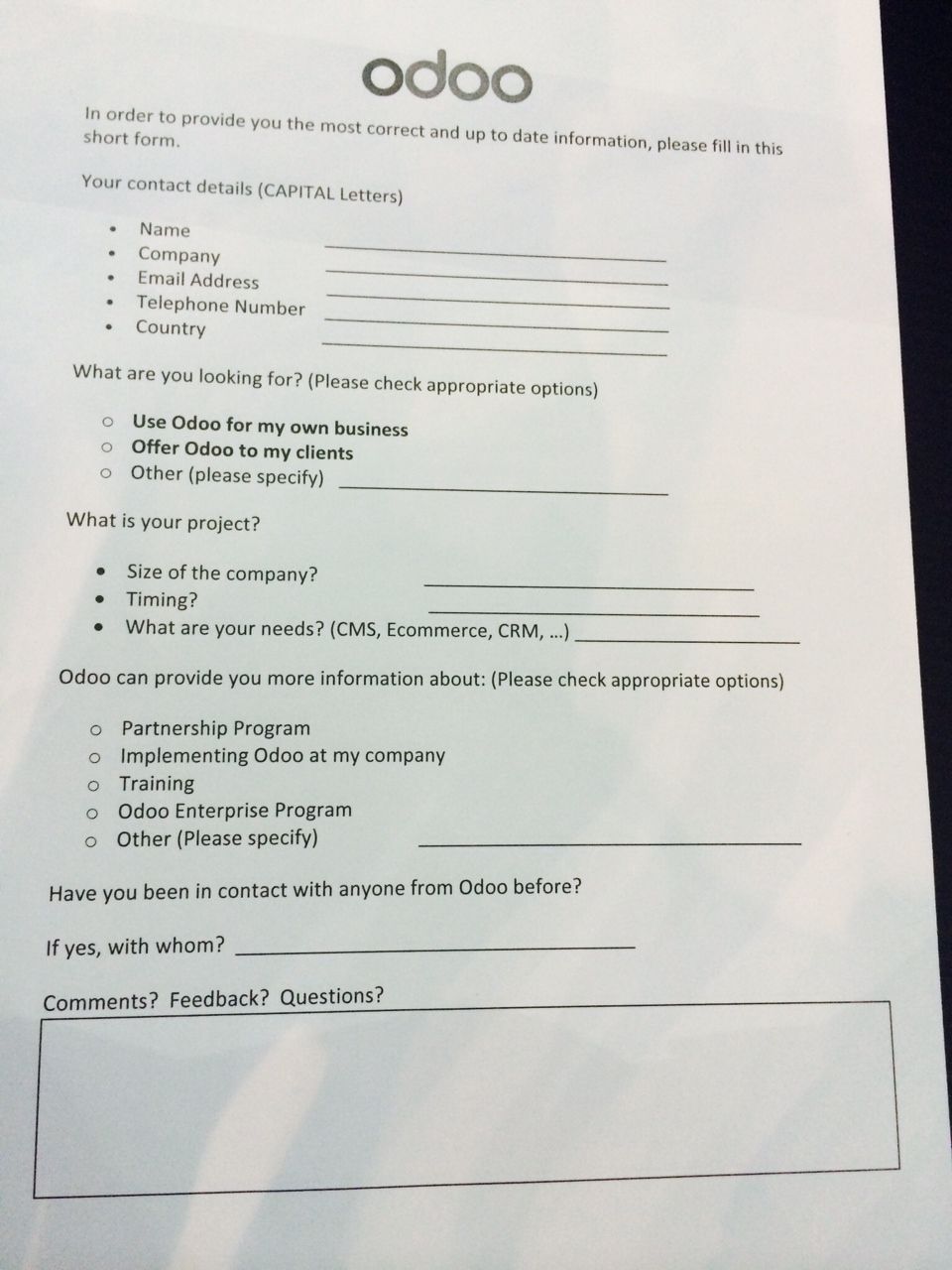
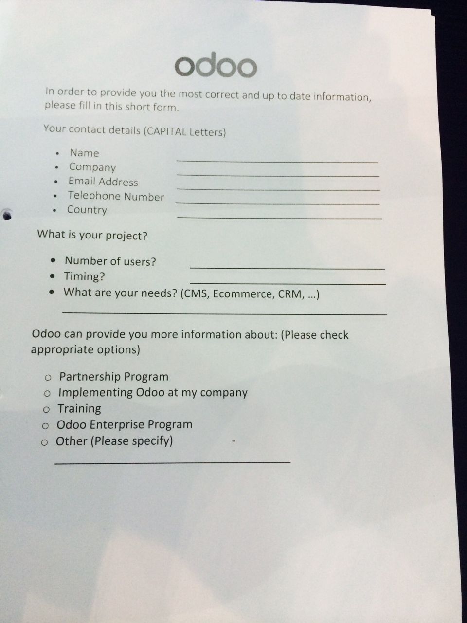
Minimize the number of fields. With an online contact form, don't ask for too much. Think about what information you need right away, what you need to get the ball rolling, what you need to qualify a lead. With this in mind, really think about what fields are essential and choose carefully. You can always ask for more details later on down the road. What we did with the second version of our paper form (picture above right) was remove the "Comments? Feedback? Questions?" Then, while talking to the people we met, we tried to get as much verbal information from them as possible and quickly write it down on their form after they had left - you will need good memory skills for this.
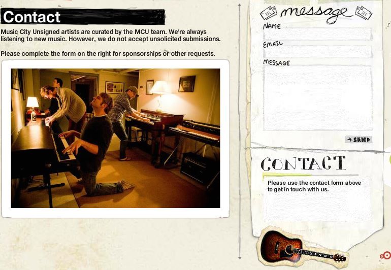
Strike the right tone. I'm not the first (and surely won't be the last) to praise this Contact page done by Music City Unsigned. The company operates in the cool, independent music scene and their Contact page is something their target audience will respond well to - the photo, the icons and even the font choices. Contact forms don't always have to be serious. Think about your audience and make yours appealing to them. Don't be afraid to be different, it will help you stand out from the crowd.
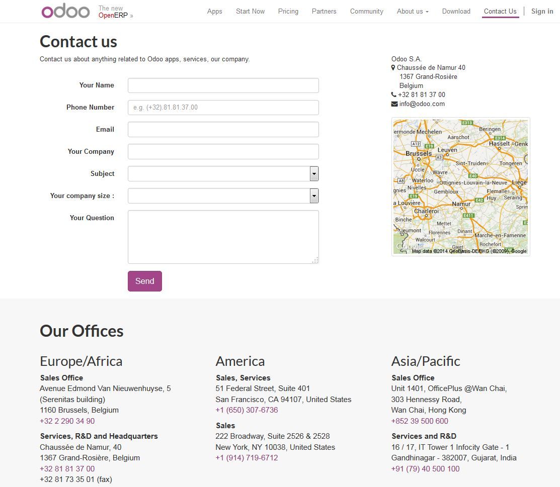
Contact works both ways. Remember this exchange of information is a two-way street. The people that you ask to give you their details should be able to find yours just as easily. For physical contact forms on a piece of paper, adding your company's details will make the page too cluttered - that's what traditional business cards are for. For the contact form on your website, it's a good idea to include all your details - your address, phone numbers and you can even add a map like we do.

Create a contact form that gets filled in