
ฟิลด์และวิดเจ็ต
Fields structure the models of a database. If you think of a model as a table or spreadsheet, fields are the columns and records are the individual rows. Fields also define the type of data that is stored within them. The way in which a field's data is presented and formatted on the UI is controlled by its widget.
With Studio, it is possible to:
add new fields to your database. From a technical point of view, there are 15 field types in Odoo. However, you can choose from 21 field types in Studio, as some field types are available more than once with a different default widget;
add existing fields, i.e., fields that already exists on a model, to any view of that model;
Studio fields vs. property fields
Fields created using Studio are saved as columns in your Odoo database. Property fields, on the other hand, act as pseudo-fields; they are shared by all records that are linked to the same parent record (e.g., for tasks, the project, or for a product, the product category), but they are not saved as columns in your database.
Example
Adding a Deadline field to the form view of a task using Studio makes that field visible in every task in your database. Adding a Special instructions property field to a task makes the field visible in all tasks within the same project (i.e., its parent) while other projects’ tasks remain unaffected.
Field types
Fields can be broadly divided into two categories:
Simple fields, which contain basic values, such as text, numbers, files, etc.
Relational fields, which are used to link and display the data from records on another model.
AI fields
AI fields are essentially standard Odoo fields with added AI capabilities that allow their values to be generated automatically through prompts.
ฟิลด์ธรรมดา
Note
Non-default widgets, when available, are presented as bullet points or sub-headings.
ข้อความ (char)
ฟิลด์ ข้อความ ใช้สำหรับข้อความสั้นๆ ที่มีอักขระใดๆ ก็ได้ หนึ่งบรรทัดข้อความจะแสดงเมื่อกรอกฟิลด์
ตราสัญลักษณ์: แสดงค่าภายในรูปทรงโค้งมน คล้ายกับแท็ก ไม่สามารถแก้ไขค่าบน UI ได้ แต่สามารถตั้งค่าเริ่มต้นได้
คัดลอกไปยังคลิปบอร์ด: ผู้ใช้สามารถคัดลอกค่าได้โดยคลิกปุ่ม
อีเมล: ค่าจะกลายเป็นลิงก์ mailto ที่คลิกได้
รูปภาพ: แสดงรูปภาพโดยใช้ URL ค่าไม่สามารถแก้ไขด้วยตนเองได้ แต่สามารถตั้งค่าเริ่มต้นได้
Note
This works differently from selecting the Image field directly, as the image is not stored in Odoo when using a Text field with the Image widget. For example, it can be useful if you want to save disk space.
โทรศัพท์: ค่าจะกลายเป็นลิงก์ tel ที่คลิกได้
Tip
ทำเครื่องหมาย เปิดใช้งาน SMS เพื่อเพิ่มตัวเลือกในการส่ง SMS โดยตรงจาก Odoo ถัดจากฟิลด์
URL: ค่าจะกลายเป็น URL ที่คลิกได้
Example

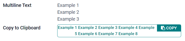
ข้อความหลายบรรทัด (text)
ฟิลด์ ข้อความหลายบรรทัด ใช้สำหรับข้อความที่ยาวขึ้นซึ่งมีอักขระประเภทใดก็ได้ สองบรรทัดข้อความจะแสดงใน UI เมื่อกรอกฟิลด์
คัดลอกไปยังคลิปบอร์ด: ผู้ใช้สามารถคัดลอกค่าได้โดยคลิกปุ่ม
Example
Integer (integer)
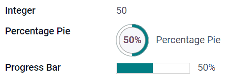
ฟิลด์ Integer ใช้สำหรับ:dfn:จำนวนเต็มทั้งหมด (บวก ลบ หรือศูนย์ โดยไม่มีทศนิยม)
Percentage Pie: แสดงค่าภายในวงกลมเปอร์เซ็นต์ โดยปกติจะใช้สำหรับค่าที่คำนวณได้ ไม่สามารถแก้ไขค่าใน UI ได้ แต่สามารถตั้งค่าเริ่มต้นได้
Progress Bar: แสดงค่าถัดจากแถบเปอร์เซ็นต์ โดยปกติจะใช้สำหรับค่าที่คำนวณได้ ไม่สามารถแก้ไขฟิลด์ด้วยตนเองได้ แต่สามารถตั้งค่าเริ่มต้นได้
Handle: แสดงไอคอนแฮนเดิลสำหรับลากเพื่อจัดเรียงระเบียนด้วยตนเองใน List view
Example
Decimal (float)
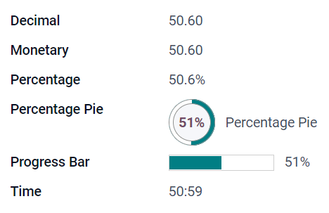
ฟิลด์ Decimal ใช้สำหรับ:dfn:จำนวนทศนิยมทั้งหมด (บวก ลบ หรือศูนย์ โดยมีทศนิยม)
Note
จำนวนทศนิยมจะแสดงทศนิยมสองตำแหน่งหลังจุดทศนิยมใน UI แต่จะถูกเก็บไว้ในฐานข้อมูลด้วยความแม่นยำมากกว่า
Monetary: คล้ายกับการใช้ Monetary field แนะนำให้ใช้ฟิลด์หลังเนื่องจากมีฟังก์ชันการทำงานมากกว่า
Percentage: แสดงสัญลักษณ์เปอร์เซ็นต์
%หลังค่าPercentage Pie: แสดงค่าภายในวงกลมเปอร์เซ็นต์ โดยปกติจะใช้สำหรับค่าที่คำนวณได้ ไม่สามารถแก้ไขฟิลด์ด้วยตนเองได้ แต่สามารถตั้งค่าเริ่มต้นได้
Progress Bar: แสดงค่าถัดจากแถบเปอร์เซ็นต์ โดยปกติจะใช้สำหรับค่าที่คำนวณได้ ไม่สามารถแก้ไขฟิลด์ด้วยตนเองได้ แต่สามารถตั้งค่าเริ่มต้นได้
Time: ค่าต้องอยู่ในรูปแบบ hh:mm โดยมีนาทีสูงสุด 59 นาที
Example
Monetary (monetary)
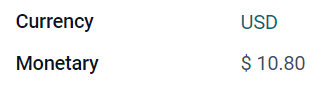
ฟิลด์ Monetary ใช้สำหรับค่าทางการเงินทั้งหมด
Note
เมื่อคุณเพิ่มฟิลด์ Monetary ครั้งแรก คุณจะได้รับแจ้งให้เพิ่มฟิลด์ Currency หากยังไม่มีอยู่ในโมเดล Odoo จะเสนอให้เพิ่มฟิลด์ Currency ให้คุณ เมื่อเพิ่มแล้ว ให้เพิ่มฟิลด์ Monetary อีกครั้ง
Example
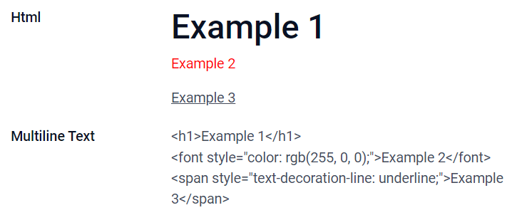
Html (html)
ฟิลด์ Html ใช้สำหรับเพิ่มข้อความที่สามารถแก้ไขได้โดยใช้ตัวแก้ไข HTML ของ Odoo
ข้อความหลายบรรทัด: ปิดการใช้งานตัวแก้ไข HTML ของ Odoo เพื่ออนุญาตให้แก้ไข HTML แบบดิบได้
Example
วันที่ (date)
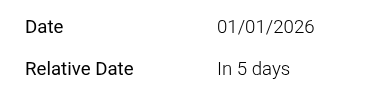
ฟิลด์ วันที่ ใช้สำหรับเลือกวันที่บนปฏิทิน
Relative Date: expresses the field value in relation to the current date using relative terms such as Yesterday, Today, In 3 days, 2 months ago, etc. This field should be set to Read only.
Example
วันที่และเวลา (datetime)
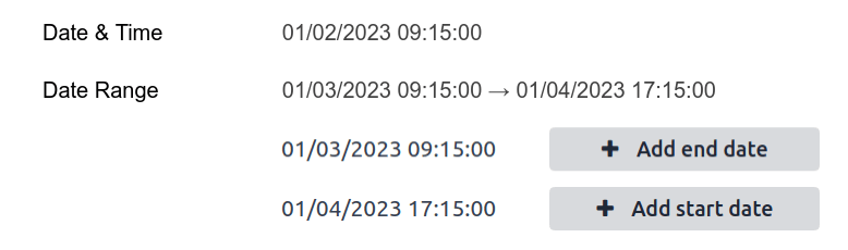
ฟิลด์ วันที่และเวลา ใช้สำหรับเลือกวันที่บนปฏิทินและเวลาบนนาฬิกา เวลาปัจจุบันของผู้ใช้จะถูกใช้โดยอัตโนมัติหากไม่ได้ตั้งค่าเวลา
Tip
นอกจาก:ref:คุณสมบัติทั่วไป <studio/fields/properties>`แล้ว ยังมี:ref:`คุณสมบัติเฉพาะ <studio/fields/properties-date-datetime>`สำหรับฟิลด์ :guilabel:`วันที่และเวลา ที่ตั้งค่าวิดเจ็ตเป็น วันที่และเวลา หรือ ช่วงวันที่
ช่วงวันที่ (daterange)
วิดเจ็ต ช่วงวันที่ ใช้สำหรับแสดงช่วงเวลาที่กำหนดโดยวันที่เริ่มต้นและวันที่สิ้นสุดในบรรทัดเดียว ช่วงวันที่สามารถมีวันที่เริ่มต้นและวันที่สิ้นสุดที่บังคับได้ เช่น สำหรับอีเวนต์หลายวัน หรืออนุญาตให้มีวันที่เริ่มต้นหรือวันที่สิ้นสุดที่เป็นตัวเลือกได้ เช่น สำหรับการบริการภาคสนามหรืองานโปรเจกต์
การเพิ่มช่วงวันที่ต้องใช้สองฟิลด์: ฟิลด์ วันที่และเวลา ที่ตั้งค่าวิดเจ็ตเป็น ช่วงวันที่ และอีกหนึ่งฟิลด์ที่เลือกเป็นวันที่เริ่มต้น หรือ วันที่สิ้นสุด ฟิลด์พื้นฐานนี้สามารถเป็นฟิลด์ วันที่ หรือ วันที่และเวลา ที่มีอยู่แล้ว หรือฟิลด์ที่สร้างขึ้นเฉพาะสำหรับวัตถุประสงค์นี้
เพื่อเพิ่มช่วงวันที่:
ระบุฟิลด์ วันที่ หรือ วันที่และเวลา ที่มีอยู่แล้วซึ่งสามารถใช้เป็นฟิลด์วันที่เริ่มต้น/สิ้นสุดพื้นฐาน หรือเพิ่มฟิลด์ใหม่ หากช่วงวันที่:
มีวันที่เริ่มต้นและวันที่สิ้นสุดที่บังคับ ฟิลด์นี้สามารถเป็นวันที่เริ่มต้นหรือวันที่สิ้นสุดก็ได้ ผลลัพธ์จะเหมือนกัน
อนุญาตให้มีวันที่เริ่มต้นหรือวันที่สิ้นสุดที่เป็นตัวเลือก ฟิลด์นี้คือวันที่เริ่มต้นหรือวันที่สิ้นสุดตามลำดับ
Tip
เพื่อหลีกเลี่ยงการแสดงข้อมูลเดียวกันสองครั้ง ฟิลด์วันที่เริ่มต้น/สิ้นสุดพื้นฐานสามารถทำให้ซ่อนได้โดยเปิดใช้งาน ซ่อน หรือลบออกจากมุมมองโดยคลิก ลบออกจากมุมมอง
เพิ่มฟิลด์ วันที่และเวลา และตั้งค่าฟิลด์ วิดเจ็ต เป็น ช่วงวันที่
ป้อน ป้ายชื่อ ที่เหมาะสม
เลือกฟิลด์วันที่เริ่มต้น/สิ้นสุดพื้นฐานจากรายการดรอปดาวน์ ฟิลด์วันที่เริ่มต้น หรือ ฟิลด์วันที่สิ้นสุด ตามความเหมาะสม
หากช่วงวันที่ต้องมีวันที่เริ่มต้นและวันที่สิ้นสุดเป็นข้อบังคับ ให้เปิดใช้งาน ใช้ช่วงเสมอ
อัปเดต:ref:
คุณสมบัติทั่วไป <studio/fields/properties>`อื่นๆ หรือ:ref:`คุณสมบัติสำหรับฟิลด์วันที่และเวลา <studio/fields/properties-date-datetime>`เฉพาะตามต้องการ จากนั้นคลิก :guilabel:`ปิดที่มุมบนขวาของหน้าจอ
Example
ช่องทำเครื่องหมาย (boolean)
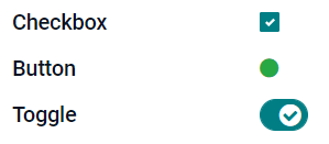
ฟิลด์ ช่องทำเครื่องหมาย ใช้เมื่อค่าควรเป็นจริงหรือเท็จเท่านั้น โดยระบุด้วยการทำเครื่องหมายหรือไม่ทำเครื่องหมายในช่อง
ปุ่ม: แสดงปุ่มตัวเลือก วิดเจ็ตทำงานโดยไม่ต้องเปลี่ยนไปยังโหมดแก้ไข
สลับ: แสดงปุ่มสลับ วิดเจ็ตทำงานโดยไม่ต้องเปลี่ยนไปยังโหมดแก้ไข
Example
การเลือก (selection)
ฟิลด์ การเลือก ใช้เมื่อผู้ใช้ควรเลือกค่าเดียวจากกลุ่มค่าที่กำหนดไว้ล่วงหน้า
ตราสัญลักษณ์: แสดงค่าภายในรูปทรงโค้งมน คล้ายกับแท็ก ไม่สามารถแก้ไขค่าบน UI ได้ แต่สามารถตั้งค่าเริ่มต้นได้
ตราสัญลักษณ์: แสดงค่าที่เลือกได้ทั้งหมดพร้อมกันภายในรูปทรงสี่เหลี่ยม โดยจัดเรียงตามแนวนอน
ความสำคัญ: แสดงสัญลักษณ์ดาวแทนค่า ซึ่งสามารถใช้เพื่อระบุระดับความสำคัญหรือความพึงพอใจ ตัวอย่างเช่น ผลที่ได้จะเหมือนกับการเลือก ฟิลด์ความสำคัญ แม้ว่าสำหรับฟิลด์หลังจะมีค่าความสำคัญสี่ค่ากำหนดไว้ล่วงหน้าแล้ว
ปุ่มตัวเลือก: แสดงค่าที่สามารถเลือกได้ทั้งหมดพร้อมกันเป็นปุ่มตัวเลือก
Tip
โดยค่าเริ่มต้น ปุ่มตัวเลือกจะจัดเรียงในแนวตั้ง เปิดใช้งาน แสดงในแนวนอน เพื่อเปลี่ยนวิธีการแสดง
แถบสถานะ: แสดงค่าที่สามารถเลือกได้ทั้งหมดพร้อมกันเป็นแถบความคืบหน้าแบบลูกศร
Tip
โดยค่าเริ่มต้น ค่าบนแถบสถานะสามารถเลือกได้ ปิดใช้งาน คลิกได้ เพื่อป้องกันไม่ให้แก้ไขค่าบนอินเทอร์เฟซผู้ใช้
Example

ความสำคัญ (selection)
ฟิลด์ ความสำคัญ ใช้เพื่อแสดงระบบการให้คะแนนแบบสามดาว ซึ่งสามารถใช้เพื่อระบุระดับความสำคัญหรือความพึงพอใจ ฟิลด์ประเภทนี้เป็น:ref:ฟิลด์การเลือก <studio/fields/simple-fields-selection>`ที่มีวิดเจ็ต :guilabel:`ความสำคัญ เลือกไว้โดยค่าเริ่มต้นและมีค่าความสำคัญสี่ค่ากำหนดไว้ล่วงหน้า ดังนั้น วิดเจ็ต ป้าย, ป้ายหลายอัน, ปุ่มตัวเลือก และ การเลือก จะมีผลเหมือนกับที่อธิบายไว้ใน:ref:การเลือก <studio/fields/simple-fields-selection>
Tip
หากต้องการเปลี่ยนจำนวนดาวที่ใช้ได้โดยการเพิ่มหรือลบค่า ให้คลิก แก้ไขค่า โปรดทราบว่าค่าแรกเท่ากับ 0 ดาว (กล่าวคือ เมื่อไม่มีการเลือก) ดังนั้นการมีสี่ค่าจะส่งผลให้เป็นระบบการให้คะแนนแบบสามดาว เป็นต้น
Example

ไฟล์ (binary)
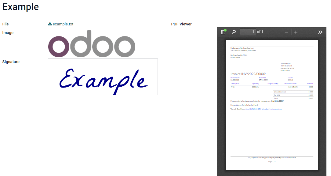
ฟิลด์ ไฟล์ ใช้สำหรับอัปโหลดไฟล์ประเภทใดก็ได้ หรือเซ็นแบบฟอร์ม (วิดเจ็ต การเซ็น)
รูปภาพ: ผู้ใช้สามารถอัปโหลดไฟล์รูปภาพ ซึ่งจะแสดงใน มุมมองแบบฟอร์ม ซึ่งให้ผลลัพธ์เช่นเดียวกับการใช้ ฟิลด์รูปภาพ
ตัวแสดง PDF: ผู้ใช้สามารถอัปโหลดไฟล์ PDF ซึ่งสามารถเรียกดูได้จาก มุมมองแบบฟอร์ม
การเซ็น: ผู้ใช้สามารถเซ็นแบบฟอร์มแบบอิเล็กทรอนิกส์ ซึ่งให้ผลลัพธ์เช่นเดียวกับการเลือก ฟิลด์การเซ็น
Example
รูปภาพ (binary)
ฟิลด์ รูปภาพ ใช้สำหรับอัปโหลดรูปภาพและแสดงใน มุมมองแบบฟอร์ม ฟิลด์ประเภทนี้คือ ฟิลด์ไฟล์ ที่มีการเลือกวิดเจ็ต รูปภาพ ไว้ตามค่าเริ่มต้น ดังนั้น วิดเจ็ต ไฟล์, ตัวแสดง PDF และ การเซ็น จะให้ผลลัพธ์เหมือนกับที่อธิบายไว้ใน ไฟล์
Tip
หากต้องการเปลี่ยนขนาดการแสดงผลของรูปภาพที่อัปโหลด ให้เลือก เล็ก, กลาง หรือ ใหญ่ ภายใต้ตัวเลือก ขนาด
การเซ็น (binary)
ฟิลด์ การเซ็น ใช้สำหรับเซ็นแบบฟอร์มแบบอิเล็กทรอนิกส์ ฟิลด์ประเภทนี้คือ ฟิลด์ไฟล์ ที่มีการเลือกวิดเจ็ต การเซ็น ไว้ตามค่าเริ่มต้น ดังนั้น วิดเจ็ต ไฟล์, รูปภาพ และ ตัวแสดง PDF จะให้ผลลัพธ์เหมือนกับที่อธิบายไว้ใน ไฟล์
Tip
หากต้องการให้ผู้ใช้มีตัวเลือก อัตโนมัติ เมื่อต้องวาดลายเซ็นของพวกเขา ให้เลือกหนึ่งในฟิลด์ กรอกอัตโนมัติด้วย ที่มีอยู่ (ข้อความ, Many2One และ ฟิลด์ที่เกี่ยวข้อง ในโมเดลเท่านั้น) ลายเซ็นจะถูกสร้างขึ้นโดยอัตโนมัติโดยใช้ข้อมูลจากฟิลด์ที่เลือก
ฟิลด์เชื่อมโยง
Note
Non-default widgets, when available, are presented as bullet points or sub-headings.
Many2One (many2one)
ฟิลด์ Many2One ใช้สำหรับเชื่อมโยงเรกคอร์ดอื่น (จากโมเดลอื่น) ไปยังเรกคอร์ดที่กำลังแก้ไข ชื่อเรกคอร์ดจากโมเดลอื่นจะแสดงบนเรกคอร์ดที่กำลังแก้ไข
Example
ในโมเดล คำสั่งขาย ฟิลด์ ลูกค้า เป็นฟิลด์ Many2One ที่ชี้ไปยังโมเดล ผู้ติดต่อ ซึ่งทำให้สามารถเชื่อมโยงคำสั่งขาย**หลายรายการ**ไปยังผู้ติดต่อ (ลูกค้า) **รายการเดียว**ได้

Tip
หากต้องการป้องกันไม่ให้ผู้ใช้สร้างเรกคอร์ดใหม่ในโมเดลที่เชื่อมโยง ให้ทำเครื่องหมาย ปิดใช้งานการสร้าง
เพื่อป้องกันไม่ให้ผู้ใช้เปิดระเบียนในหน้าต่างป๊อปอัป ให้ทำเครื่องหมาย ปิดการเปิด
เพื่อช่วยให้ผู้ใช้เลือกเฉพาะระเบียนที่ถูกต้อง ให้คลิก โดเมน เพื่อสร้างตัวกรอง
หากต้องการให้ทริกเกอร์การค้นหาสำหรับเรกคอร์ดที่เชื่อมโยงหลังจากป้อนอักขระขั้นต่ำแล้ว ให้ป้อนจำนวนที่ต้องการในฟิลด์ การค้นหาแบบพิมพ์ล่วงหน้า ในสถานการณ์ที่ชุดข้อมูลมีขนาดใหญ่ สามารถเพิ่มทั้งความเกี่ยวข้องและประสิทธิภาพของการค้นหาได้
ตราสัญลักษณ์: แสดงค่าภายในรูปทรงโค้งมน คล้ายกับแท็ก ไม่สามารถแก้ไขค่าบน UI ได้
ปุ่มตัวเลือก: แสดงค่าที่สามารถเลือกได้ทั้งหมดพร้อมกันเป็นปุ่มตัวเลือก
One2Many (one2many)
ฟิลด์ One2Many ใช้เพื่อแสดงความสัมพันธ์ที่มีอยู่ระหว่างระเบียนหนึ่งในโมเดลปัจจุบันกับหลายระเบียนจากโมเดลอื่น
Example
คุณสามารถเพิ่มฟิลด์ One2Many ในโมเดล ผู้ติดต่อ เพื่อดูคำสั่งขายหลายรายการของลูกค้า**คน**หนึ่ง

Note
เพื่อใช้ฟิลด์ One2Many ทั้งสองโมเดลจะต้องถูกเชื่อมโยงกันแล้วโดยใช้ ฟิลด์ Many2One ความสัมพันธ์แบบ One2Many ไม่มีอยู่เองโดยอิสระ แต่จะทำการค้นหาย้อนกลับของความสัมพันธ์ Many2One ที่มีอยู่
บรรทัด (one2many)
ฟิลด์ บรรทัด ใช้เพื่อสร้างตารางที่มีแถวและคอลัมน์ (เช่น บรรทัดของสินค้าในคำสั่งขาย)
Tip
เพื่อแก้ไขคอลัมน์ ให้คลิกที่ฟิลด์ บรรทัด จากนั้นคลิก แก้ไขมุมมองรายการ หากต้องการแก้ไขฟอร์มที่ปรากฏขึ้นเมื่อผู้ใช้คลิก เพิ่มบรรทัด ให้คลิก แก้ไขมุมมองฟอร์ม แทน
Example

Many2Many (many2many)
ฟิลด์ Many2Many ใช้เพื่อเชื่อมโยงหลายระเบียนจากโมเดลอื่นกับหลายระเบียนในโมเดลปัจจุบัน ฟิลด์ Many2Many สามารถใช้ ปิดการสร้าง, ปิดการเปิด, โดเมน เช่นเดียวกับ ฟิลด์ Many2One
Example
ในโมเดล งาน ฟิลด์ ผู้รับมอบหมาย เป็นฟิลด์ Many2Many ที่ชี้ไปยังโมเดล ผู้ติดต่อ สิ่งนี้ทำให้ผู้ใช้คนเดียวสามารถถูกมอบหมายให้กับงาน**หลาย**งานและผู้ใช้**หลาย**คนสามารถถูกมอบหมายให้กับงานเดียวได้

Tip
หากต้องการให้ทริกเกอร์การค้นหาสำหรับเรกคอร์ดที่เชื่อมโยงหลังจากป้อนอักขระขั้นต่ำแล้ว ให้ป้อนจำนวนที่ต้องการในฟิลด์ การค้นหาแบบพิมพ์ล่วงหน้า ในสถานการณ์ที่ชุดข้อมูลมีขนาดใหญ่ สามารถเพิ่มทั้งความเกี่ยวข้องและประสิทธิภาพของการค้นหาได้
ช่องทำเครื่องหมาย: ผู้ใช้สามารถเลือกหลายค่าโดยใช้ช่องทำเครื่องหมาย
แท็ก: ผู้ใช้สามารถเลือกหลายค่าที่ปรากฏในรูปทรงกลม หรือที่เรียกว่า แท็ก ซึ่งมีผลเหมือนกับการเลือก ฟิลด์แท็ก
แท็ก (many2many)
ฟิลด์ แท็ก ใช้เพื่อแสดงหลายค่าจากโมเดลอื่นที่ปรากฏในรูปทรงกลม หรือที่เรียกว่า แท็ก ฟิลด์ประเภทนี้เป็น ฟิลด์ Many2Many ที่มีวิดเจ็ต แท็ก ถูกเลือกโดยค่าเริ่มต้น ดังนั้น วิดเจ็ต ช่องทำเครื่องหมาย และ Many2Many มีผลเหมือนกับที่อธิบายไว้ใน Many2Many
Tip
เพื่อแสดงแท็กที่มีสีพื้นหลังแตกต่างกัน ให้ทำเครื่องหมาย ใช้สี
Example

Add a field to a view
With Studio, it is possible to add:
a new field to a form or list view of a model
an existing field, i.e., a field that already exists on the model in question, to any view of that model
Tip
Add a new field to a form or list view to save it to the model and make it available as an existing field in other views of the same model.
Add a new field
Tip
Activate developer mode before adding a new field to see, and be able to edit, the field's technical name during configuration.
To add a new field, follow these steps:
Navigate to the relevant form or list view, then click the (Toggle Studio) icon in the upper-right corner. Alternatively, with any app open, click the (Toggle Studio) icon, then navigate to the relevant form or list view.
In the Add tab, drag the relevant field type from the New Fields section and drop it in the desired position. If the new field is a relational field, select the relevant reciprocal field, model, or related field in the pop-up.
In the Properties tab, configure the field's properties:
Enter the Label to be displayed as the field name on the UI; this is also used to generate the default technical name of the field.
Click anywhere outside the Label field to see the Technical Name updated with the default technical name.
Note
The Technical Name of a new field can be edited in Studio during the configuration process. At any other time, a field's technical name can only be modified via the technical settings of the database.
The technical name of a new field added using Studio is by default prefixed by
x_studio_.
Optionally, select a different Widget via the dropdown; the default widget for the field type is selected by default.
Optionally, configure any other field properties.
Click Close in the top-right corner to close Studio.
ดูเพิ่มเติม
Add an existing field
To add a field that exists on the model but that is not present on the current view, follow these steps:
Navigate to the relevant view, then click the (Toggle Studio) icon in the upper-right corner. Alternatively, with any app open, click the (Toggle Studio) icon, then navigate to the relevant view.
In the Add tab, in the left panel, click Existing Fields to reveal a list of all the model's fields that are not currently present in the view.
Drag the relevant field and drop it in the desired position.
In the Properties tab, configure the relevant properties for the field in the current view.
Note
Various properties can be configured independently for different views, if needed, such as the Label, the Widget, the visibility of the field for certain user groups, as well as whether or not the field is Invisible, Required, or Readonly.
Click Close in the top-right corner to close Studio.
Field properties
A series of general properties can be configured for most combinations of field type and widget. Additional properties are available depending on the specific field type and widget selected. For example, Date & Time fields using the Date & Time or Date Range widget have various specific properties that can be configured.
คุณสมบัติทั่วไป
Class: Use Bootstrap or other custom classes defined in Odoo to customize how the field is styled and displayed on the UI.
ซ่อน: เปิดใช้งานคุณสมบัตินี้เมื่อไม่จำเป็นต้องให้ผู้ใช้เห็นฟิลด์ในอินเทอร์เฟซผู้ใช้ ช่วยลดความยุ่งเหยิงในอินเทอร์เฟซโดยแสดงเฉพาะฟิลด์ที่จำเป็นตามสถานการณ์เฉพาะ
จำเป็น: เปิดใช้งานคุณสมบัตินี้หากฟิลด์ควรได้รับการกรอกข้อมูลจากผู้ใช้เสมอก่อนที่จะดำเนินการต่อได้
อ่านอย่างเดียว: เปิดใช้งานคุณสมบัตินี้หากผู้ใช้ไม่สามารถแก้ไขฟิลด์ได้
Tip
The Invisible property also applies inside Studio. To view hidden fields in Studio, click on a view's View tab and enable Show Invisible Elements.
The Invisible, Required, and Readonly properties can be enabled for specific records only by clicking on Conditional and creating a filter.
Example
On the form view of the Contact model, the Title field only appears when Individual is selected, as that field would not be helpful for a Company contact.
Label: This is the field name on the UI; the label is used to generate the technical name of the field.
คำแนะนำช่วยเหลือ: เพื่ออธิบายวัตถุประสงค์ของฟิลด์ ให้เพิ่มคำอธิบาย ข้อความจะแสดงในกล่องคำแนะนำเมื่อเลื่อนเมาส์ไปที่เครื่องหมายคำถามข้างป้ายกำกับของฟิลด์
Technical Name: To view a field's technical name in Studio (and, during the configuration of a new field, edit it if desired), activate developer mode.
Tip
If this field needs to be updated but is no longer editable via Studio, the technical name can be modified via the technical settings of the database.
วิดเจ็ต: เพื่อเปลี่ยนรูปลักษณ์หรือฟังก์ชันการทำงานเริ่มต้นของฟิลด์ ให้เลือกวิดเจ็ตที่มีให้ใช้งาน
Placeholder: To provide an example of how a field should be completed, add a fixed placeholder text. The text appears in light gray until a value is entered.
Dynamic Placeholder: To provide the value of the selected field as an example of how a field should be completed. The text appears in light gray until a value is entered.
ค่าเริ่มต้น: เพื่อแสดงค่าเริ่มต้นในฟิลด์เมื่อสร้างรายการ ให้เพิ่มค่า
อนุญาตการมองเห็นให้กับกลุ่ม: เพื่อจำกัดว่าผู้ใช้คนใดสามารถดูฟิลด์ได้ ให้เลือกหนึ่ง:ref:`กลุ่ม <access-rights/groups>`การเข้าถึงของผู้ใช้หรือมากกว่า
ห้ามการมองเห็นให้กับกลุ่ม: เพื่อป้องกันไม่ให้ผู้ใช้บางคนเห็นฟิลด์ ให้เลือกหนึ่ง:ref:`กลุ่ม <access-rights/groups>`การเข้าถึงของผู้ใช้หรือมากกว่า
คุณสมบัติสำหรับฟิลด์วันที่และเวลา
For Date & Time fields using the Date & Time or Date Range widget, some specific properties are available:
Minimal precision: Determine the smallest date unit that must be selected in the date selector. The possible values are
Day,Month,YearorDecade. If no value is selected, the user must select a day in the date selector.Maximal precision: Determine the largest date unit that can be used to navigate the date selector. The possible values are
Day,Month,YearorDecade. If no value is selected, the user can navigate the date selector by decade.คำเตือนสำหรับวันที่ในอนาคต: เปิดใช้งานคุณสมบัตินี้เพื่อแสดงไอคอนคำเตือนหากเลือกวันที่ในอนาคต
รูปแบบวันที่: โดยค่าเริ่มต้น วันที่จะแสดงเป็น
Apr 2, 2025, 08:05 AMเปิดใช้งานคุณสมบัตินี้เพื่อแสดงวันที่ในรูปแบบ4/2/2025 08:05:00โหมดตัวเลขคือรูปแบบที่ตั้งไว้ในภาษาปัจจุบัน ในโหมดนี้วินาทีจะแสดงเสมอแสดงวันที่: คุณสมบัตินี้เปิดใช้งานโดยค่าเริ่มต้นสำหรับฟิลด์ วันที่และเวลา ปิดใช้งานคุณสมบัตินี้เพื่อแสดงเฉพาะเวลา
แสดงเวลา: คุณสมบัตินี้เปิดใช้งานโดยค่าเริ่มต้นสำหรับฟิลด์ วันที่และเวลา ในฟิลด์แบบอ่านอย่างเดียว ให้ปิดใช้งานคุณสมบัตินี้เพื่อแสดงเฉพาะวันที่ ตัวอย่างเช่น สิ่งนี้สามารถช่วยให้มุมมองรายการดูเรียบร้อยขึ้น
แสดงวินาที: คุณสมบัตินี้ปิดใช้งานโดยค่าเริ่มต้นสำหรับฟิลด์ วันที่และเวลา เปิดใช้งานคุณสมบัตินี้เพื่อแสดงวินาที
ช่วงเวลา: ป้อนค่าเพื่อกำหนดช่วงนาทีที่แสดงในตัวเลือกเวลา ตัวอย่างเช่น ป้อน 15 เพื่อให้มีช่วงเวลาทุก 15 นาที ค่าเริ่มต้นถูกตั้งไว้ที่ 5 นาที
วันที่ที่ยอมรับได้เร็วที่สุด: ป้อนวันที่เร็วที่สุดที่สามารถเลือกได้ในตัวเลือกวันที่ในรูปแบบ ISO คือ
YYYY-MM-DDหากวันที่ปัจจุบันเป็นวันที่ที่ยอมรับได้เร็วที่สุดเสมอ ให้ป้อนtodayในตัวเลือกวันที่ วันที่ก่อนหน้าวันที่ที่ยอมรับได้เร็วที่สุดจะแสดงเป็นสีเทาวันที่ที่ยอมรับได้ล่าสุด: ป้อนวันที่ล่าสุดที่สามารถเลือกได้ในตัวเลือกวันที่ในรูปแบบ ISO คือ
YYYY-MM-DDหากวันที่ปัจจุบันเป็นวันที่ที่ยอมรับได้ล่าสุดเสมอ ให้ป้อนtodayในตัวเลือกวันที่ วันที่หลังจากวันที่ที่ยอมรับได้ล่าสุดจะแสดงเป็นสีเทา
Modify a field's properties
To modify the properties of a field, follow these steps:
Navigate to the relevant view, then click the (Toggle Studio) icon in the upper-right corner. Alternatively, with any app open, click the (Toggle Studio) icon, then navigate to the relevant view.
Click on the relevant field.
In the Properties tab, make any desired changes to the field properties.
Tip
Various properties can be configured independently for different views, such as the Label, the Widget, the visibility of the field for certain user groups, as well as whether or not the field is Invisible, Required, or Readonly.
Click Close in the top-right corner to close Studio.
Note
The Technical Name of a field (visible in Studio with developer mode activated) cannot be modified in Studio; this can be done via the technical settings of the database.
Modify a field's technical name
To modify the technical name of a field, activate developer mode, then follow these steps:
With the field open in Studio, copy the technical name of the field.
Remove the field from all views in Studio, then click Close to close Studio.
Navigate to .
Paste the copied technical name into the search bar, then open the relevant field.
Modify the Field Name as needed.
Once the field's technical name has been updated, the field can then be added (back) to the relevant view(s) from the list of existing fields.
Important
When updating the technical name of a field, make sure to keep at least the x_ prefix, which is
required for any custom field; for fields created using Studio, keep the x_studio_ prefix to
allow such fields to be more easily identified.
Remove a field from a view
To remove a field from a view, follow these steps:
Navigate to the relevant view, then click the (Toggle Studio) icon in the upper-right corner. Alternatively, with any app open, click the (Toggle Studio) icon, then navigate to the relevant view.
Click on the relevant field.
Scroll to the bottom of the Properties tab, then click Remove from view.
Click Ok to confirm the action.
Tip
A removed field can be easily added back to the view at a later stage, if needed.
If the intention is to declutter the view, it is also possible to modify a field and make it Invisible on the view in question.