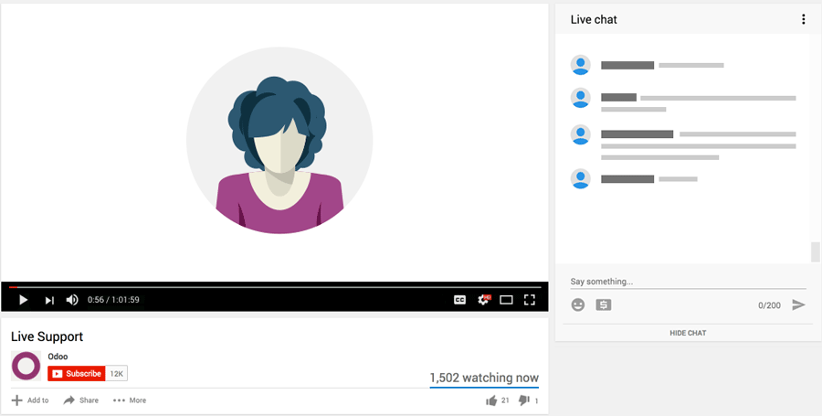
The "Activities" window that appears on the right of every Odoo Input screen takes up almost 40% of the screen width. The entries there are usually short and sweet, leaving vast amount of dead white space on the right hand side of the screen.
The left window on the other hand is all bunched up and text input fields often wrap or is not fully visible and the window invariably has a scroll bar which has to be dragged left or right in order to view or edit the fields & values on the right hand side of the page.
Can the default width of the activities window be reduced to say 75% or 60% of it's current allocation, leaving more space for the left hand window? Why not make it user adjustable by allowing the user to drag the window sizes left/right to make it bigger/smaller to suit their needs

