My appointment set-up assignment method is "Pick User/Resource then Time". It seems that because of this, I get a poor appointment cancellation UX.
What happens:
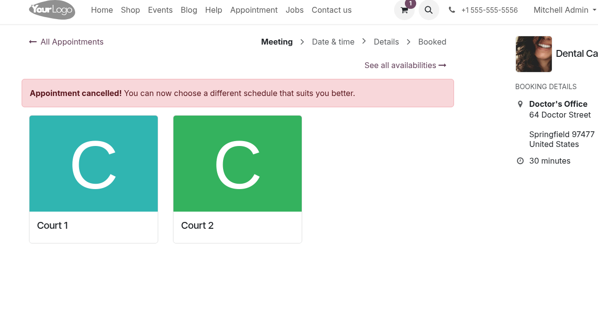
When a customer clicks "Cancel Appointment" on the online booking page, they are immediately redirected to the "Choose Resource" screen with no confirmation or visual indication that the appointment was cancelled.
Only after they have clicked on a resource, are they then shown the "Appointment Cancelled" page.
This causes confusion - customers will assume the cancellation didn't go through. The actual cancellation confirmation only appears after selecting a resource again, which is illogical and very poor user experience.
To add to this, it doesn't matter what resource they've clicked, it doesn't even have to be the one they booked. As long as they click on any resource, they are redirected to the cancellation confirmation page. This seems very illogical to me and causes even myself a lot of confusion.
How can I fix this? I feel that this is a UX flaw that should be corrected in the original module.
Expected behaviour:
- After clicking "Cancel Appointment", the user should immediately be shown a cancellation confirmation
- There should be no further navigation required to confirm the action, especially when there is no explanation on the choosing resource page on what to do next
I'm using odoo online so I cannot access the routes. How else can I fix this?