
Campos e widgets
Fields structure the models of a database. If you think of a model as a table or spreadsheet, fields are the columns and records are the individual rows. Fields also define the type of data that is stored within them. The way in which a field’s data is presented and formatted on the UI is controlled by its widget.
With Studio, it is possible to:
add new fields to your database. From a technical point of view, there are 15 field types in Odoo. However, you can choose from 21 field types in Studio, as some field types are available more than once with a different default widget;
add existing fields, i.e., fields that already exist on a model, to any view of that model;
Studio fields vs. property fields
Fields created using Studio are saved as columns in your Odoo database. Property fields, on the other hand, act as pseudo-fields; they are shared by all records that are linked to the same parent record (e.g., for tasks, the project, or for a product, the product category), but they are not saved as columns in your database.
Example
Adding a Deadline field to the form view of a task using Studio makes that field visible in every task in your database. Adding a Special instructions property field to a task makes the field visible in all tasks within the same project (i.e., its parent) while other projects’ tasks remain unaffected.
Field types
Fields can be broadly divided into two categories:
Simple fields, which contain basic values, such as text, numbers, files, etc.
Relational fields, which are used to link and display the data from records on another model.
Campos simples
Nota
Non-default widgets, when available, are presented as bullet points or sub-headings.
Texto (char)
O campo Texto é usado para texto curto contendo qualquer caractere. Uma linha de texto é exibida ao preencher o campo.
Medalha: exibe o valor dentro de uma forma arredondada, semelhante a um marcador. O valor não pode ser editado na interface do usuário, mas um valor padrão pode ser definido.
Copiar para a prancheta: os usuários podem copiar o valor clicando em um botão.
E-mail: o valor se torna um link enviar para clicável.
Imagem: exibe uma imagem usando um URL. O valor não pode ser editado manualmente, mas um valor padrão pode ser definido.
Nota
This works differently from selecting the Image field directly, as the image is not stored in Odoo when using a Text field with the Image widget. For example, it can be useful if you want to save disk space.
Telefone: o valor se torna um link tel clicável.
Dica
Marque Habilitar SMS para adicionar ao lado do campo uma opção para enviar um SMS diretamente do Odoo.
URL: o valor se torna um URL clicável.
Example

Texto multilinha (text)
O campo Texto multilinha é usado para textos mais longos que contenham qualquer tipo de caractere. Duas linhas de texto são exibidas na interface do usuário quando o campo é preenchido.
Copiar para a prancheta: os usuários podem copiar o valor clicando em um botão.
Example

Número inteiro (integer)
O campo Número inteiro é usado para todos os números inteiros (positivos, negativos ou zero, sem decimal).
Gráfico de porcentagem: exibe o valor dentro de um círculo de porcentagem, geralmente para um valor calculado. O valor não pode ser editado na interface do usuário, mas um valor padrão pode ser definido.
Barra de progresso: exibe o valor ao lado de uma barra de porcentagem, geralmente para um valor computado. O campo não pode ser editado manualmente, mas um valor padrão pode ser definido.
Alça: exibe um ícone de alça de arrastar para ordenar os registros manualmente na List view.
Example

Decimal (float)
O campo Decimal é usado para todos os números decimais (positivo, negativo ou zero, com decimal).
Nota
Os números decimais são exibidos com duas casas decimais após o ponto na interface do usuário, mas são armazenados na base de dados com mais precisão.
Monetário: é semelhante ao uso do campo Monetário. É recomendável usar o último, pois ele oferece mais funcionalidades.
Porcentagem: exibe um caractere de porcentagem
%após o valor.Gráfico de porcentagem: exibe o valor dentro de um círculo de porcentagem, geralmente para um valor calculado. O campo não pode ser editado manualmente, mas um valor padrão pode ser definido.
Barra de progresso: exibe o valor ao lado de uma barra de porcentagem, geralmente para um valor computado. O campo não pode ser editado manualmente, mas um valor padrão pode ser definido.
Tempo: o valor deve seguir o formato hh:mm, com um máximo de 59 minutos.
Example

Html (html)
O campo Html é usado para adicionar texto que pode ser editado usando o editor HTML do Odoo.
Texto multilinha: desativa o editor HTML do Odoo para permitir a edição de HTML bruto.
Example

Monetário (monetário)
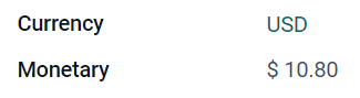
O campo Monetário é usado para todos os valores monetários.
Nota
Quando você adiciona um campo Monetário pela primeira vez, é solicitado que você adicione um campo Moeda se ainda não existir nenhum no modelo. O Odoo oferece adicionar o campo Moeda. Depois que ele for adicionado, adicione o campo Monetário novamente.
Example
Date (date) and Datetime (datetime)
The Date field is used to select a date on a calendar. The Datetime field is used to select a date on a calendar and a time on a clock; if no time is set, the time of the user’s local device is automatically used.
Date Range: displays a period of time defined by a start date and an end date in a single line. A date range can have a mandatory start and end date, e.g., for a multi-day event, or allow an optional start or end date, e.g., for a field service intervention or a project task. If the field is a Datetime field, a start time and end time are also displayed.
Remaining Days: displays the remaining number of days before the selected date (e.g., In 5 days), based on the current date and time. This field should be set to Readonly.
Example

Dica
As well as general properties, some specific properties are available for Date and Datetime fields.
Intervalo de datas (daterange)
Adding a date range requires two fields:
a Date or Datetime field with the Date Range widget set
another field that is selected as the start date or end date. This underlying field can be an existing Date or Datetime field, or one created specifically for this purpose.
Para adicionar um intervalo de datas:
Identify the existing Date or Datetime field to use as the underlying start/end date field, or add a new one. If the date range:
a data de início e adata de término são obrigatórias, esse campo pode ser a data de início ou a data de término; o resultado é o mesmo.
a data de início ou de término são opcionais, esse campo é a data de início ou de término, respectivamente.
Dica
Para evitar a visualização da mesma informação duas vezes, o campo de data de início/término subjacente pode ser tornado invisível ativando Invisível ou removido da visualização clicando em Remover da visão.
Add a Date or Datetime field and set the Widget field to Date Range.
Digite um Rótulo apropriado.
Selecione o campo de data de início/fim subjacente no menu suspenso Campo de data de início ou Campo de data de término, conforme relevante.
If the date range should always have a start and end date, enable Always range.
Update any other general properties or specific properties for Date and Datetime fields as needed, then click Close in the upper right corner of the screen.
Caixa de seleção (boolean)
O campo Caixa de seleção é usado quando um valor deve ser apenas verdadeiro ou falso, indicado pela marcação ou desmarcação de uma caixa de seleção.
Botão: exibe um botão de rádio. O widget funciona sem alternar para o modo de edição.
Alternância: exibe um botão de alternância. O widget funciona sem alternar para o modo de edição.
Example

Seleção (selection)
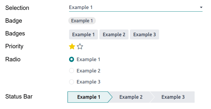
O campo Seleção é usado quando os usuários devem selecionar um único valor em um grupo de valores predefinidos.
Medalha: exibe o valor dentro de uma forma arredondada, semelhante a um marcador. O valor não pode ser editado na interface do usuário, mas um valor padrão pode ser definido.
Medalhas: exibe todos os valores selecionáveis simultaneamente dentro de formas retangulares, organizadas na horizontal.
Prioridade: exibe símbolos de estrelas em vez de valores, que podem ser usados para indicar um nível de importância ou satisfação, por exemplo. Isso tem o mesmo efeito que selecionar o campo Prioridade, embora, para esse último, quatro valores de prioridade já estejam predefinidos.
Rádio: exibe todos os valores selecionáveis ao mesmo tempo como botões de rádio.
Dica
Por padrão, os botões de seleção são organizados verticalmente. Ative a opção Exibir horizontalmente para mudar a forma como são exibidos.
Barra de status: exibe todos os valores selecionáveis ao mesmo tempo, como uma barra de progresso em forma de seta.
Dica
Por padrão, os valores na barra de status são selecionáveis. Desabilite Clicável para evitar que o valor seja editado na interface do usuário.
Example
Arquivo (binary)
The File field is used to upload any type of file.
Imagem: os usuários podem carregar um arquivo de imagem, que é então exibido na Visualização de formulário. Isso tem o mesmo efeito que usar o campo Imagem.
Visualizador de PDF: os usuários podem carregar um arquivo PDF, que pode ser navegado a partir da Visualização de formulário.
Example

Image (image)
The Image field is used to upload an image and display it in Form view. This field type is a File field with the Image widget selected by default. Consequently, the File and PDF Viewer widgets have the same effects as described under File.
Dica
Para alterar o tamanho de exibição das imagens carregadas, selecione Pequeno, Médio ou Grande na opção Tamanho.
Prioridade (selection)
O campo Prioridade é usado para exibir um sistema de classificação de três estrelas, que pode ser usado para indicar a importância ou o nível de satisfação. Esse tipo de campo é um Campo de seleção com o widget Prioridade selecionado por padrão e quatro valores de prioridade predefinidos. Consequentemente, os widgets Medalha, Medalhas, Rádio e Seleção têm os mesmos efeitos descritos em Seleção.
Dica
Para alterar o número de estrelas disponíveis adicionando ou removendo valores, clique em Editar valores. Observe que o primeiro valor é igual a 0 estrelas (ou seja, quando nenhuma seleção é feita), portanto, ter quatro valores resulta em um sistema de classificação de três estrelas, por exemplo.
Example

Signature (signature)
The Signature field is used to sign the form electronically. This field type is a File field with the Signature widget selected by default. Consequently, the File, Image, and PDF Viewer widgets have the same effects as described under File.
Dica
To give users the Auto option when having to draw their signature, select one of the available Prefill with fields (Many2One, and Related Field on the model only). The signature is then automatically generated using the data from the selected field.
Example

AI Field
An AI Field is essentially a standard Odoo field with added AI capabilities that allow its values to be generated automatically through prompts.
Dica
It is also possible to add AI capabilities to a newly added field via the field properties.
Campos relacionais
Nota
Non-default widgets, when available, are presented as bullet points or sub-headings.
Linhas (one2many)
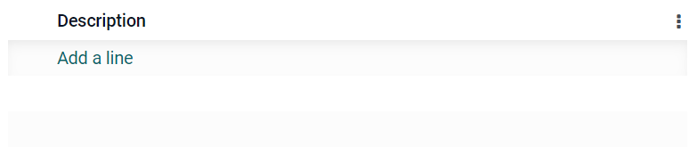
O campo Linhas é usado para criar uma tabela com linhas e colunas (por exemplo, as linhas de produtos em um pedido de vendas).
Dica
Para modificar as colunas, clique no campo Linhas e, em seguida, em Editar visualização de lista. Para editar o formulário que aparece quando o usuário clica em Adicionar uma linha, clique em Editar visualização de formulário.
Example
One2Many (one2many)
O campo One2Many é usado para exibir as relações existentes entre um registro no modelo atual e vários registros de outro modelo.
Example
Você poderia adicionar um campo One2Many no modelo Contato para examinar os muitos pedidos de vendas de um cliente.

Nota
Para usar um campo One2Many, os dois modelos já devem ter sido vinculados usando um campo Many2One. As relações One2Many não existem independentemente: é realizada uma pesquisa reversa das relações Many2One existentes.
Many2One (many2one)
Campos Many2One é usado para vincular outro registro (de outro modelo) ao registro que está sendo editado. O nome do registro do outro modelo é então exibido no registro que está sendo editado.
Example
No modelo Pedido de venda, o campo Cliente é um campo Many2One que aponta para o modelo Contato. Isso permite que muitos pedidos de vendas sejam vinculados a um contato (cliente).

Dica
Para impedir que os usuários criem um novo registro no modelo vinculado, marque a opção Desabilitar criação.
Para evitar que os usuários abram registros em uma janela pop-up, marque a opção Desabilitar abertura.
Para ajudar os usuários a selecionar apenas o registro correto, clique em Domínio para criar um filtro.
To only trigger the search for a linked record after a minimum number of characters has been entered, enter the desired number in the Typeahead search field. In situations where the data set is large, this can enhance both search relevancy and performance.
Distintivo: exibe o valor dentro de uma forma arredondada, semelhante a um marcador. O valor não pode ser editado na interface do usuário.
Rádio: exibe todos os valores selecionáveis ao mesmo tempo como botões de rádio.
Many2Many (many2many)
O campo Many2Many é usado para vincular vários registros de outro modelo a vários registros no modelo atual. Os campos Many2Many podem usar Desabilitar criação, Desabilitar abertura, Domínio, assim como os campos Many2One.
Example
No modelo Tarefa, o campo Responsáveis é um campo Many2Many que aponta para o modelo Contato. Isso permite que um único usuário seja atribuído a muitas tarefas e que muitos usuários sejam atribuídos a uma única tarefa.

Dica
To only trigger the search for the linked record after a minimum number of characters has been entered, enter the desired number in the Typeahead search field. In situations where the data set is large, this can enhance both search relevancy and performance.
Caixas de seleção: os usuários podem selecionar vários valores usando caixas de seleção.
Marcadores: os usuários podem selecionar vários valores que aparecem em formas arredondadas, também conhecidos como marcadores. Isso tem o mesmo efeito que selecionar o campo Marcadores.
Marcadores (many2many)
O campo Marcadores é usado para exibir vários valores de outro modelo que aparecem em formas arredondadas, também conhecidos como marcadores. Esse tipo de campo é um campo Many2Many com o widget Tags selecionado por padrão. Consequentemente, os widgets Checkboxes e Many2Many têm os mesmos efeitos descritos em Many2Many.
Dica
Para exibir tags com cores de fundo diferentes, marque a opção Usar cores.
Example

Add a field to a view
With Studio, it is possible to add:
a new field to a form or list view of a model
an existing field, i.e., a field that already exists on the model in question, to any view of that model
Dica
Add a new field to a form or list view to save it to the model and make it available as an existing field in other views of the same model.
Add a new field
Dica
Activate developer mode before adding a new field to see, and be able to edit, the field’s technical name during configuration.
To add a new field, follow these steps:
Navigate to the relevant form or list view, then click the (Toggle Studio) icon in the upper-right corner. Alternatively, with any app open, click the (Toggle Studio) icon, then navigate to the relevant form or list view.
In the Add tab, drag the relevant field type from the New Fields section and drop it in the desired position. If the new field is a relational field, select the relevant reciprocal field, model, or related field in the pop-up.
In the Properties tab, configure the field’s properties:
Enter the Label to be displayed as the field name on the UI; this is also used to generate the default technical name of the field.
Click anywhere outside the Label field to see the Technical Name updated with the default technical name.
Nota
The Technical Name of a new field can be edited in Studio during the configuration process. At any other time, a field’s technical name can only be modified via the technical settings of the database.
The technical name of a new field added using Studio is by default prefixed by
x_studio_.
Optionally, select a different Widget via the dropdown; the default widget for the field type is selected by default.
Optionally, configure any other field properties.
Click Close in the top-right corner to close Studio.
Veja também
Add an existing field
To add a field that exists on the model but that is not present on the current view, follow these steps:
Navigate to the relevant view, then click the (Toggle Studio) icon in the upper-right corner. Alternatively, with any app open, click the (Toggle Studio) icon, then navigate to the relevant view.
In the Add tab, in the left panel, click Existing Fields to reveal a list of all the model’s fields that are not currently present in the view.
Drag the relevant field and drop it in the desired position.
In the Properties tab, configure the relevant properties for the field in the current view.
Nota
Various properties can be configured independently for different views, if needed, such as the Label, the Widget, the visibility of the field for certain user groups, as well as whether or not the field is Invisible, Required, or Readonly.
Click Close in the top-right corner to close Studio.
Field properties
A series of general properties can be configured for most combinations of field type and widget. Additional properties are available depending on the specific field type and widget selected. For example, Datetime fields using the Date & Time or Date Range widget have various specific properties that can be configured.
Propriedades gerais
Class: Use Bootstrap or other custom classes defined in Odoo to customize how the field is styled and displayed on the UI.
Invisível: Ative essa propriedade quando não for necessário que os usuários visualizem um campo na interface do usuário. Isso ajuda a organizar a interface do usuário, mostrando apenas os campos essenciais, dependendo de uma situação específica.
Obrigatório: Habilite essa propriedade se um campo sempre deve ser preenchido pelo usuário antes de ser possível continuar.
Somente leitura: Habilite essa propriedade se os usuários não puderem modificar um campo.
Dica
The Invisible property also applies inside Studio. To view hidden fields in Studio, click on a view’s View tab and enable Show Invisible Elements.
The Invisible, Required, and Readonly properties can be enabled for specific records only by clicking on Conditional and creating a filter.
Example
On the form view of the Contact model, the Title field only appears when Individual is selected, as that field would not be helpful for a Company contact.
Label: This is the field name on the UI; the label is used to generate the technical name of the field.
Dica de ajuda: Para explicar a finalidade de um campo, adicione uma descrição. O texto é exibido ao passar o mouse, em uma caixa de dica de ferramenta acima do ponto de interrogação ao lado do rótulo do campo.
AI: To add AI capabilities allowing the value of the field to be generated automatically through a prompt, enable AI. When the browser page reloads, click the Prompt field that appears and enter a prompt; type
/to open the AI prompt tools and use the Field Selector to tell Odoo AI which fields to check for context. Click Save & Generate.Dica
It is also possible to add a new AI field directly to a form or list view.
Technical Name: To view a field’s technical name in Studio (and, during the configuration of a new field, edit it if desired), activate developer mode.
Dica
If this field needs to be updated but is no longer editable via Studio, the technical name can be modified via the technical settings of the database.
Widget: Para alterar a aparência ou a funcionalidade padrão de um campo, selecione um dos widgets disponíveis.
Placeholder: To provide an example of how a field should be completed, add a fixed placeholder text. The text appears in light gray until a value is entered.
Dynamic Placeholder: To provide the value of the selected field as an example of how a field should be completed. The text appears in light gray until a value is entered.
Default value: To display a default value in a field when a record is created, enter a value.
Permitir visibilidade para grupos: Para limitar os usuários que podem visualizar o campo, selecione um ou mais acessos de grupos <access-rights/groups> de usuários.
Proibir visibilidade para grupos: Para impedir que determinados usuários vejam o campo, selecione um ou mais acessos de grupos <access-rights/groups> de usuários.
Properties for Date and Datetime fields
For Date fields using the Date or Date Range widget and Datetime fields using the Date & Time or Date Range widget, some specific properties are available:
Minimal precision: Determine the smallest date unit that must be selected in the date selector. The possible values are
Days,Decades,MonthsandYears. If no value is selected, the user must select a day in the date or datetime selector.Maximal precision: Determine the largest date unit that can be used to navigate the date selector. The possible values are
Days,Decades,MonthsandYears. If no value is selected, the user can navigate the date selector by decade.Date format: By default the date will be shown as e.g.,
Jan 31, 2026(or the equivalent for the user’s language/regional settings). Select the all-numeric date format, e.g., 31/01/2026, if desired.Warning for future dates: Enable this property to warn the user that a future date has been selected by displaying the date in red.
Primeira data aceita: Insira a primeira data que pode ser selecionada no seletor de datas no formato ISO, ou seja,
AAAA-MM-DD. Se a data atual for sempre a primeira data aceita, digitehoje. No seletor de datas, as datas anteriores à primeira data aceita ficam acinzentadas.Primeira data aceita: Insira a última data que pode ser selecionada no seletor de datas no formato ISO, ou seja,
AAAA-MM-DD. Se a data atual for sempre a última data aceita, digitehoje. No seletor de datas, as datas posteriores à última data aceita ficam acinzentadas.
For Date or Datetime fields using the Date Range widget, additional properties are available:
Start date field and End date field: These properties are used to define a start or end date for a date range or date and time range; only one of these properties can be populated.
Show date: This property is enabled by default for Datetime fields. Disable this property to show only the time.
Show time: This property is enabled by default for Datetime fields. On a read-only field, disable the property to show only the date. This can keep a list view less cluttered, for example.
Show seconds: This property is disabled by default for Datetime fields. Enable the property to show the seconds.
Intervalo de tempo: Insira um valor para determinar os intervalos de minutos mostrados no seletor de tempo. Por exemplo, digite 15 para permitir intervalos de um quarto de hora. O valor padrão é definido como 5 minutos.
Modify a field’s properties
To modify the properties of a field, follow these steps:
Navigate to the relevant view, then click the (Toggle Studio) icon in the upper-right corner. Alternatively, with any app open, click the (Toggle Studio) icon, then navigate to the relevant view.
Click on the relevant field.
In the Properties tab, make any desired changes to the field properties.
Dica
Various properties can be configured independently for different views, such as the Label, the Widget, the visibility of the field for certain user groups, as well as whether or not the field is Invisible, Required, or Readonly.
Click Close in the top-right corner to close Studio.
Nota
The Technical Name of a field (visible in Studio with developer mode activated) cannot be modified in Studio; this can be done via the technical settings of the database.
Modify a field’s technical name
To modify the technical name of a field, activate developer mode, then follow these steps:
With the field open in Studio, copy the technical name of the field.
Remove the field from all views in Studio, then click Close to close Studio.
Navigate to .
Paste the copied technical name into the search bar, then open the relevant field.
Modify the Field Name as needed.
Once the field’s technical name has been updated, the field can then be added (back) to the relevant view(s) from the list of existing fields.
Importante
When updating the technical name of a field, make sure to keep at least the x_ prefix, which is
required for any custom field; for fields created using Studio, keep the x_studio_ prefix to
allow such fields to be more easily identified.
Remove a field from a view
To remove a field from a view, follow these steps:
Navigate to the relevant view, then click the (Toggle Studio) icon in the upper-right corner. Alternatively, with any app open, click the (Toggle Studio) icon, then navigate to the relevant view.
Click on the relevant field.
Scroll to the bottom of the Properties tab, then click Remove from view.
Click Ok to confirm the action.
Dica
A removed field can be easily added back to the view at a later stage, if needed.
If the intention is to declutter the view, it is also possible to modify a field and make it Invisible on the view in question.